Pages

Showing posts with label sketchbook. Show all posts

8/01/2019

Sketchbook Challenge!

In June I attended Light Grey Art Lab's artist residency in Norway. It was such a great experience to go somewhere remote and spend it with artists from around the world, sharing our experiences and having fun. I will never forget it! Part of what we had to do as a requirement of the residency was give a presentation about our inner art life and practice and also challenge the other artists in the residency in some way. This is my challenge, which I thought I would share publicly. 

Enjoy!


I am posting my monthly e-sketchbook on Patreon, as well as bonus video and process on paintings while I figure out tiers. Donating $3 is a great value, IMHO. ;)

5/10/2019

Patreon

I've decided to start up a Patreon account as a supplement to my long running blog, where I write about my art process, experiences, and share images and other information regarding art. 


Since 2006, I have been writing and sharing on this blog while also working full time. These days I am taking time off from work in order to develop my personal art more fully, work that is a departure from my commercial portfolio. At the same time, I would like to continue to share and expand my art process with time lapses, video demos, materials recommendations, notes, concept development, book recommendations, class recommendations, and sharing of ideas. 


Patreon is a place where I can do more, share more, and get a little support while doing so.


Throughout 2019 I will offer ONE monthly tier: 
  • thank you for your support @ $2 per month 
  • with that you get all of my tutorial videos, time lapse, and monthly downloadable sketchbook. 


The sketchbook will be a PDF each month and will include sketchbook studies and paintings, thoughts about sketching, materials, how-to sketchbook practice, and other material that will only be offered in the e-sketchbook. I will continue to share my sketches on social media, but the e-sketchbook will be for patrons to keep, plus the bonus patreon only material.

Thank you!


1/24/2019

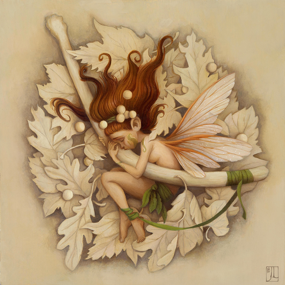
"Ancient Grief" plus process

Participating in Inktober for the past two years has really been helpful in improving my inking techniques and exploring new ways to render a subject in ink, and it has also been pretty great for generating ideas that I'd like to develop further. This painting, "Ancient Grief" came out of a series of sketches I did as prep for Inktober while I was thinking about a connective narrative for all of the pieces for the month.


"Ancient Grief", oil on gessoboard panel

For the past few years I have been waking up around 5:30 am. After I get some coffee, I spend a few hours drawing in my sketchbook in the living room, usually while listening to ambient music on my headphones. I've found that if I don't think too much about what to draw, subjects begin to tumble out of my mind. This entire series of sketches was one of those mornings. 

Apparently I am not alone in this experience. Many artists and writers dedicate their early morning hours to their craft and have reported it as a unique period of productive creativity. This short article sums it up pretty well: Why You Need to Write First Thing in the Morning.  

Early morning sketching has therefore been at the very core of finding images that resonate for me and is a sacred part of my process. 


Most of these sketches ended up being a part of a larger narrative that I used for my Inktober pieces, a story that I've not finished. I wrote about my last inktober series here.

But one sketch in particular stood out as something I'd like to paint rather than ink; it had an extra sense of mood and emotion that brought it into a different realm than the other sketches. I developed it as a larger sketch in order to figure out more details and think about a composition that might work as a painting.


After the sketch was finished, I transferred it to a panel using saral graphite transfer paper. (Next time I would rather use an oil transfer for this step, which I'll talk about that in later posts.) This time instead of painting on a white board, I decided to tone the entire canvas with raw sienna, yellow ochre and white, and then painted in the rough shadows before going into color.


For the palette, I chose a pretty limited palette of Natural Pigments Lead White #2, Lead Tin Yellow, Yellow Ochre, Cad Orange, Raw Sienna, Transparent Red Oxide, Burnt Sienna Raw Sienna, and Italian Green Umber. 


Originally, I was going to use the exact same limited palette of custom mixes I made for my Seasons series (as described in my last post), but I thought instead I could just create the mixes in a close enough range to match that palette on the fly. 

Also, I wanted the keep the focal point on the emotion of the scene and didn't want to distract from the color of the character. I wanted the fairy to have rich red hair and pale skin, similar to some of the Pre-Raphaelite paintings I had just seen at the Palace of Legion of Honor in San Francisco. 


This painting by Dante Gabriel Rossetti, "Bocca Baciata", 1859, had such a beautiful contrast in the hair and skin that I wanted to see if I could create a similar contrast and delicacy in my painting.

Although she is laying on a bed of fall leaves, I thought I would depict them as a monochromatic drawing rather than paint them in full color. Originally I wanted the leaves to be much more loose and sketchy, but after I painted the fairy and the bone, it seemed like I needed to tighten up the leaves...so they became sort of a monochromatic painting in the end.


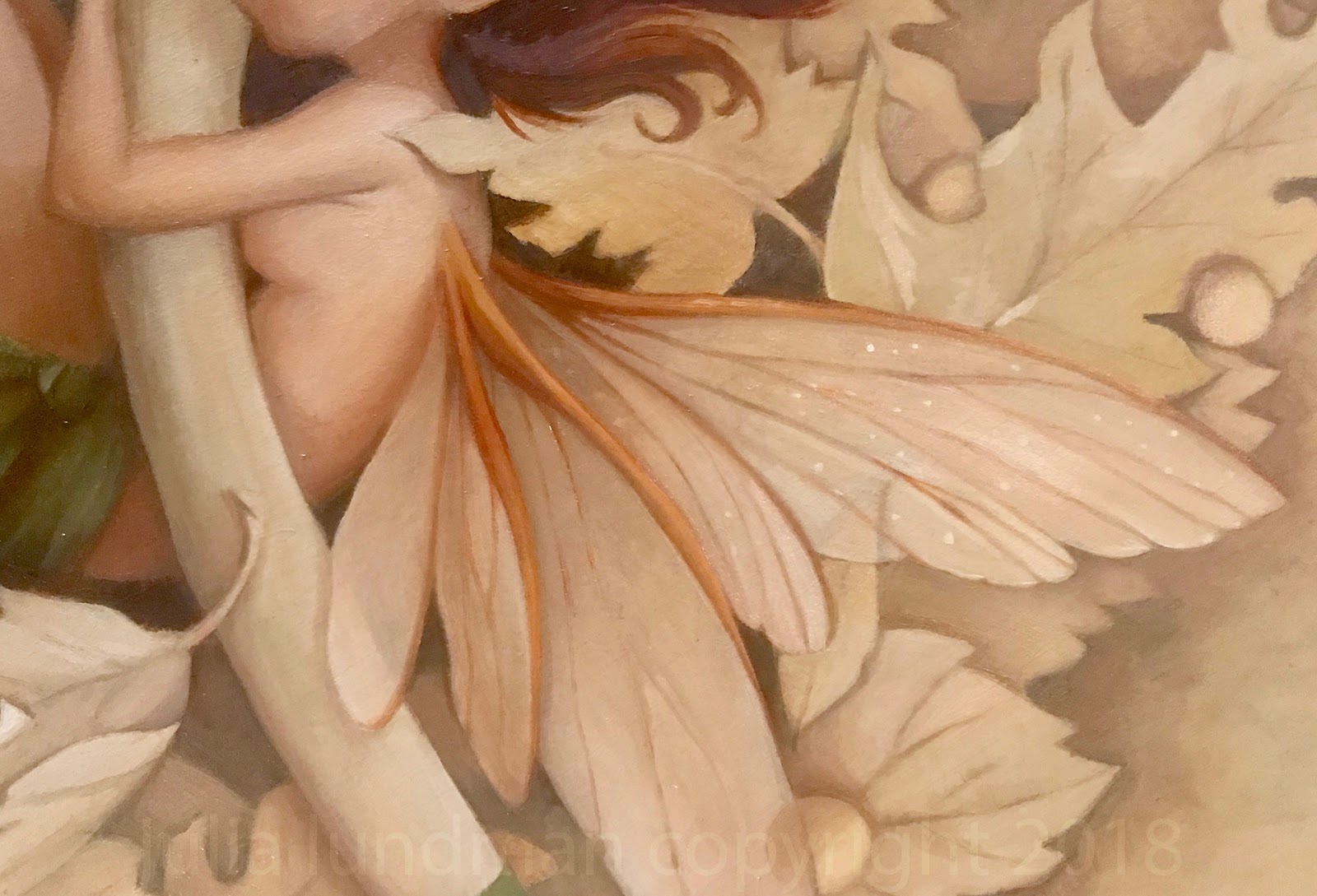
Hard to believe, but fairy wings and insect wings are really time consuming to paint. At first I thought they might be the easiest to paint, requiring just a few highlights and accents to make them feel transparent. However, I ended up fiddling around with the details quite a bit to get them to look shimmery, and honestly I still feel like they aren't shimmery enough. (This reason alone is probably why I will make a billion more fairy paintings...)

Since this painting is connected to the story of my inktober pieces, I am going to continue along with these paintings and more inks throughout this year. Stay tuned for more and follow along! 


If you've made it this far down the page, thanks for reading! 


5/12/2018

Plein Air Gouache/Catalina Island

This month I've lived in San Francisco for exactly 18 years! I can hardly believe it's been that long, longer than any other place I've lived. In all that time, I had never visited Catalina Island, 17 miles off the shore of Long Beach, just south of Los Angeles. 


The view from our hotel, especially at sunset, was gorgeous! 


I normally sketch in either pastels or oil, but I didn't want to carry around an easel or heavy materials. Gouache is so easy to pack, light to carry in a backpack, and easy to clean up on site. 

I also started a new sketchbook made of kraft paper. The paper has a nice base tone that I like for gouache, but I don't care for how much it absorbs the pigment. I end up using more paint than I normally would and I never really got clean color in the sky areas. I will continue to fill up this sketchbook, though. I will likely gesso a few pages with a base of casein or acrylic for future sketches. 


Little ticket booth for "submarine" rides out in the bay. I'd love to try it, but we were there to sketch this trip.


The view from the main beach in Avalon. Just a quick sketch before we watched the Kentucky Derby!


The staff told us that on Mondays and Tuesdays cruise ships arrive. There was an uptick in visitors, but even then it wasn't too crowded. 


On our final day, we sat and ate breakfast on the second floor of our hotel, the Vista del Ray. After breakfast, we sat and sketched for awhile. This was our view. I was working pretty quickly on this one, trying to get all the little details recorded.


I hope to come back and do more exploring of the island. It's rather large and apparently there are hiking trails and another small town on the other side. 

Thanks for looking!
10/03/2015

Yosemite & The High Sierras, 2015

This past July, I went with my family to the fabulous Yosemite National Park, Lake Mammoth, and Bodie. It was a family trip that was packed with activities and endless inspiration all around. Yet we were surprised when the hot, dry heat suddenly turned to RAIN, THUNDER, LIGHTING, HAIL, and SNOW! In fact, the Tioga Pass had to be closed one night due to snow and slick conditions along the windy, high elevation road.

The weather curbed my painting time since my pastel kit would have melted if gotten wet. I regretted not having brought my oil kit, which can work in any weather. Because of the weather, I managed to sneak in just a few studies, mostly under the threat of rain or the watchful eyes of aggressive squirrels and scrub jays looking for a handout.

One hot, semi-rainy afternoon in Yosemite I went out a long the Mirror Lake trail. I was completely blown away by the massive moss covered granite boulders and pine trees everywhere. 


The scale alone is impressive! 


I stopped along the way off the path in a quiet spot from the huge crowds on the trail, spreading out my pastel kit on my oil cloth picnic blanket only to be visited by two squirrels who came right up to my backpack and sniffed around. 


On another day out we all went along the Vernal Falls trail, which is mostly uphill. It was fortunately a bright, hot, sunny day with great light. On the way back down the trail I climbed up some rocks, found a nice spot and painted this quick 45 minute study. 


I ended up spending more time along the Mirror Lake trail since it had great views of the North face of Half Dome.


This view (above) is the base of Half Dome, while the painting below is a study of the entire North face of Half Dome, a different view of the usual one we see in photos of the park. 


After a full week bike-riding, playing, hiking, and laughing around Camp Curry, we left to make the long drive up to Mammoth Lake, stopping at the historic gold rush ghost town Bodie. A massive thunderstorm was on it's way, making it impossible to do any sketching.

We eventually made our way to a cabin deep in the Mammoth Lakes area near Lake Mamie. We took a shuttle up to the Mammoth Adventure Center, where I found some a-frame chalet style cabins I wanted to paint. 


Just as I was finishing rain drops started to hit the paper, and I raced to cover it all up. 


*********************************************************************

What I missed in plein air time I made up for in art viewing.  Hanging on the walls of the famous Ahwahnee hotel is a collection of gorgeous Gunnar Widforss watercolors that are worth checking out, along with the collections of Native American baskets, stained glass windows and hanging textiles. 

The Ansel Adams Gallery on the Yosemite grounds is really more of a store but underneath large prints of his work hanging on the walls, beautiful books, prints and postcards of his work can be bought there. 

I think my favorite art viewing place in all of Yosemite was a small gallery that contained a collection of paintings by 19th and 20th century artists who painted around the valley floor after the landscape was designated as protected by Abraham Lincoln. 

Below is a painting, "Yosemite Valley, Winter" by William Keith (1838-1911) that I looked at for some time. I am always amazed at how little detail an artist can get away with and still create a landscape that says everything it needs to. It also made me really want to visit the valley floor in snowy winter!


The brushy strokes of the trees are so simple. I've painted tons of trees and I have yet to achieve the gesture of one that is as effective as these trees in this snowy landscape.


Careful gestures of the figures and horses - not too much over modeling.


On a plaque next to this Thomas Moran painting (below) was this description:

Thomas Moran joined the Hayden Expedition to Yellowstone and traveled at his own expense to record the landscapes along their route. His paintings and the photographs of William Jackson were used to persuade Congress to protect Yellowstone, much as Carleton Watkins' Yosemite photographs had been used in 1864. He continued to interpret western landscapes - including Yosemite and the Grand Canyon - throughout his life, often on a grand scale. His daughter donated many of his works to the Yosemite Park after his death, and these pieces are now part of the collection of several national parks. 


This Andreas Roth (1872 - 1949) painting impressed me up close when I looked at his brush work. "Inspiration Point, 1933. 


Again, groupings of trees painted with simple masses. I love the negative painting in the shadow areas that create the look of tree trunks too. You see that a lot in watercolor but I've not seen it in oils very often.


I love the washy transparent masses of trees in the distance against the more opaque foreground tree. Works so well.


The watercolors of Gunnar Widforss (1879-1934) are always amazing to me for just the technique alone. The description says they were painted on pebble mat board. It seems the focus of Widforss' work was texture of things like trees, plants, rocks, almost pattern like in their treatment. "Halfdome in Autumn", 1923


Frederick Schafer (1839-1927), "Morning in Yosemite Valley, Cal.", 1887


At first this Albert Bierstadt (1830-1902) painting, below, appeared to both my dad and I a bit overly dramatic, but when I looked at it further I began to appreciate the masterful vignettes within the larger painting.  "Night at the Valley View", 1864


*********************************************************

When we went up to Mammoth we stayed at a little cabin that had a nice porch area. On a few showery days my nephews and I sat out on the porch drawing and painting in our sketchbooks. What a cool experience to spend in sketching sessions with your own family. Nothing could be more fun!


Thanks for reading!