Once again I decided to challenge myself and try out Inktober 2018 to see if I could improve my inking ability.
I have always admired ink drawings more than other kinds of drawing because of the boldness and confidence immediately indicated by committing line to paper and using two values to define any given subject. A particular favorite inking artist is Italian artist Dino Battaglia, who worked primarily in the 1940's-1970's illustrating comics and graphic novels. I love his use of texture and negative shapes, and his compositions are pretty incredible, too.


You can find more of his work online, but there doesn't seem to be a lot, unfortunately. Someone needs to put a book together!
With Battaglia's work in mind, I started out inktober trying to figure out where and how I could include texture. It was not at all easy. Not only did I have to draw the composition, but then had to figure out some sort of value pattern where I could commit a texture as a third value. I found texture in general worked best with a small bit of reindeer moss or gauze and a somewhat dry stamp pad. The texture didn't come across as clearly if the ink was too wet.

My materials were mainly: Platinum Carbon ink, an inking pad and reindeer moss for textures, sometimes gauze, Dip pens and small brushes. I used some pro-white occasionally to clean up extra lines I didn't want. I inked everything on Strathmore bristol board 4 ply plate surface. I also used masking film.


I also experimented with a dark background, white paint and a roller with white paint to get additional texture. I had to mask out the area, which was really time consuming.


I really like that dark background texture a lot - will probably find ways to use it for other pieces in the future. I may also redesign this piece since I think it's too top heavy and not as clear as I would like it.
However, as inktober progressed, I decided that perhaps it would be better to get a feel for how dip pens worked and how I could indicate value with cross hatching and line work. I ended up using texture as an accent rather than feature.

In the piece below, I primed the paper with a thin wash of acrylic titanium buff, a technique I've used for a long time in my sketchbooks, usually if I want to paint on top of the sketchbook paper. It makes a nice gessoed surface that accepts watermedia. Also, it turns out, makes a great surface for inking.

Another artist I really love is Arthur Rackham. He did a lovely series of illustrations all in silhouette, which I've always admired. I wanted to try at least one silhouette. I toned the paper with a light grey wash of acrylic, let dry, then a few touches of textures, and then painted the forms with a brush. The hardest part I think is the clear design. I'd love to try a whole series of these.

And this one has the same general idea, but with some modeling in the silhouette.

Towards the end of inktober I was inking and re-inking at least 2-3 times. I think it's good practice to re-ink pieces because it gives you a chance to not only warm up, but also loosen up and see if you can push the subject further. Each time I re-inked a piece I did not regret it. I'd post my original inks for these here, but I cringe every time I look at them, sorry. :)
I think I inked this one over 3 times...finding reference of a pelvis bone was really tough. I also was unsure about the composition, so I tried out a few ideas before finalizing this one.

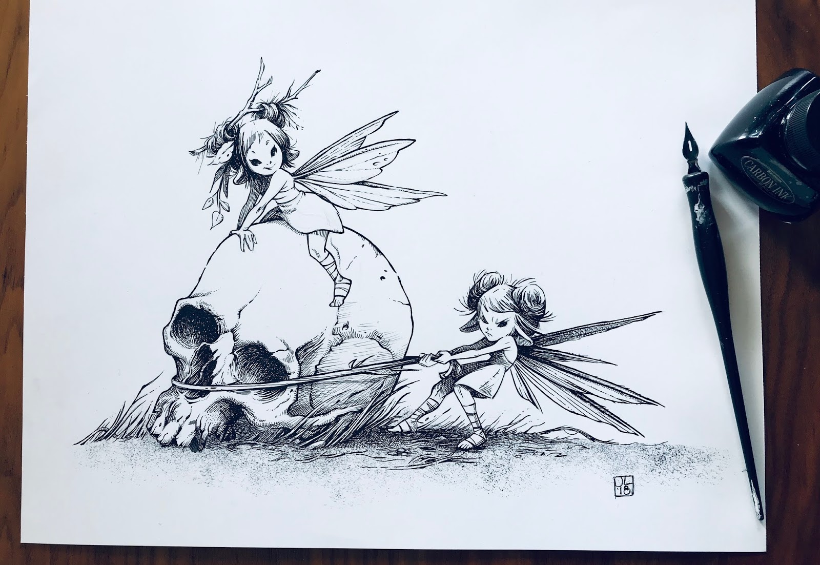
For the very last piece, I switched from using a dip pen to rapidiograph pens. What a relief! I had more control over the thickness of the lines, which I generally wanted fairly small. I also started working larger, which I think helped a great deal in getting the kind of detail I wanted.

The drawing alone took a full day to complete and edit at a larger size.

Inking took about a day to complete, with a few extra hours the next day to make some final edits and additions.

I put a warm filter on the drawing for the final shot. Is that cheating? I don't know. I like it better, though. Toned paper always has a nice feel to it that I like.
NOTE: You may be wondering about why all these fairies are messing around with old bones in the forest. There is an answer, but I am not finished telling the story. I like the idea a lot and will continue adding to it over the next couple of months in between painting work.

**********************************************************
In all, I ended up creating nine pieces, which falls far short of the intended 31 days of ink drawings. However, the intent is to improve, and I feel like I worked pretty hard during the month. I experimented with ideas and compositions as well as story telling, acting, and overall value design. While I wasn't able to finish the mini story I am telling in these pieces, I am still left feeling like I made a journey that has left me in a better place than where I was last inktober.
If you've read this far, thank you!
Follow me on twitter and instagram for more updates: @paintkatt
Cheers!


