Pages

Showing posts with label personal projects. Show all posts

1/22/2019

"Seasons" series/ Process


Earlier this year I finished these four small paintings. It was a huge breakthrough because I spent so much time planning and figuring out technical details (process outlined below). More importantly, they represent an aesthetic I've been trying to figure out for some time, which recalls my love of fantasy inspired by illustrators in literature and history. All of these subjects have been deep influences on my interests throughout my life, yet I never quite knew how to channel it all.  

Below is my process. For those interested, feel free to ask any questions. I am happy to give more details if they help.


Seems like video is the best way to view these. 


****************************************************************
PROCESS

The first thing I did was work up some quick loose sketches in my sketchbook, then these studies below. 


Because I wanted my paintings to have gold and silver details, I needed to carefully consider the palette. I scanned the drawings and then played with color palettes in Photoshop before I actually painted them. I really liked a muted palette against the brightness of the gold and silver and went with it. 

I thought about making some custom black frames, but decided against it, at least for now.


***************************************************************
Because the drawings were scanned, all I needed to do was print them out to the correct size for the transfer. I transferred the drawings using saral graphite paper on to panels that I gessoed and sanded a few months before. 


The method of painting I use is called indirect oil painting. It is the oldest form of all the oil painting techniques developed by Dutch painters, sometimes also called the Flemish method. Indirect oil painting involves a few layers of underpainting in warm tones, which is called a grisaille. This first layer, the "open grisaille", is always really unattractive looking, but it is important to get some paint on the surface so that subsequent opaque layers can adhere to the panel. 


After the first open grisaille, I began the second grisaille, which uses white paint and is entirely opaque.


For all of these paintings, I designed the palette to be limited to a few custom mixes. 
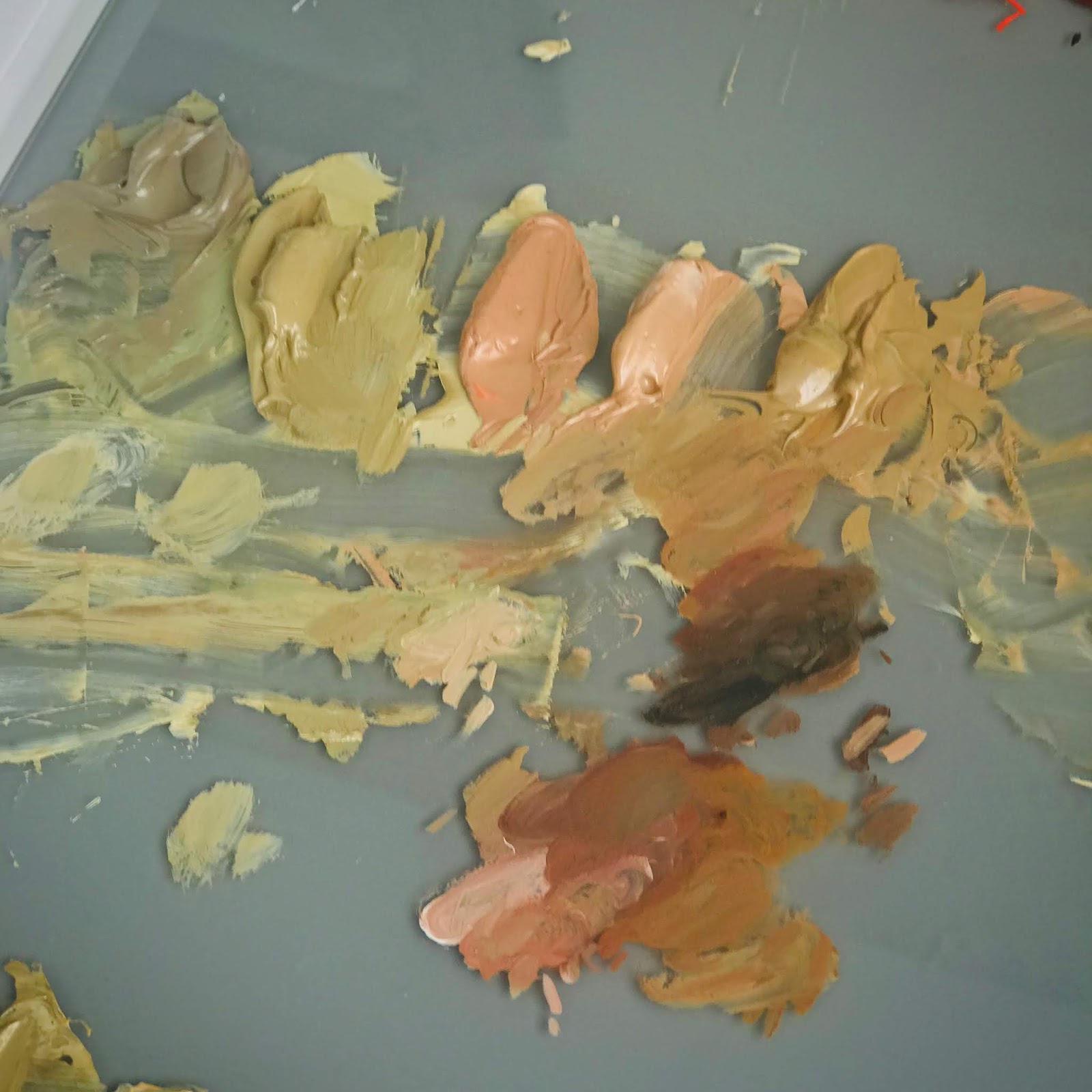

My limited palette comprised of mixtures I made from a typical palette of colors. 
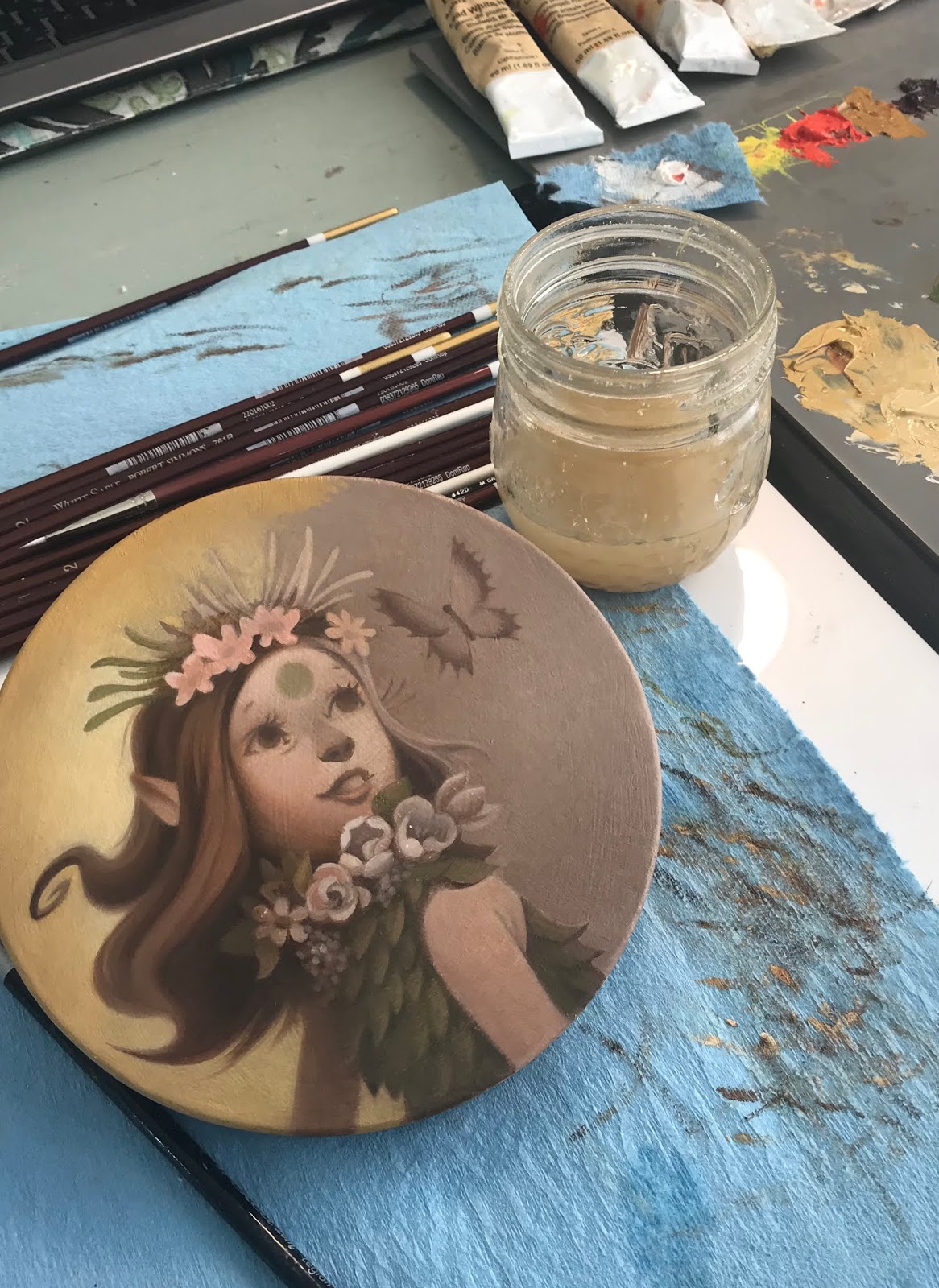

After coming up with the base color palette and marking down how I made the mixtures, I began the color glazing stage, following the color mock ups I did in Photoshop, which I have in front of my on my ipad at my desk. 

In regards to technique, glazing color on top is fairly easy, it is just takes a few layers in order to cover the underpainting underneath. I love this stage the most. It finally feels like everything is coming alive.


After they were finished, I used a matte varnish rather than a glossy varnish. I wanted to make sure the metal leaf details didn't compete with another shiny surface. 

And this is the part that took me literally months to figure out...gilding.

I had so many frustrating experiments on test surfaces that were not working the way I needed them to. Gilding on oil paintings, it turns out, is a little more involved than gilding on paper surfaces. I see a lot of artists using gilding in their work, but it is not at all easy when you want a specific design and are working with oil paint, which tends to want to grab the metal leaf, making brushing away the excess a nightmare.

I ended up taking a class with Lynn Rutter on gilding techniques. I am so glad I did. I learned a huge amount in information in two days that answered a lot of questions and provided important information about how to make sure that materials like oil paint and varnishes underneath the gilded surface interact well and archival for a long time. For all of the gilded details, I painted used twelve hour oil size and then used various metal leaf when the size was ready. Because some metal leaf tarnishes, I also learned about the importance of using shellac (and which kind) to create an isolation layer. 


These are the samples of gilded surfaces we learned about in Lynne Rutter's two day weekend class.


I used twelve hour size. Timing it is important, so you have to make sure your schedule is clear twelve hours later, otherwise the gilding window closes and you have to start all over again. The photo above is what it looks like while it's drying.

After that, brushing it off was fun, too, except that sometimes the edges weren't as crisp as I'd like them to be. I had to double leaf the details in some places. 


The finished piece.

Much more to come in 2019!
 If you've made it this far down the page - THANK YOU.

10/06/2017

Inktober 2017

I'm not really an inking artist, so I thought this year I might try learning. The biggest challenge so far has been getting used to the materials. I've been experimenting with different papers, inks, pens and brushes. 

Also, I wanted to focus on one subject, memento mori. I've lately been looking a lot at medieval art and especially love reliquaries. So beautiful and creepy! 


I usually started with a sketchbook drawing which I then retraced using a lightbox onto new paper (usually using a colerase pencil - my favorite)


I filled in the dark areas with sepia acrylic ink for this one.


But I wanted to see what I could do with the materials, so after I painted the acrylic ink above, I brushed on a thin layer of tan acrylic on top to seal it. I like the way it makes it look more weathered and imperfect. After the acrylic wash was dry, I used pro-white and black gouache to model some tones. 

Not sure I liked the way I drew the drapery on the ghost, BUT I did enjoy this technique a lot.


For this one I was mainly interested in a white shape against a black background. I spattered on some prowhite after it was dry to get a speckled effect in the background. 


Thanks for taking a peek at my inks! Hopefully by next year I'll have learned a few more techniques. I plan to keep trying out various ways to ink throughout 2018. (and continue on a few of my other projects...coming soon!)

11/06/2016

Fall Picnic

Sometimes I just have to draw things that make me happy and are fun to think about. This was one of those pieces. I was originally going to render this entirely in ink for inktober, but I just never had the time during the entire month of October. I finally got a few free moments this past week, so I picked away here and there until it was finished. 


Happy Fall! 

10/10/2016

Shop Is Officially Open!

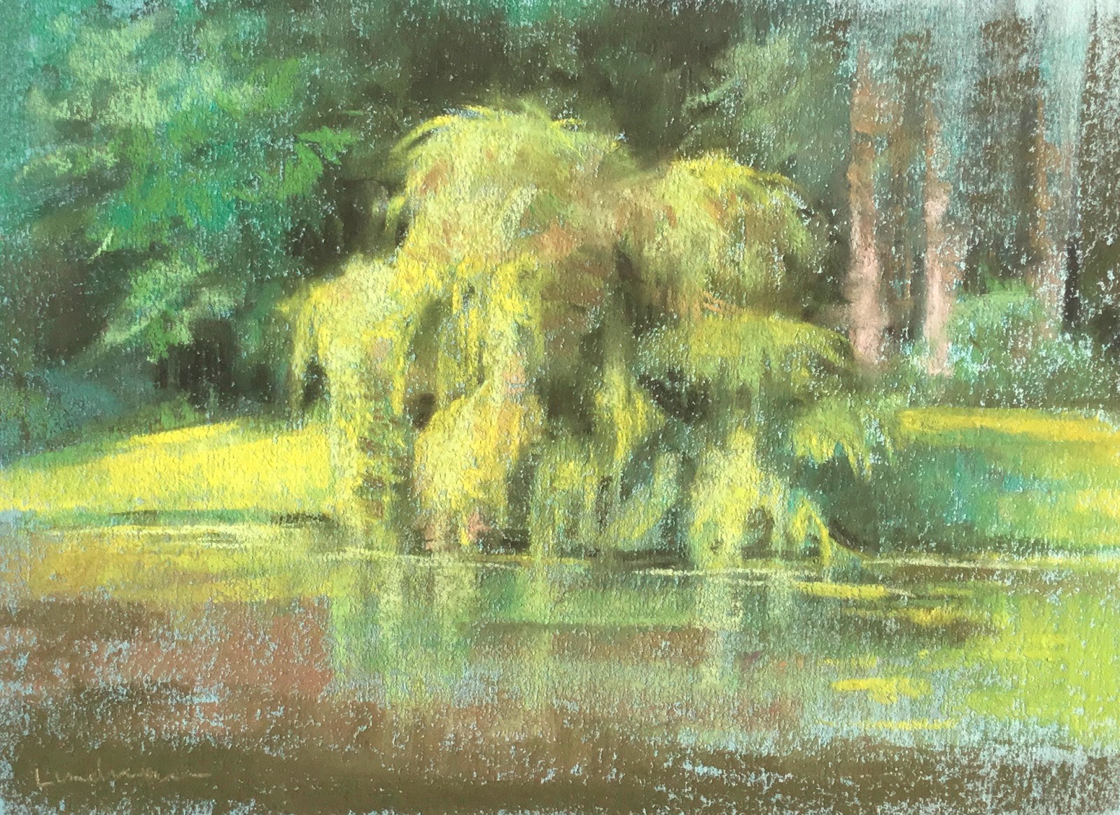
Spent some time on Bainbridge Island, Washington, with my dad and step mom. While there I visited Bloedel Nature Reserve almost every day. Brought my pastels with me and did some sketching.

 "Summer Willow Tree, Bloedel Nature Preserve", pastel on paper

"Birch Pines, Bloedel Nature Preserve", pastel on paper

 "Forgotten Voyages", pastel on paper
This old ship is right down the street from my dad's house. I've watched it age over the years. While I was sketching the family that owns it came out and we chatted for a bit. What a great old girl this ship was and still is!

"Japanese Pine, Bloedel Nature Preserve", pastel on paper
Let me just say painting backlighting with pastels is trickly. I felt I could have pushed the contrast more, but the pastels weren't having any of it.

"Morning Willow Tree, Bloedel Nature Preserve", pastel on paper

"Pleasant Beach Afternoon", pastel on paper

"Rich Passage Morning, Bainbridge Island", pastel on paper

My father recently had a few of my paintings framed. I really like the simple mat and framing that his framer recommended. With pastel paintings, the mat needs to be slightly raised off of the surface because of the dust. This looks great and adds some dimension to the piece. I like how the borders of the paintings are exposed although I think they would also look great cropped. Either way - nice job!


7/20/2016

The Little Mermaid, A different take

I recently saw some online images of the Finnish ballet of Hans Christian Andersen's, "The Little Mermaid" and was totally floored. Everything from the costume design to the lighting and dance have a slightly dark and mysterious tone that feel just right for the classic tale, departing completely from the Disney version. It made me wonder what other cultures and takes on the tale might be interesting to see. I was inspired by the architecture of Okinawa and thought perhaps the Little Mermaid might fall in love with a Samurai. I'm not sure I really got it but it was seriously a blast to dream about.


Some initial thumbnails, dreaming about what kind of island The Little Mermaid first encounters the Samurai.


This is an establishing shot of the island I chose from the thumbnails, just before The Little Mermaid meets the Samurai she falls in love with.


I was thinking of some foreshadowing in the architectural motifs. These are a few ideas. The possibilities are endless, really.

Below are a few variations on The Little Mermaid. I still feel like I want to do a few more pages of these and then move on to the Samurai, Triton and the Sea Witch.


Many more updates coming in a few weeks! Thanks for visiting.

4/23/2016

Bee Rider


"Bee Rider", photoshop


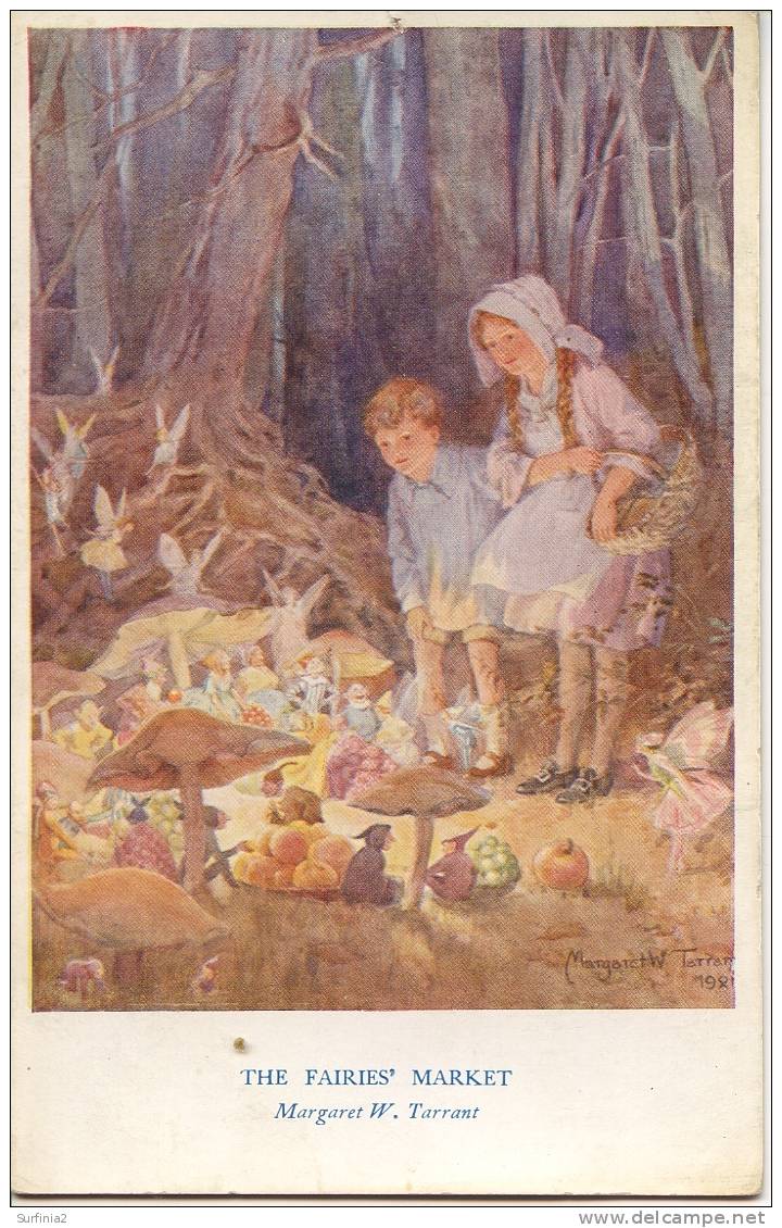
A few years ago I had this idea that tiny humans with wings were discovered in various regions of the planet. It's not a new idea at all, but I wanted to mess around with making these fairies a sort of tribal, pagan warrior race that looked more human than the wide-eyed alien version. I am deeply inspired by the art of Mary Cicely Barker (of Flower Fairy fame) and Margaret Tarrant, Edwardian era artists that depicted tiny human-like fairies usually of a friendly beautiful sort. 

Margaret Tarrant watercolor

Cicely Mary Barker watercolor

I wanted to take their ideas about fairies and focus on aspects of character personality and group culture. It's a pretty big project that I am picking away at here and there in between many other projects. 

I did this quick little sketch about five years ago. I like the idea but it's a little too vertical for the kinetics of the scene, and the costume doesn't work for me. I wanted to explore warriors that are more gutsy and brutal instead of sweet. I scanned my sketch and then did a TON of loose drawings on top to work out the idea more to my liking. 


I also did a few studies of bees. Here are a few sketches. I thought about stylizing the shapes and the character far more than this, but in the end decided I'd rather focus on the story of the character, and of course (since I love to paint) the light.


I have a several more warrior fairies in the works in various states of finish. Hopefully I'll post a few more this year in between other posts. :) 

Thanks for reading!


1/05/2016

2016


Being a Capricorn, I have always been driven to succeed. It is frustrating to me that even with all my heart and intentions, I have yet to complete some of the many goals I set out to complete way back in my 20's. There are, of course, many complicated life reasons for this. 

This year I've decided that no matter what, I will accomplish a few of my big art goals, no matter what. 

Seven times fall, eight times stand up. 


I did an alternate, darker version of this painting as well. I can't decide which I like better. 


If you aren't familiar with a Japanese Daruma doll, you can read about them here:

https://en.wikipedia.org/wiki/Daruma_doll

Happy New Year
2016

7/22/2015

The Unfortunate Toad

This summer I have been working on a short story that I plan to bring to print. It is about a Toad, and is tentatively called, "The Unfortunate Toad". 

There is a cast of characters that you'd expect in a fairy tale, but in this story their roles are a little different, due to some unforeseen circumstances.

I thought I would share some of the work I've created so far. There is a lot more in the works, including many more characters, but I will be keeping those to myself for awhile. In addition to "The Unfortunate Toad" story,  in the next few months I will be posting a few more updates to "The Time Machine" and other art that I have been working on behind the scenes. It's really exciting stuff that I can't wait to share!

***********************************************************************


Please stay tuned for more in the next two months! Thanks for visiting.