Pages

Showing posts with label paintings. Show all posts

1/28/2019

"Earth", "Sun", "Moon" Mini Series/ Process

For quite awhile I've been kicking around the idea of a series of paintings having to do with our solar system in relation to earth. Although I have a lot of ideas, I wanted to start off with a really small series that included either animals or insects each relating to the Earth, the Sun, and the Moon. After a lot of sketching and thinking, I landed on a cicada, a bee, and a moth. I chose these insects because cicadas hibernate in the earth for many years, bees are active in sunlight hours, and moths are nocturnal.

I also wanted these to be illustrations rather than scientific studies of any specific species. It was really a challenge...I messed around with embellishing each insect with symbols and landed on a few, but then altered those in the final paintings. 

All of these are drawn on heavy weight duralar vellum, a surface I really like for graphite studies. The warm tone you see underneath is a table top.


I gilded each 6x6 panel in three metal leafs, copper to represent the Earth, Gold to represent the Sun, and Silver to represent the moon. (I ended up double gilding the copper panel to remove the seams you see in the photo)


I should note here that these panels are all oil gilded rather than water gilded. Oil gilding involves applying oil size and allowing it to dry for a specific time before adhering the metal leaf. Water gilding is a different process that yields great results, too, and is often used for making very slick and shiny surfaces, which I wasn't necessarily interested in for these little pieces. Also, I gilded the panels straight onto a white gessoed surface instead of applying a base color (typically called a "bole"). 

I scanned my drawings, made line drawings in photoshop, then printed out the designs to the specific size I needed, and then transferred them to the gilded panels. This time I used white graphite transfer paper so that the line work could show up against the metal leaf. 


I painted a closed grisaille underpainting first so that paint adhered to the surface before adding color. I'm glad I did because the metal leaf was slick to paint on, requiring some layers of paint as a base before adding color.


One really cool thing about the metal surface is that it reflects light even in the middle of the night with all of the lights turned off. I tried to capture this a bit. (Sorry for the shaky cam!)


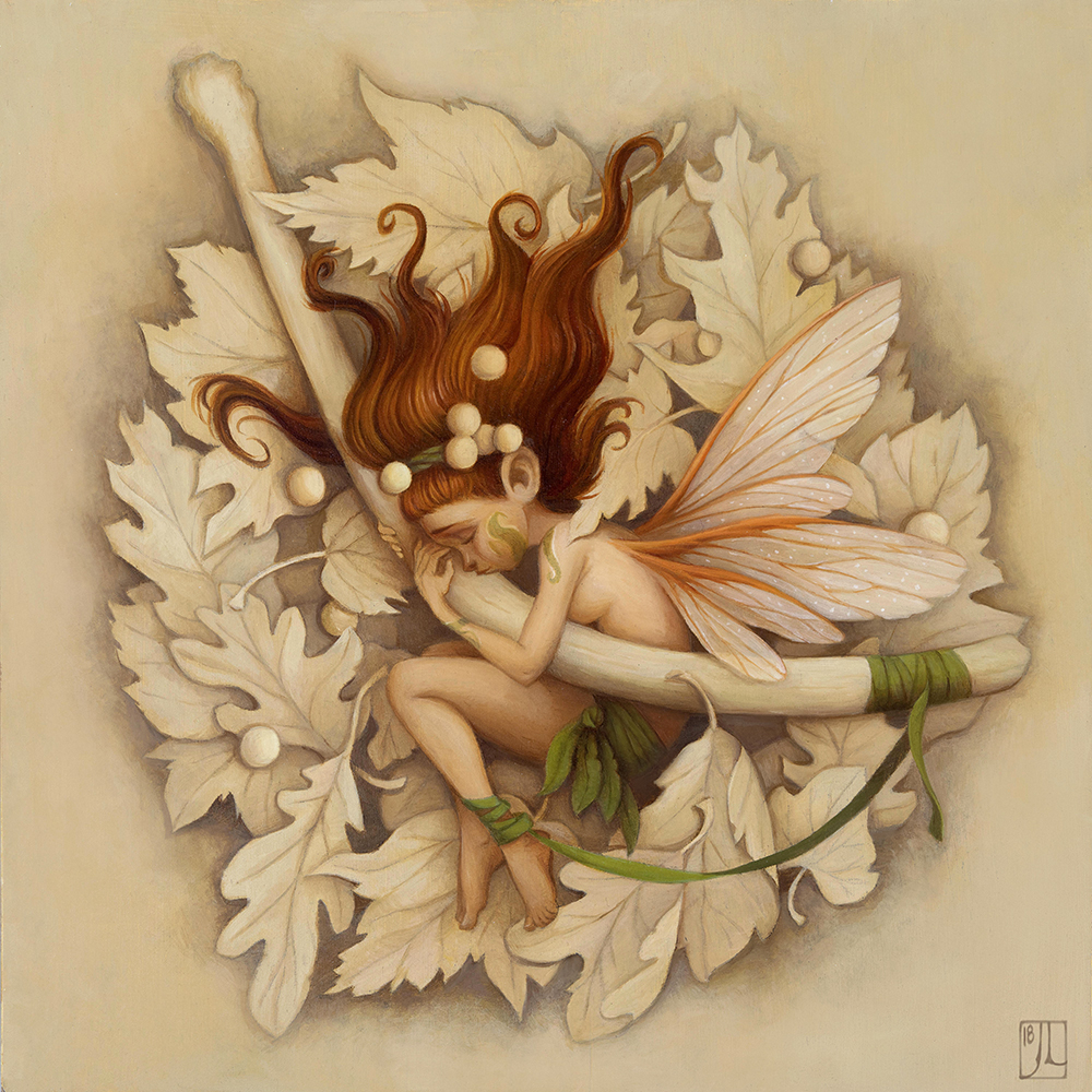
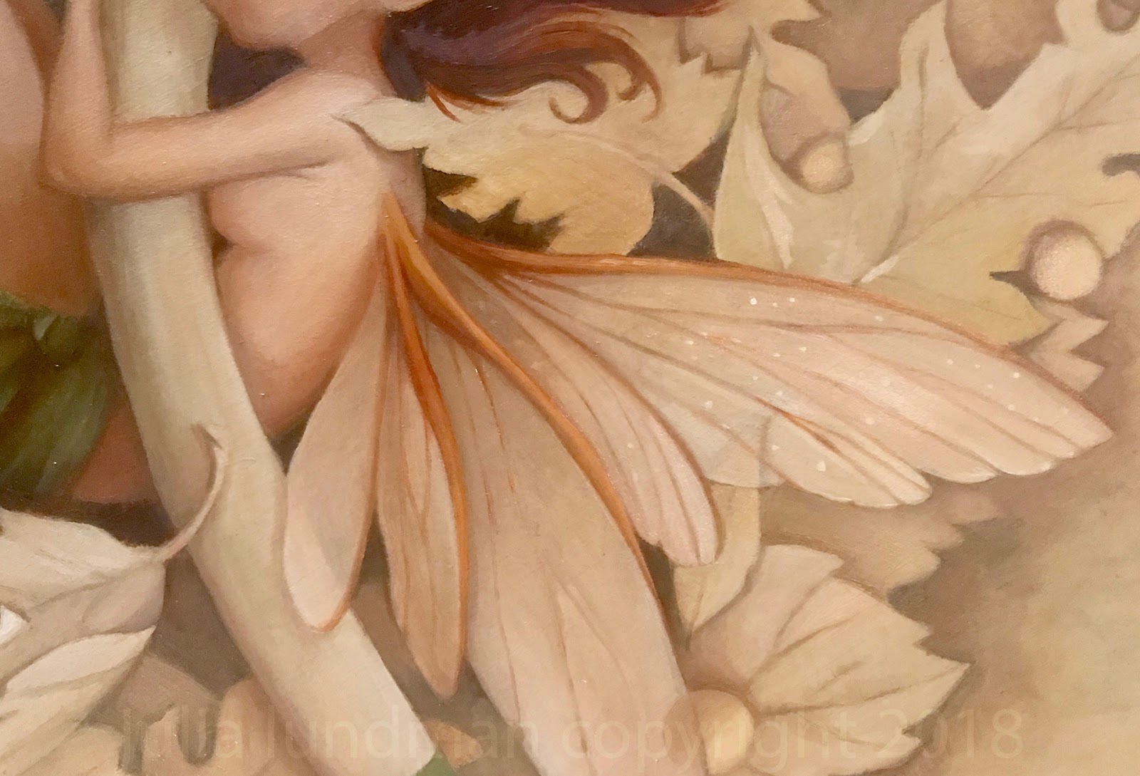
After the grisaille under paintings were finished, I moved to detail color work. I found with each one that balancing the transparency of the wings for "Earth" and "Sun" against the metal leaf was quite difficult. I probably spent more time working on the wings than any other aspect of each painting. It was also difficult to gauge the color structure while painting because the shimmery metal leaf would change during the day and change the nature of the color. In some cases I repainted the color layer twice in order to adjust.


Varnishing these paintings took a few tries, as well. I ended up reapplying the varnish and stripping it a few times. I think a matte varnish works really well with these. The metal leaf still looks shimmery and the painted surfaces end up having a nice matted quality that contrasts well.

The finished paintings, "Earth", "Sun", "Moon".


I plan to continue this series with larger pieces later this year, which I am very excited about... For the mean time, I am in the midst of two more gothic themed paintings, one of which you can follow along with on instagram and twitter:


Thank you for reading!

1/24/2019

"Ancient Grief" plus process

Participating in Inktober for the past two years has really been helpful in improving my inking techniques and exploring new ways to render a subject in ink, and it has also been pretty great for generating ideas that I'd like to develop further. This painting, "Ancient Grief" came out of a series of sketches I did as prep for Inktober while I was thinking about a connective narrative for all of the pieces for the month.


"Ancient Grief", oil on gessoboard panel

For the past few years I have been waking up around 5:30 am. After I get some coffee, I spend a few hours drawing in my sketchbook in the living room, usually while listening to ambient music on my headphones. I've found that if I don't think too much about what to draw, subjects begin to tumble out of my mind. This entire series of sketches was one of those mornings. 

Apparently I am not alone in this experience. Many artists and writers dedicate their early morning hours to their craft and have reported it as a unique period of productive creativity. This short article sums it up pretty well: Why You Need to Write First Thing in the Morning.  

Early morning sketching has therefore been at the very core of finding images that resonate for me and is a sacred part of my process. 


Most of these sketches ended up being a part of a larger narrative that I used for my Inktober pieces, a story that I've not finished. I wrote about my last inktober series here.

But one sketch in particular stood out as something I'd like to paint rather than ink; it had an extra sense of mood and emotion that brought it into a different realm than the other sketches. I developed it as a larger sketch in order to figure out more details and think about a composition that might work as a painting.


After the sketch was finished, I transferred it to a panel using saral graphite transfer paper. (Next time I would rather use an oil transfer for this step, which I'll talk about that in later posts.) This time instead of painting on a white board, I decided to tone the entire canvas with raw sienna, yellow ochre and white, and then painted in the rough shadows before going into color.


For the palette, I chose a pretty limited palette of Natural Pigments Lead White #2, Lead Tin Yellow, Yellow Ochre, Cad Orange, Raw Sienna, Transparent Red Oxide, Burnt Sienna Raw Sienna, and Italian Green Umber. 


Originally, I was going to use the exact same limited palette of custom mixes I made for my Seasons series (as described in my last post), but I thought instead I could just create the mixes in a close enough range to match that palette on the fly. 

Also, I wanted the keep the focal point on the emotion of the scene and didn't want to distract from the color of the character. I wanted the fairy to have rich red hair and pale skin, similar to some of the Pre-Raphaelite paintings I had just seen at the Palace of Legion of Honor in San Francisco. 


This painting by Dante Gabriel Rossetti, "Bocca Baciata", 1859, had such a beautiful contrast in the hair and skin that I wanted to see if I could create a similar contrast and delicacy in my painting.

Although she is laying on a bed of fall leaves, I thought I would depict them as a monochromatic drawing rather than paint them in full color. Originally I wanted the leaves to be much more loose and sketchy, but after I painted the fairy and the bone, it seemed like I needed to tighten up the leaves...so they became sort of a monochromatic painting in the end.


Hard to believe, but fairy wings and insect wings are really time consuming to paint. At first I thought they might be the easiest to paint, requiring just a few highlights and accents to make them feel transparent. However, I ended up fiddling around with the details quite a bit to get them to look shimmery, and honestly I still feel like they aren't shimmery enough. (This reason alone is probably why I will make a billion more fairy paintings...)

Since this painting is connected to the story of my inktober pieces, I am going to continue along with these paintings and more inks throughout this year. Stay tuned for more and follow along! 


If you've made it this far down the page, thanks for reading! 


1/22/2019

"Seasons" series/ Process


Earlier this year I finished these four small paintings. It was a huge breakthrough because I spent so much time planning and figuring out technical details (process outlined below). More importantly, they represent an aesthetic I've been trying to figure out for some time, which recalls my love of fantasy inspired by illustrators in literature and history. All of these subjects have been deep influences on my interests throughout my life, yet I never quite knew how to channel it all.  

Below is my process. For those interested, feel free to ask any questions. I am happy to give more details if they help.


Seems like video is the best way to view these. 


****************************************************************
PROCESS

The first thing I did was work up some quick loose sketches in my sketchbook, then these studies below. 


Because I wanted my paintings to have gold and silver details, I needed to carefully consider the palette. I scanned the drawings and then played with color palettes in Photoshop before I actually painted them. I really liked a muted palette against the brightness of the gold and silver and went with it. 

I thought about making some custom black frames, but decided against it, at least for now.


***************************************************************
Because the drawings were scanned, all I needed to do was print them out to the correct size for the transfer. I transferred the drawings using saral graphite paper on to panels that I gessoed and sanded a few months before. 


The method of painting I use is called indirect oil painting. It is the oldest form of all the oil painting techniques developed by Dutch painters, sometimes also called the Flemish method. Indirect oil painting involves a few layers of underpainting in warm tones, which is called a grisaille. This first layer, the "open grisaille", is always really unattractive looking, but it is important to get some paint on the surface so that subsequent opaque layers can adhere to the panel. 


After the first open grisaille, I began the second grisaille, which uses white paint and is entirely opaque.


For all of these paintings, I designed the palette to be limited to a few custom mixes. 


My limited palette comprised of mixtures I made from a typical palette of colors. 


After coming up with the base color palette and marking down how I made the mixtures, I began the color glazing stage, following the color mock ups I did in Photoshop, which I have in front of my on my ipad at my desk. 

In regards to technique, glazing color on top is fairly easy, it is just takes a few layers in order to cover the underpainting underneath. I love this stage the most. It finally feels like everything is coming alive.


After they were finished, I used a matte varnish rather than a glossy varnish. I wanted to make sure the metal leaf details didn't compete with another shiny surface. 

And this is the part that took me literally months to figure out...gilding.

I had so many frustrating experiments on test surfaces that were not working the way I needed them to. Gilding on oil paintings, it turns out, is a little more involved than gilding on paper surfaces. I see a lot of artists using gilding in their work, but it is not at all easy when you want a specific design and are working with oil paint, which tends to want to grab the metal leaf, making brushing away the excess a nightmare.

I ended up taking a class with Lynn Rutter on gilding techniques. I am so glad I did. I learned a huge amount in information in two days that answered a lot of questions and provided important information about how to make sure that materials like oil paint and varnishes underneath the gilded surface interact well and archival for a long time. For all of the gilded details, I painted used twelve hour oil size and then used various metal leaf when the size was ready. Because some metal leaf tarnishes, I also learned about the importance of using shellac (and which kind) to create an isolation layer. 


These are the samples of gilded surfaces we learned about in Lynne Rutter's two day weekend class.


I used twelve hour size. Timing it is important, so you have to make sure your schedule is clear twelve hours later, otherwise the gilding window closes and you have to start all over again. The photo above is what it looks like while it's drying.

After that, brushing it off was fun, too, except that sometimes the edges weren't as crisp as I'd like them to be. I had to double leaf the details in some places. 


The finished piece.

Much more to come in 2019!
 If you've made it this far down the page - THANK YOU.

5/12/2018

Plein Air Gouache/Catalina Island

This month I've lived in San Francisco for exactly 18 years! I can hardly believe it's been that long, longer than any other place I've lived. In all that time, I had never visited Catalina Island, 17 miles off the shore of Long Beach, just south of Los Angeles. 


The view from our hotel, especially at sunset, was gorgeous! 


I normally sketch in either pastels or oil, but I didn't want to carry around an easel or heavy materials. Gouache is so easy to pack, light to carry in a backpack, and easy to clean up on site. 

I also started a new sketchbook made of kraft paper. The paper has a nice base tone that I like for gouache, but I don't care for how much it absorbs the pigment. I end up using more paint than I normally would and I never really got clean color in the sky areas. I will continue to fill up this sketchbook, though. I will likely gesso a few pages with a base of casein or acrylic for future sketches. 


Little ticket booth for "submarine" rides out in the bay. I'd love to try it, but we were there to sketch this trip.


The view from the main beach in Avalon. Just a quick sketch before we watched the Kentucky Derby!


The staff told us that on Mondays and Tuesdays cruise ships arrive. There was an uptick in visitors, but even then it wasn't too crowded. 


On our final day, we sat and ate breakfast on the second floor of our hotel, the Vista del Ray. After breakfast, we sat and sketched for awhile. This was our view. I was working pretty quickly on this one, trying to get all the little details recorded.


I hope to come back and do more exploring of the island. It's rather large and apparently there are hiking trails and another small town on the other side. 

Thanks for looking!

10/10/2016

Shop Is Officially Open!

Spent some time on Bainbridge Island, Washington, with my dad and step mom. While there I visited Bloedel Nature Reserve almost every day. Brought my pastels with me and did some sketching.

 "Summer Willow Tree, Bloedel Nature Preserve", pastel on paper

"Birch Pines, Bloedel Nature Preserve", pastel on paper

 "Forgotten Voyages", pastel on paper
This old ship is right down the street from my dad's house. I've watched it age over the years. While I was sketching the family that owns it came out and we chatted for a bit. What a great old girl this ship was and still is!

"Japanese Pine, Bloedel Nature Preserve", pastel on paper
Let me just say painting backlighting with pastels is trickly. I felt I could have pushed the contrast more, but the pastels weren't having any of it.

"Morning Willow Tree, Bloedel Nature Preserve", pastel on paper

"Pleasant Beach Afternoon", pastel on paper

"Rich Passage Morning, Bainbridge Island", pastel on paper

My father recently had a few of my paintings framed. I really like the simple mat and framing that his framer recommended. With pastel paintings, the mat needs to be slightly raised off of the surface because of the dust. This looks great and adds some dimension to the piece. I like how the borders of the paintings are exposed although I think they would also look great cropped. Either way - nice job!


8/28/2015

BACCA workshop with Michael Klein

"Every worthwhile art movement supports and encourages it's members to become better at what they do." - quote from Michael Klein.

This summer I have been very busy taking a Maya modeling class while I am also working on a personal project. Although most of the work I've been doing involves staring into my computer screen for most of the day, when I heard artist Michael Klein would be teaching a floral still life workshop at the Bay Area Classical Artist Atelier, otherwise known as BACCA, I jumped at the chance. 

Here are just a few examples of Michael Klein's work, focusing on his florals. His work encompasses figures, still lives, and semi-narrative pieces, all done in a painting manner that brings the spirit of the subject to life with energetic, yet carefully planned brushwork. Much more of Klein's work can be seen on his website:

I love the textures and depth that he paints in his floral arrangements. They remind me a little of Fantin Latour florals while still being all his own.

 Michael Klein's progress shot from his blog on his website. GORGEOUS!

********************************************************************
BACCA

The Bay Area Classic Artists Atelier is a wonderful traditional 19th century atelier right in the midst of an industrial park very near to Silicon Valley in San Carlos, California. The studio itself, run by tireless founder Linda Dulaney and a few dedicated studio hands, was comfortable to work in, providing taborets to store our supplies during the week, daily snacks, coffee, and relevant reading material on hand.

The atelier has a wide array of on-going workshops, courses and a once a week open studio with a model. During Michael Klein's floral painting workshop, next door in the adjoining studio, Dan Thompson was conducting a gross anatomy course with afternoon visits to Stanford's lab to study from a real specimen. I loved that there was a lot of great art on the walls that was not only Linda's, but also artists who have taught there, including great anatomy breakdowns on big sheets of butcher paper. Inspiring!

********************************************************************
WORKSHOP NOTES

Materials 

Michael Klein provided us with an interesting palette of colors and arrangement I have not seen before now with lead white or titanium white in between his yellow and orange hues. Interestingly, he begins his arrangement with Viridian. Omitting Cadmium Red, he instead included Cadmium Orange. He also includes Ivory Black on his palette. Just past Ivory Black, low saturated colors sit towards the end of the palette arrangement with Raw and Burnt Umber. Colors are as follows in this arrangement:

Old Holland Viridian Green Deep
Michael Harding Raw Sienna
W and N Yellow Ochre Pale
W and N Cadmium Yellow Pale
Rublev Lead White no. 2
OH Cad. Orange
W and N Burnt Sienna
W and N Perm. Alizarin Crimson
OH Quincinadrone Magenta
W and N Cobalt Violet
W and N Cobalt Blue
OH Ultramarine Blue
OH Ivory Black
OH Raw Umber
OH Burnt Umber

Mediums used were simply Gamsol for cleaning brushes, which he uses mostly on the first day to thin down the paint a little if it's too thick or sticky. After day one, he uses a widely known mixture known as "fat medium", equal parts linseed oil plus damar varnish. In later stages of his paintings, he makes use of Rublev Oleogel to thicken up paint strokes and add texture. Paint rags were Viva paper towels.


I did not have Oleogel for the class, so Michael gave me a tiny smidgen to test out. The gel is used for glazing, but also for adding body and flow to the oil paint on top layers. It is truly amazing stuff. I ordered a big vat of it along with the lead white. Michael noted that with Lead White he will sometimes mix it with a few drops of walnut oil to loosen up the stiff mixture. (He also uses stack white from Rublev to create texture, although he wasn't using it in this workshop.)

Surface and Easel: Like many painters lately, Michael Klein paints on dibond, an inexpensive but very durable metal composite that is easy to order. It comes in one big sheet that arrives with a light primer on top, which he sands and then cuts into smaller pieces, after which he applies either gesso or lead gesso on top. Dibond sheets are easy to cut with a box cutter, which you can use to make scores and then break off into smaller sizes. Also, since the sheets are magnetic, they work really well with the magnetized holding mechanism of the Edge Pro pochade box, which he was using with a tripod. (I have one as well - it's very durable and sleek, although I can't recommend it for carrying around on long hikes because of the weight.)

Brushes: In our workshop, Michael Klein mostly used synthetic rounds. Rosemary and Company will be soon making a custom set of Michael Klein brushes which come with short handles and a pink rosey color he designed specifically for floral painting. I will definitely order a set!


Michael's custom brush set right under that tube of paint. 


*****************************************************************
Process

Each of the four days of Michael Klein's workshop, he worked on a painting demo. He typically spends about 3-4 days working on a floral still life.

Mixed in with his natural flowers were two artificial flowers, which he doesn't like to use but did for this class. He noted that when flower companies make good quality artificial flowers, they mimic natural color patterns of the flower, like spray painting the joints of the stems and leaves with a little brownish overlay instead of one uniform green and will also boost saturation of petals. When using artificial flowers, you will need to understand the methods that manufacturers use to make their flowers appear real and compensate by using your observation and knowledge of real flowers. However, use real flowers whenever possible.


Michael's demo from the first day, pictured above. He explained that when it comes to floral paintings he usually spends the first day blocking in the first half, the second day the second half, third and fourth day for finishing and adjusting. Although he used to spend a lot of time making a detailed line drawing, which he then transferred to canvas, he no longer uses that method. These days he instead dives in with a block in of basic shapes, starting with the background area as a foil against the larger shapes and green leaves that typically sit underneath the main forms of the flowers. He sometimes uses a very soft fan brush to lightly brush over the background to knock down some edges and to avoid glare on the surface. He also noted that he tends to work from the center out, working on each shape one at a time.


My initial block in, above. Michael thought my background color was too far into the brown/warm tones so I worked on adjusting that the next day. I had been thinking I would warm up the cool ivory black background to be more warm, but he felt I should stick to the truth of what was in front of me because of the reflected light that worked into the flowers, especially the yellows. 

On the second day, after watching more progress on Michael's demo, I made color adjustments to the background, after which I spent a lot of my time making drawing adjustments in order to get the shape relationships to balance a bit better. Unfortunately, it was then that I noticed I placed everything too far to the left of the canvas. Michael told me I could emphasize the atmosphere in the background to compensate. Using light as an element of composition is always a plus, in my book. 

End of the second day I got most of the big areas in, adjusting drawing, color and value.

When I came in the on our third day, I was disappointed to find that almost the entire black background had sunk in, making the paint appear a dull lifeless black! Ugh! That might be ok in some situations, but in this case it really dulled out the color and made the flowers themselves look terrible. Michael explained to our class that sinking in happens when you paint over a dried layer of paint with no medium, which is why using some medium in subsequent layers is necessary. Sinking in can be fixed by either repainting or using spray touch varnish, which I couldn't use in this case because I would be painting all day and couldn't wait for the areas to dry. After some touching up and repainting, I realized I had lost the gesture and luminosity of the initial block in, which is so key to making florals feel fresh. A serious downer, but I pressed on. (incidentally, if I were at home working on this, it would be at this point I'd quit and start over)

You can see the sunken in areas especially in the black passages. The color here was completely painted over in order to correct the hues, but instead of remaining luminous, it flatted out and sunk into the canvas, creating a dullness. Yuk yuk yuk!!!

As for overpainting on a dry surface that already has oil paint, Michael explained that if you cut into paint with more turp (gamsol), the painting will crack, which is one reason, along with sinking in, that using a medium is necessary at this point. (In fact I have seen this happen in some of my own older floral paintings, a few of which I will not sell because of the cracking.) He likes to use linseed oil mixed with equal parts of damar varnish (a similar mixture "fat medium" that I've used in other classes). This along with Oleogel should be sufficient. It is OK to continue to clean brushes with gamsol, just as long as you don't cut the gamsol into your paint mixtures to thin down paint. (Don't panic if a few drops inevitably get in there, though!) A hard lesson to learn, but I will probably never forget...


After fixing what I could in the background, adding some light coming from the upper right, I pressed on, mainly working on the color relationships between the yellow flowers, and the white ones to the right. 

Michael had an interesting side demo (below) on the paint effects that can be had by layering pigments. For instance, the neutral warm background color, when brushed or scrubbed into the surface, appears warm. When that very same color is lightly scumbled over the same, but thinner color, it appears to be cooler. How awesome is that? Also, he layered on thicker colors like a basic warm burnt sienna/ultramarine blue mixture that serves well for green shadows and then worked up to a floral orange hue to show the depth that can be created with these particular mixtures. 


As for color mixing in general, he explained that he doesn't like to overmix his colors on the palette, but instead "loosely" mixes, keeping a bit of each original color separate, so that when the colors move on to the brush and then the painting, a light effect mixes them in our eyes, producing a color vibration. This is a technique I've seen before and used myself, especially with pastel paintings, and also have read about. Golden aged Illustrator Haddon Sundblom's painting method included using two pure colors on one brush to create a mixture directly on the canvas. I'm not sure if this method is an innovation by the Impressionists, but the idea of vibrating color via broken color and paint layers feels impressionist to me. 

Also, regarding color mixing on the palette, Michael encouraged everyone to create a "puddle of color" that is essentially a color portrait of the thing you are painting, otherwise you will end up with a lot of muddled color. My own tendency to dance around the palette with all sorts of mixtures usually leads to confusion at times, which I need to work on correcting. He does not create "strings" of color on the palette, instead he creates the middle hue, shadow and light hues all in one puddle.


During his demo, he spoke a bit about using a combo of observation vs. knowledge of form. He explained that Jacob Collins emphasized a thorough understanding of form and how light moves across it, and it was when he finally understood what that meant, that he finally made some breakthroughs in his work. He went on to explain that after painting the initial gesture on the first day, he will start thinking about what he knows about how light reacts on the surface of particular forms. Often, he will not look at the still life but instead focus on the object being painted, paying attention to the direction of the light source and modeling the form so that it reads clearly while still maintaining the beauty of the still life. 


This becomes particularly necessary when painting subjects like flowers, which change each day. When asked about his atelier training compared to how he paints now, he explained that in his current work, he is now concerned with evoking a mood or a feeling rather than rendering every bit of the subject in front of him, trying to find that balance between the truthful statement vs. gesture. 

For form painting demos, Michael recommended the excellent form painting lessons by fellow Grand Central graduate, Scott Waddell. I've seen all of Scott's videos and they are indeed incredibly useful.

My final painting, which I've cropped to make a more attractive composition.

On the fourth and final day, Michael helped me at the end make some value relationship adjustments and talked with me about editing to the highlight, which did not serve the overall painting as it was too eye catching and distracted from the main subject. His emphasis throughout the workshop was always on the final, poetic statement rather than a 1:1 rendering of the subject, which I agree with wholeheartedly.

Michael Klein's finished four day demo.

During his demo on the fourth day, he spent some time working again on the main white rose, making shifts to it because it had opened more fully than it was a few days earlier. Rather than repainting it entirely or making too many drawing adjustments, he simply added to it, explaining that he liked that the new additions added more variety to the painting.

*****************************************************************

Is it Alla Prima?

I think over the years that the term Alla Prima has become overused and misunderstood. Alla Prima is strictly a one session painting. That session might last a full 12 hour day, sure, but it is always one session, wet into wet. This came up because I think, generally speaking, people tend to assume that any painting that has a looseness to it is an Alla Prima statement. I asked Michael if his paintings are not AP, what are they? His answer was simple, they are just paintings! 

On a personal note, when I was first introduced to oil painting as an 18 year old art student at the American Academy of Art in Chicago and then at the Palette and Chisel where Richard Schmid and many other amazing artists were painting, I fell in love with what the medium could achieve and the promise of what I might be able to as well. I had never seen paint become so intriguing; sketchy, energetic brushwork that came together in harmony to represent everyday things like portraits and figures, still life, and animals with rich color and layers of texture. That is where I first heard the term Alla Prima, the painting approach that Richard Schmid popularized throughout the 80's and 90's and especially with the release of his book, Alla Prima. 


1993, I think. I believe this was a four hour demo. I mainly remember being so stunned at how quickly he was able get down rich color juxtaposed against greys in the white objects - and especially how loose and sketchy it all was. 


Of all those years, this unfortunately blurry photo along with the one above are all I took of the actual man. The majority of my photos taken were of actual works hanging on the walls in revolving shows, auctions or works in progress. I'm still kicking myself for taking these blurry photos! 

As much as I love a good Alla Prima sketch, my question has always been the same, how can I maintain the look of an Alla Prima sketch but work on it for multiple days without losing that fresh brushwork? Often, when I worked on a painting more than one day, many of the problems I encountered in this workshop were similar - sinking in, dry cracking paint, or thick paint that just looked dull and lifeless, overworked, over rendered, boring. I've always admired painters that are able to maintain a fresh feel in their longer pieces, giving the impression that the work was painted quickly and effortlessly. It was a pleasure to finally meet Michael Klein and get to chat with him about various ways to strategize and plan a painting to create a mood, a visual poetry, throughout a longer, more elaborate work. What a great experience, one that I will keep close throughout my new paintings.

Note: My next several updates will be a switch back to digital work for a personal project I am working on. Entirely different, and yet so many of the core concepts overlap one another. 

Thanks for reading!