Pages

1/22/2019

"Seasons" series/ Process


Earlier this year I finished these four small paintings. It was a huge breakthrough because I spent so much time planning and figuring out technical details (process outlined below). More importantly, they represent an aesthetic I've been trying to figure out for some time, which recalls my love of fantasy inspired by illustrators in literature and history. All of these subjects have been deep influences on my interests throughout my life, yet I never quite knew how to channel it all.  

Below is my process. For those interested, feel free to ask any questions. I am happy to give more details if they help.


Seems like video is the best way to view these. 


****************************************************************
PROCESS

The first thing I did was work up some quick loose sketches in my sketchbook, then these studies below. 


Because I wanted my paintings to have gold and silver details, I needed to carefully consider the palette. I scanned the drawings and then played with color palettes in Photoshop before I actually painted them. I really liked a muted palette against the brightness of the gold and silver and went with it. 

I thought about making some custom black frames, but decided against it, at least for now.


***************************************************************
Because the drawings were scanned, all I needed to do was print them out to the correct size for the transfer. I transferred the drawings using saral graphite paper on to panels that I gessoed and sanded a few months before. 


The method of painting I use is called indirect oil painting. It is the oldest form of all the oil painting techniques developed by Dutch painters, sometimes also called the Flemish method. Indirect oil painting involves a few layers of underpainting in warm tones, which is called a grisaille. This first layer, the "open grisaille", is always really unattractive looking, but it is important to get some paint on the surface so that subsequent opaque layers can adhere to the panel. 


After the first open grisaille, I began the second grisaille, which uses white paint and is entirely opaque.


For all of these paintings, I designed the palette to be limited to a few custom mixes. 
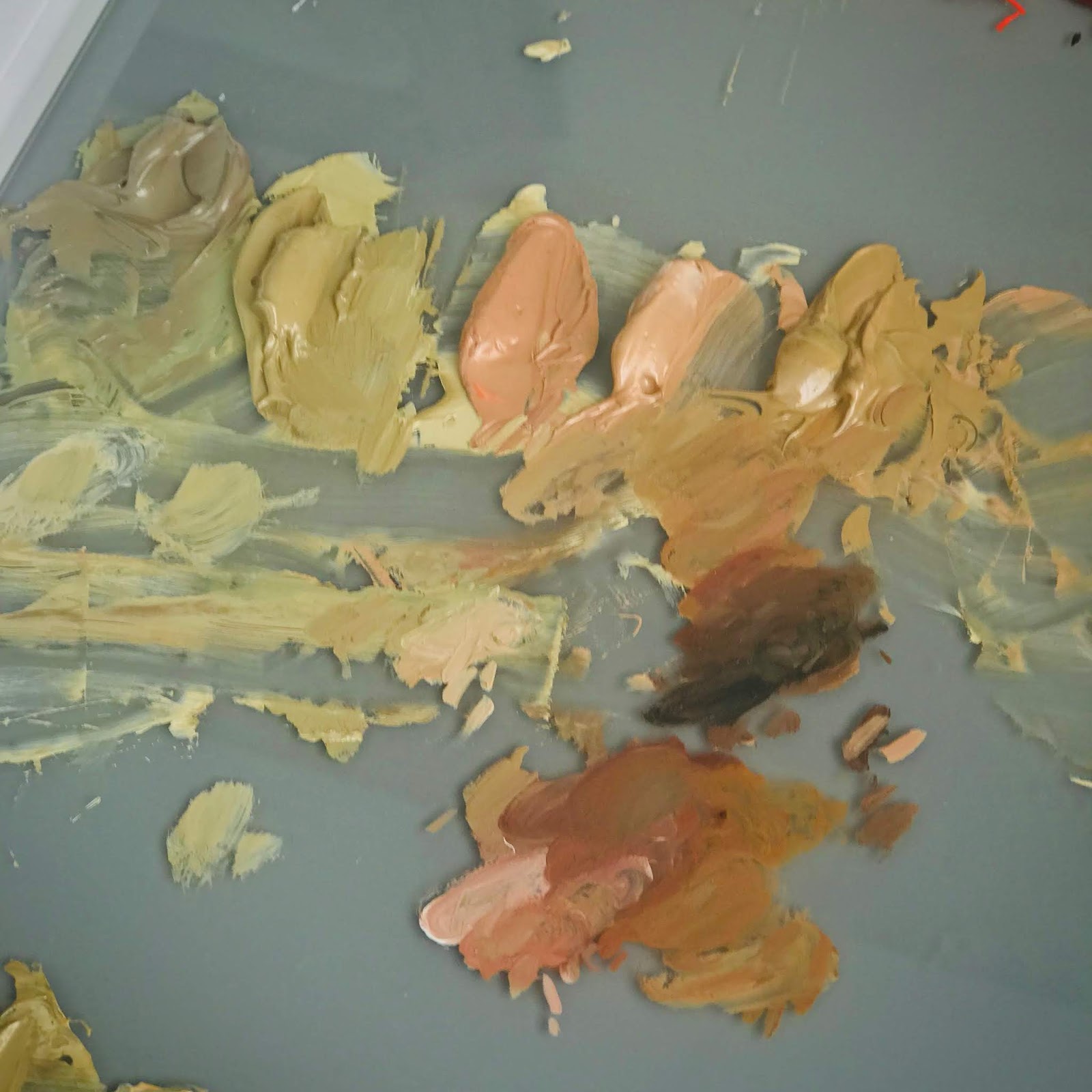

My limited palette comprised of mixtures I made from a typical palette of colors. 
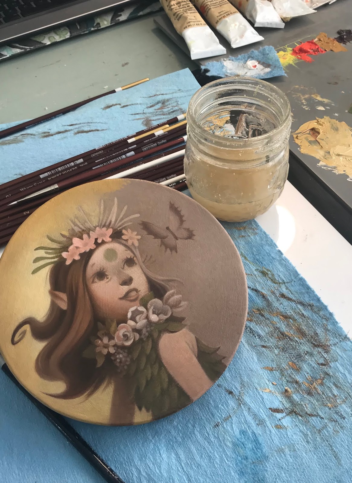

After coming up with the base color palette and marking down how I made the mixtures, I began the color glazing stage, following the color mock ups I did in Photoshop, which I have in front of my on my ipad at my desk. 

In regards to technique, glazing color on top is fairly easy, it is just takes a few layers in order to cover the underpainting underneath. I love this stage the most. It finally feels like everything is coming alive.


After they were finished, I used a matte varnish rather than a glossy varnish. I wanted to make sure the metal leaf details didn't compete with another shiny surface. 

And this is the part that took me literally months to figure out...gilding.

I had so many frustrating experiments on test surfaces that were not working the way I needed them to. Gilding on oil paintings, it turns out, is a little more involved than gilding on paper surfaces. I see a lot of artists using gilding in their work, but it is not at all easy when you want a specific design and are working with oil paint, which tends to want to grab the metal leaf, making brushing away the excess a nightmare.

I ended up taking a class with Lynn Rutter on gilding techniques. I am so glad I did. I learned a huge amount in information in two days that answered a lot of questions and provided important information about how to make sure that materials like oil paint and varnishes underneath the gilded surface interact well and archival for a long time. For all of the gilded details, I painted used twelve hour oil size and then used various metal leaf when the size was ready. Because some metal leaf tarnishes, I also learned about the importance of using shellac (and which kind) to create an isolation layer. 


These are the samples of gilded surfaces we learned about in Lynne Rutter's two day weekend class.


I used twelve hour size. Timing it is important, so you have to make sure your schedule is clear twelve hours later, otherwise the gilding window closes and you have to start all over again. The photo above is what it looks like while it's drying.

After that, brushing it off was fun, too, except that sometimes the edges weren't as crisp as I'd like them to be. I had to double leaf the details in some places. 


The finished piece.

Much more to come in 2019!
 If you've made it this far down the page - THANK YOU.

11/02/2018

Inktober 2018

Once again I decided to challenge myself and try out Inktober 2018 to see if I could improve my inking ability. 


I have always admired ink drawings more than other kinds of drawing because of the boldness and confidence immediately indicated by committing line to paper and using two values to define any given subject. A particular favorite inking artist is Italian artist Dino Battaglia, who worked primarily in the 1940's-1970's illustrating comics and graphic novels. I love his use of texture and negative shapes, and his compositions are pretty incredible, too.


You can find more of his work online, but there doesn't seem to be a lot, unfortunately. Someone needs to put a book together!

With Battaglia's work in mind, I started out inktober trying to figure out where and how I could include texture. It was not at all easy. Not only did I have to draw the composition, but then had to figure out some sort of value pattern where I could commit a texture as a third value. I found texture in general worked best with a small bit of reindeer moss or gauze and a somewhat dry stamp pad. The texture didn't come across as clearly if the ink was too wet. 


My materials were mainly: Platinum Carbon ink, an inking pad and reindeer moss for textures, sometimes gauze, Dip pens and small brushes. I used some pro-white occasionally to clean up extra lines I didn't want. I inked everything on Strathmore bristol board 4 ply plate surface. I also used masking film.


I also experimented with a dark background, white paint and a roller with white paint to get additional texture. I had to mask out the area, which was really time consuming.


I really like that dark background texture a lot - will probably find ways to use it for other pieces in the future. I may also redesign this piece since I think it's too top heavy and not as clear as I would like it.

However, as inktober progressed, I decided that perhaps it would be better to get a feel for how dip pens worked and how I could indicate value with cross hatching and line work. I ended up using texture as an accent rather than feature.


In the piece below, I primed the paper with a thin wash of acrylic titanium buff, a technique I've used for a long time in my sketchbooks, usually if I want to paint on top of the sketchbook paper. It makes a nice gessoed surface that accepts watermedia. Also, it turns out, makes a great surface for inking.


Another artist I really love is Arthur Rackham. He did a lovely series of illustrations all in silhouette, which I've always admired. I wanted to try at least one silhouette. I toned the paper with a light grey wash of acrylic, let dry, then a few touches of textures, and then painted the forms with a brush. The hardest part I think is the clear design. I'd love to try a whole series of these.


And this one has the same general idea, but with some modeling in the silhouette. 


Towards the end of inktober I was inking and re-inking at least 2-3 times. I think it's good practice to re-ink pieces because it gives you a chance to not only warm up, but also loosen up and see if you can push the subject further. Each time I re-inked a piece I did not regret it. I'd post my original inks for these here, but I cringe every time I look at them, sorry. :)

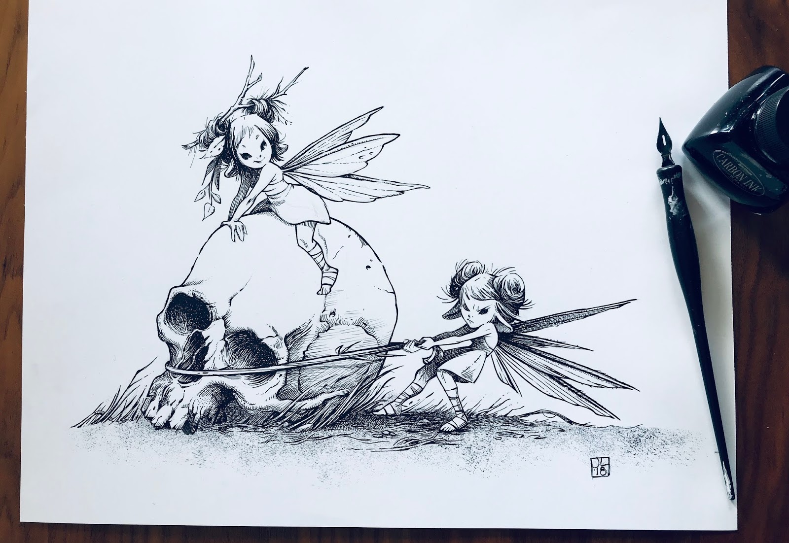
I think I inked this one over 3 times...finding reference of a pelvis bone was really tough. I also was unsure about the composition, so I tried out a few ideas before finalizing this one.


For the very last piece, I switched from using a dip pen to rapidiograph pens. What a relief! I had more control over the thickness of the lines, which I generally wanted fairly small. I also started working larger, which I think helped a great deal in getting the kind of detail I wanted. 


The drawing alone took a full day to complete and edit at a larger size.


 Inking took about a day to complete, with a few extra hours the next day to make some final edits and additions. 


I put a warm filter on the drawing for the final shot. Is that cheating? I don't know. I like it better, though. Toned paper always has a nice feel to it that I like.

NOTE: You may be wondering about why all these fairies are messing around with old bones in the forest. There is an answer, but I am not finished telling the story. I like the idea a lot and will continue adding to it over the next couple of months in between painting work. 


**********************************************************

In all, I ended up creating nine pieces, which falls far short of the intended 31 days of ink drawings. However, the intent is to improve, and I feel like I worked pretty hard during the month. I experimented with ideas and compositions as well as story telling, acting, and overall value design. While I wasn't able to finish the mini story I am telling in these pieces, I am still left feeling like I made a journey that has left me in a better place than where I was last inktober. 

If you've read this far, thank you! 

Follow me on twitter and instagram for more updates: @paintkatt

Cheers!

5/12/2018

Plein Air Gouache/Catalina Island

This month I've lived in San Francisco for exactly 18 years! I can hardly believe it's been that long, longer than any other place I've lived. In all that time, I had never visited Catalina Island, 17 miles off the shore of Long Beach, just south of Los Angeles. 


The view from our hotel, especially at sunset, was gorgeous! 


I normally sketch in either pastels or oil, but I didn't want to carry around an easel or heavy materials. Gouache is so easy to pack, light to carry in a backpack, and easy to clean up on site. 

I also started a new sketchbook made of kraft paper. The paper has a nice base tone that I like for gouache, but I don't care for how much it absorbs the pigment. I end up using more paint than I normally would and I never really got clean color in the sky areas. I will continue to fill up this sketchbook, though. I will likely gesso a few pages with a base of casein or acrylic for future sketches. 


Little ticket booth for "submarine" rides out in the bay. I'd love to try it, but we were there to sketch this trip.


The view from the main beach in Avalon. Just a quick sketch before we watched the Kentucky Derby!


The staff told us that on Mondays and Tuesdays cruise ships arrive. There was an uptick in visitors, but even then it wasn't too crowded. 


On our final day, we sat and ate breakfast on the second floor of our hotel, the Vista del Ray. After breakfast, we sat and sketched for awhile. This was our view. I was working pretty quickly on this one, trying to get all the little details recorded.


I hope to come back and do more exploring of the island. It's rather large and apparently there are hiking trails and another small town on the other side. 

Thanks for looking!

12/21/2017

Happy Holidays, Winter Solstice, and Merry Christmas!

Winter solstice is here but maybe, somehow, a real life Rudolph is out there lighting the way. 


Merry Christmas to everyone! Thank you for reading my blog and commenting! 

Let's all make 2018 a year to remember. 
Cheers,
Julia


12/03/2017

Reliquaries/ Initial Concepts for dimensional pieces

I've been working on a large series of what will be dimensional pieces using a variety of materials, oil paint, gold and silver leaf, clay and ribbon. They will, hopefully, have some depth by lifting cut pieces off the base. I am a little nervous about cutting the pieces, but I'm going to give it a shot anyway.

Here are are a few concepts which I adapted from a few of my inktober pieces, the concepts pertaining to traditional memento mori.


***************************************

THIS series, "Seasons" is going to be much more complicated. Here are a few concepts I'm playing with. The scalloped edges may change when I finally paint and assemble the pieces. Good to have a plan, though.


Please stay tuned for more! 


10/06/2017

Inktober 2017

I'm not really an inking artist, so I thought this year I might try learning. The biggest challenge so far has been getting used to the materials. I've been experimenting with different papers, inks, pens and brushes. 

Also, I wanted to focus on one subject, memento mori. I've lately been looking a lot at medieval art and especially love reliquaries. So beautiful and creepy! 


I usually started with a sketchbook drawing which I then retraced using a lightbox onto new paper (usually using a colerase pencil - my favorite)


I filled in the dark areas with sepia acrylic ink for this one.


But I wanted to see what I could do with the materials, so after I painted the acrylic ink above, I brushed on a thin layer of tan acrylic on top to seal it. I like the way it makes it look more weathered and imperfect. After the acrylic wash was dry, I used pro-white and black gouache to model some tones. 

Not sure I liked the way I drew the drapery on the ghost, BUT I did enjoy this technique a lot.


For this one I was mainly interested in a white shape against a black background. I spattered on some prowhite after it was dry to get a speckled effect in the background. 


Thanks for taking a peek at my inks! Hopefully by next year I'll have learned a few more techniques. I plan to keep trying out various ways to ink throughout 2018. (and continue on a few of my other projects...coming soon!)