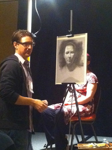
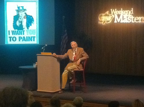
David Jon Kassan is an artist I was really excited to meet and study with at the painting conference I recently attended, American Artist's Weekend With the Masters, in Monterey, California. Aside from his technique and acute observational abilities, Kassan has been an artist I've admired for his subject matter and unusual juxtaposition of realist figures against street art or other interesting abstract textures.
I've also enjoyed the videos he has put together, particularly a portrait on an ipad tablet using the ArtRage app as well as traditional portrait sessions of people around where he lives in Brooklyn, NY. If you haven't watched them yet, be sure to check out his blog and enjoy.
From Kassan's artist statement on his website:
My influences are understandably just as contradictory as they have fed
and connected my perspective on painting. I am constantly seeking out
work that is congruent with my own which has led me to explore the work
of life size old master paintings, urban stencil and graffiti street
art, Marcel Duchamp's found objects, abstract paintings by Robert
Rauschenberg, and finally the sheer conceptual and executed realism of
Caravaggio.
A flexible and open mind. I like that.
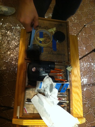
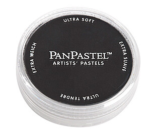
Notable supplies for the day included pan pastel in black, Generals charcoal pencils in blacks, greys,
and white, a custom maul stick he made using a collapsible tent pole and
coat hanger, and binoculars...
Kassan's drawing supply list can be found here.
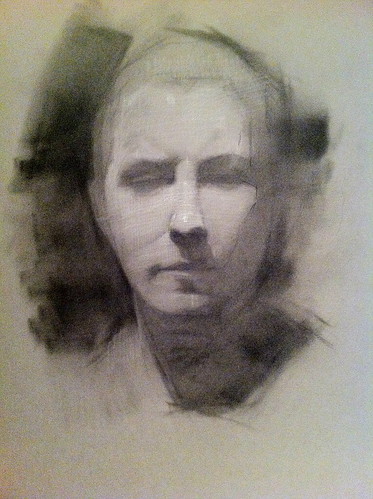
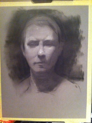
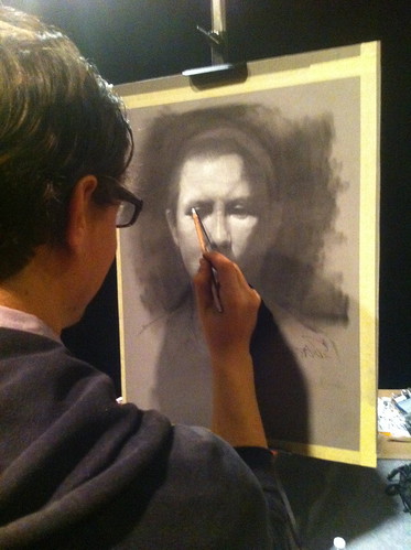
He began the demo on toned paper in a mid range moving up or down the value scale in order to model the form. He started by massing in the key darks of the eye sockets, under the nose and mouth with black Pan Pastel.
 | |||
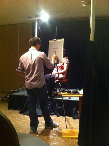
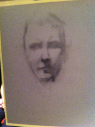
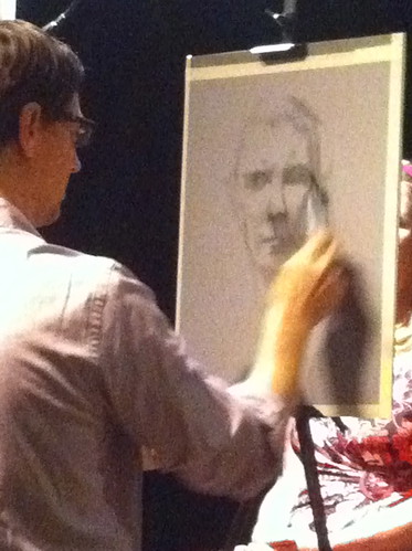
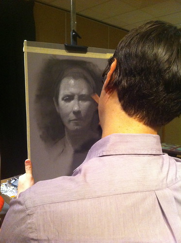
After he laid in the darks, he refined them by looking into a set of a binoculars at the model (not the drawing) to find the exact edges of these shapes and adjusting with an eraser. I had never before seen an artist use binoculars and was really curious to know how he was using them.
Kassan explained that the binoculars aid in finding the exact edges of shadow shapes and help in observing specifically where forms turn. He told us that occasionally students find this device controversial. His view is that while yes, binoculars are an optical aid, the mind and the hand are still creating the work; an artist still has to understand the form well enough to know what to look for in the first place as well as translate what is being seen on to the page. I have no problem with this myself. I wear eyeglasses for the same reason so binoculars to me feel like essentially the same thing.
Kassan explained that the binoculars aid in finding the exact edges of shadow shapes and help in observing specifically where forms turn. He told us that occasionally students find this device controversial. His view is that while yes, binoculars are an optical aid, the mind and the hand are still creating the work; an artist still has to understand the form well enough to know what to look for in the first place as well as translate what is being seen on to the page. I have no problem with this myself. I wear eyeglasses for the same reason so binoculars to me feel like essentially the same thing.
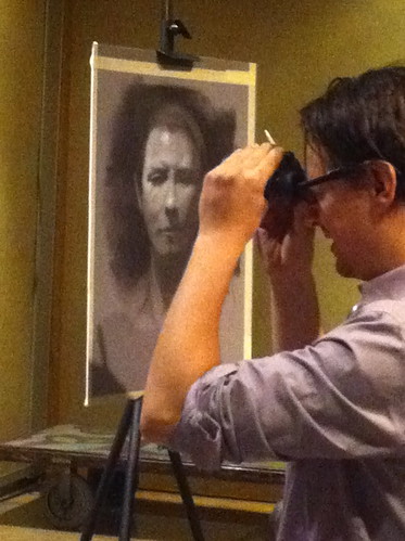
After he adjusted and refined the shadow shapes with a tuff stuff eraser, he used a white General's pencil employing crosshatching, another departure from my own training and one that attracted me to Kassan's work.
As he continued to refine the form in the light and add more depth and accuracy to the darks, he explained further about his use of crosshatching with white in the light tones. He follows each form around the face according to the natural grain that grows on that particular feature, something he learned from Costa Vavagiakis, with whom he studied at The Art Student's League in NYC. Years later Kassan learned from a doctor who was also a student of his that there is a medical term for this concept, Langer lines !!!
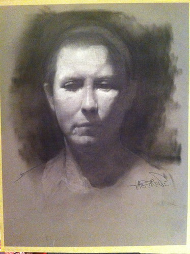
Kassan's finished 3 hour demo drawing:
It was cathardic for me to hear about Kassan's use of white pencil, crosshatching and langer lines. A seemingly innocent thing like cross hatching has become a bit of a flash point in my personal art.
Many years ago, while I was in high school, I became completely obsessed with Langer lines, although at the time I didn't realize that is what they were. I had been at a local book store and discovered the Dover Press Alphonse Mucha's Figurative Decoratives, a book which remains incredibly inspiring to me to this day. I stopped experimenting with this technique when I went to art school because I learned that lines do not exist in Nature, that light illuminates volume creating tones rather than lines. Additionally, when I began to study at the Palette and Chisel during the early 90's, this idea was reinforced quite powerfully as tone being the best way to accurately depict light in Nature.
While this concept might be actual fact, it does not take into account that visual language is a human way of depicting our world on to two dimensional surfaces. During a lecture given by Quang Ho, he mentioned line as a part of visual language - and it caused a bit of an on stage controversy. (more about this in subsequent posts)
While this concept might be actual fact, it does not take into account that visual language is a human way of depicting our world on to two dimensional surfaces. During a lecture given by Quang Ho, he mentioned line as a part of visual language - and it caused a bit of an on stage controversy. (more about this in subsequent posts)
I have always loved the line work in Mucha's life drawings throughout the years; It was the addition of using white plus line work in the lights that attracted me to Kassan's work and in my personal life I know so many comics artists who use line ONLY to create absolutely stunning work. It was a relief to hear from another artist in the fine art Realist community who is intrigued by cross hatching and line work and makes no apologies about it.
Further, during the above portrait demo, Kassan mentioned that he felt it was a good idea to try out various techniques in order to find what fits your personal temperament - also an idea that resonates with me.
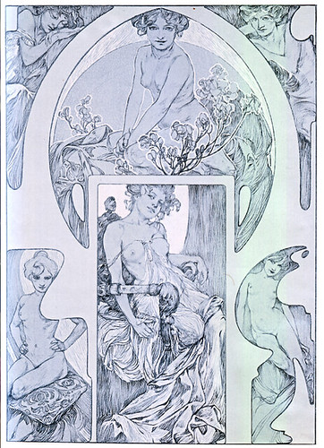
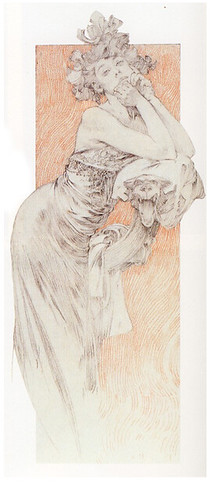
a nice flickr set of Alphonse Mucha's Figurative Decoratives can be found here.
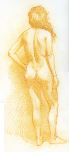
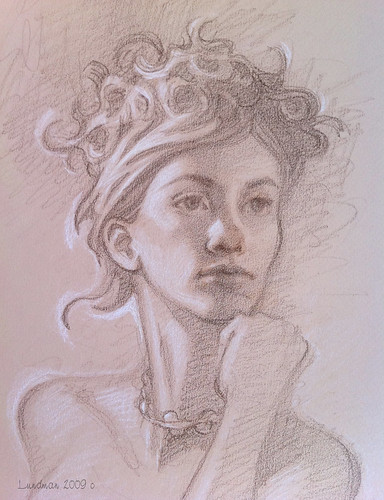
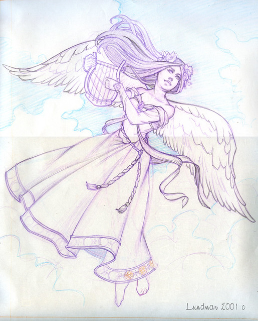
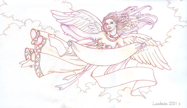
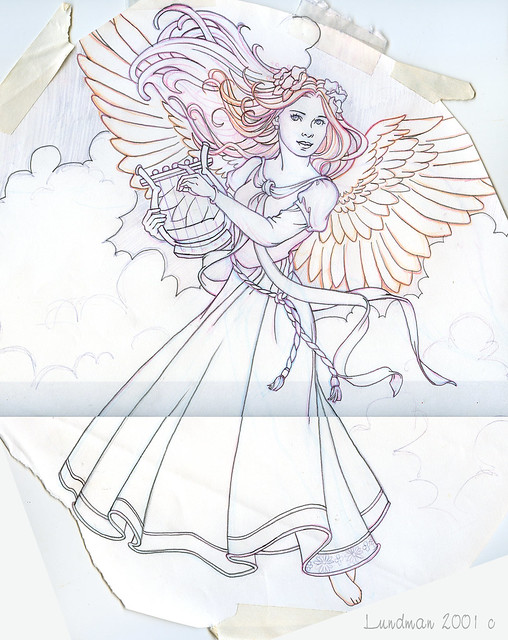
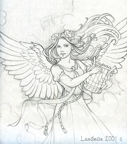
Here are some of my more recent experimentations using Langer lines:
Here are some of my more recent experimentations using Langer lines:
"Bilge" pastel pencil on Strathmore paper, 9 x 12
"Tiffany", brown and white pastel pencil on Canson's Mi Tientes paper
*note: this might have been more effective had the lines followed the forms on the face and body - and if the hand were more accurately drawn.
What I've learned over time, perhaps more than anything else, is that the art community is rife with opinions about the 'right' way. It is
quite easy as a young and eager student to be overwhelmed by a Master, especially as I was genuinely blown away by some of the artists around me and wanted to paint exactly like they did.
Later in life, I have begun to realize my own internal temperament is different than those who influenced me in school, but they are still difficult to to ignore; I want to explore the idea of drawing with lines and yet I feel horribly when I do because it is the opposite of what I was taught. The only way I can address it is to break away from that line of thinking completely and put my fine art work "on hold" while I experiment with whatever I seem to gravitate toward.
So far it has been an interesting journey in finding my original influences, the things that attracted me to drawing before I even went to art school which are still deep within like a burning ember that never went out.
”…pay attention to the urges that motivate you…it’s your job to make it yours…not to judge it or compare it to other expressions…no artist is pleased…it’s just a divine dissatisfaction…a blessed unrest that keeps us marching…and makes us more alive...”
Martha Graham
