Pages

10/31/2011

Bowie the Greyhound

 On Thursday evenings, I attend a sculpture workshop with some friends. Usually we hire a model for figurative work. This time, however, we thought we'd tackle something different,  the greyhound of one of our favorite models.

Greyhound - model Bowie

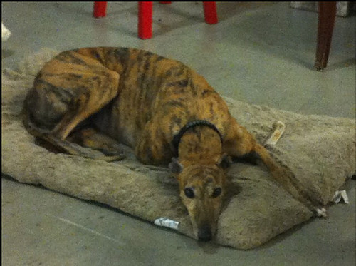
 We set Bowie up on a sleeping mat while we sculpted. Occasionally she would get up and walk around the room or go outside for a quick run. 

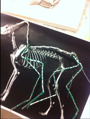
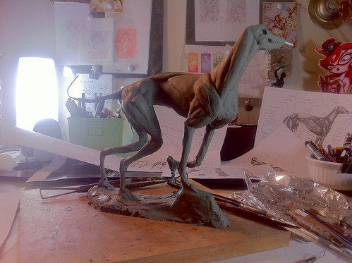
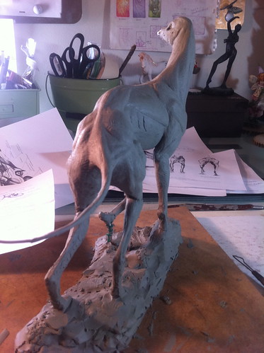
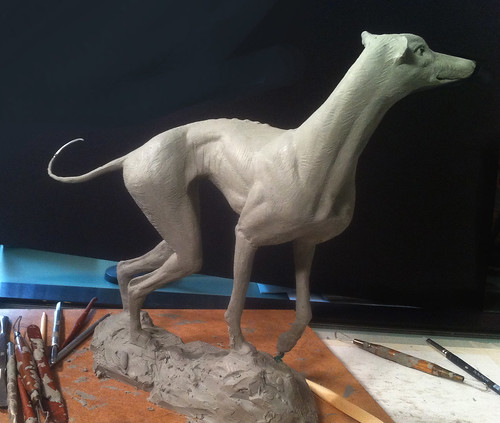
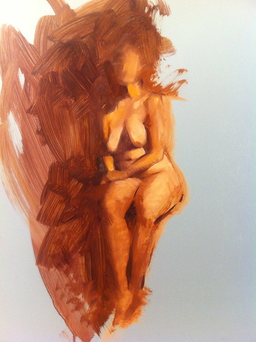
While I was making the armature, I observed the incredibly graceful movements of our model. I noticed the long flowing s curves repeated throughout her form and her incredibly "springy" stride. I wanted to somehow capture that kinetic grace in the pose.

Greyhound - armature

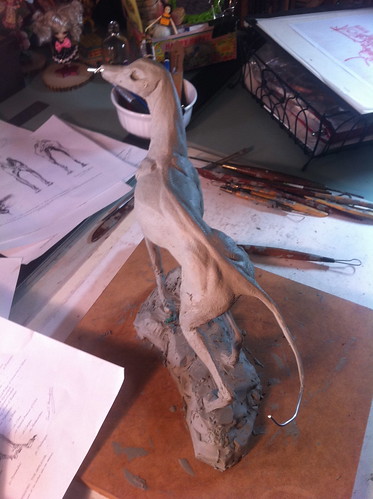
I didn't make any gesture drawings, but instead decided to just mess with the armature until I found a pose that worked. I put a base layer of clay on the armature, adjusted it several times, and after about two sessions found a pose that had movement. I had trouble with the armature because I used aluminum wire where I should have used steel; the clay is heavy and can bend the aluminum wire. To compensate I decided to make a sturdy base at the bottom and balled up aluminum foil for the rib cage.

Greyhound - first pass gesture

Greyhound - first pass other side gesture

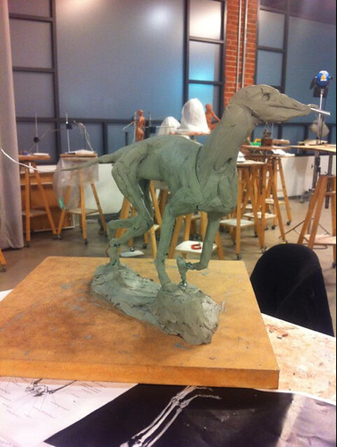
Eventually, our Thursday night sessions ended and our model was no longer available. I decided to take the sculpture home to work on it little by little after work.

The truth is, I am not really a sculptor. I am a two dimensional artist studying the 3rd dimension, sculpture. In the 3 years since I have been learning about sculpting with my friends each Thursday, I have found that the practice aids my understanding of depicting nature in two dimensions greatly. My mind is better able to process how form turns and how light falls on those forms far better than if I hadn't.

Greyhound-3


Greyhound-5


Greyhound - tail anatomy


Greyhound - Scurve2

My underlying interest in visual language is the idea of making something, anything feel alive to the viewer, whether it is realistic or fantasy; I want to be able create an illusion and spirit of life, the sublime. I strive to transcend technique in order to create something beautiful that reflects Nature in a visually poetic manner. It is this idea that keeps me pushing forward, wanting to learn more, improve my abilities and become increasingly skilled at how I might do this. Sculpture has helped me understand in a different way how to think about how to capturing "aliveness" of a creation. While I am certainly a lesser sculptor than others, I feel exploring this medium has helped me solidify ideas about visual illusions.

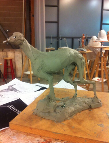
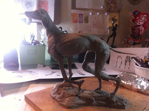
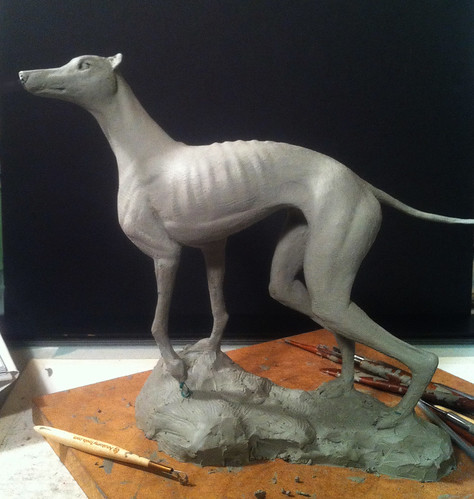
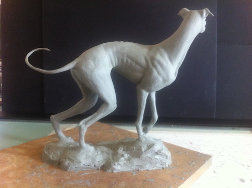
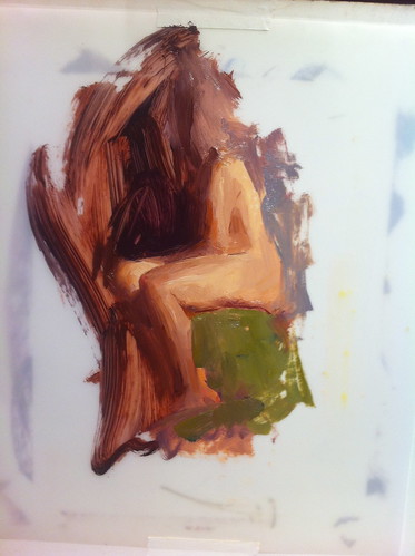
At this point, I decided to place a black board behind Bowie so that I could see more clearly the lines of her form. I started to soften the muscles and add some areas of compression along with skin folds. I came to the conclusion that although some of the sculpture might not be entirely "correct", it was my choice in serving the design at this point; I enjoyed rounding out forms and accenting areas I found the most beautiful.

Lundman-1

Lundman-2

*********
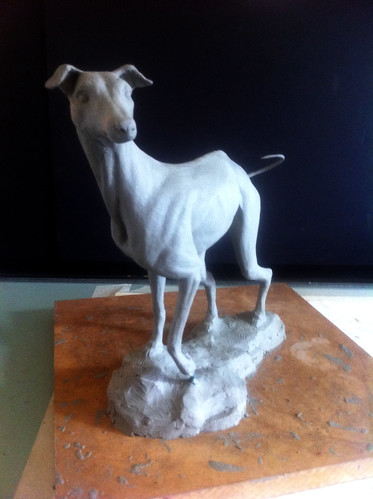
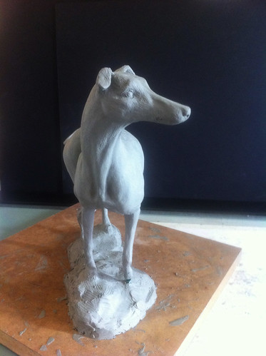
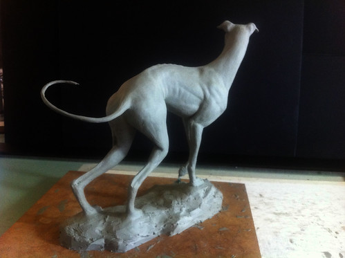
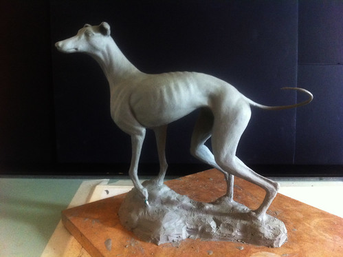
My "finished" sculpture, at least as finished as I want it to be:

"Bowie", oil based clay on wood base.
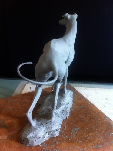
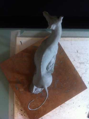
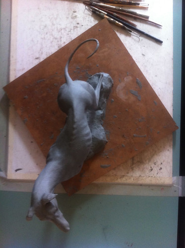
Lundman_Bowie_frontview1

Lundman_Bowie_frontview2

Lundman_Bowie_side2

Lundman_Bowie_back1

Lundman_Bowie_back3

Lundman_Bowie_side3

Lundman_Bowie_topview1

Lundman_Bowie_topview2

s curves in motion:


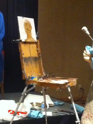
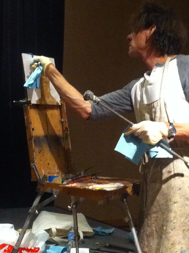
While I worked on this sculpture throughout the summer, I took breaks to attend the Weekend with the Masters painting conference, which you can find in some of my previous posts, but, perhaps more interestingly, during this time I immersed myself in the work of string theorist Brian Greene, author of "The Hidden Reality". *

Aside from ideas about the shape of our questionably infinite universe, one fact about Greene's work stands out as entirely relevant to every day considerations: 

"Nothing in the laws of physics points to free will. Therefore, like time, it is a useful illusion. We are a bag of particles governed by the laws of physics.  And that’s it.”
 (from an interview with screen writer Charlie Kaufman)

 Really? Assuming Nature created these complex particles, it also created the desire for some of us to want to recreate it in art. Why? To understand it? For what purpose? Maybe meditating on Nature's beauty is somehow important in the grander scheme. It certainly is for me at least.

*You can also watch a fantastic PBS dvd series based on his book by the same name, "The Elegant Universe", which explains quantum mechanics in layman terms and is pretty enjoyable regardless (among numerous articles and speeches published all over the web).


10/10/2011

Weekend with the Masters - Daniel Sprick Demo


On the last day of the Weekend with the Masters, hosted by American Artist Magazine, I took a one day workshop with an artist I have admired for years, Daniel Sprick.

The painting conference was structured so that students could take several one-day courses, choosing one instructor for each day (look to my two previous blog posts for other instructors courses I attended). All twenty instructors were master painters on the Realist fine art scene; quite an impressive roster with a wide span of approaches and philosophies ranging from the alla prima direct painters, to the Rembrandt school of thought, to the Classical Realists of the East Coast atelier scene to the many noted plein air painters of the West coast.

I was surprised and delighted when I saw Daniel Sprick's name on the roster since I had never before seen offerings of workshops taught by him in the past; this was a rare treat to meet the artist I have admired for so long. I was not disappointed.

An excerpt from an article written about him on his website:

"A Vermeer-like glow infuses many of Daniel Sprick’s paintings, often falling on objects from some unseen source. It spreads arbitrarily through his interiors, picking out this tangerine and that bottle, causing their color and form to bloom, submerging other parts of the painting in warm shadow. From Vermeer too, comes the suggestion of worlds within worlds. Oriental rugs imply distant exotic places (and perhaps Sprick’s obsession with flying via magic carpet as well). Paintings and fine art prints tacked to walls, tantalizing reflections in a blank television screen, figures half-seen through distant doorways enhance the notion of time and distance. Daniel Sprick also revisits the tradition of the still life as memento mori. Yet again, in these contemporary works, the traditional images of decay and dissolution –faded flowers, broken china, eggshells, a human skull---are leavened with humorous elements such as nibbled cookies and a seeping stain that spreads from a paper bag to the book it stands on. "
-- Jane Fudge
Jane Fudge is assistant curator of modern and contemporary art at the Denver Art Museum, and a visual art and film critic.

Daniel Sprick, "Passage", 36x30, oil on board

Two interviews, the first from the Denver Art Museum, and the second, below, an excerpt from American Painting Video Magazine:


**************
Because the conference was expensive to attend, I appreciated Sprick's thoughtful note on the supply list that mentioned that we could use whatever supplies we already had. He provided a list of his specific materials also, and indicated that we were welcome to use those if we chose but that it was not necessary.**

His supply list can be found here.

However, for this demo, Sprick was using Royal Talens water based oils that were provided as samples from a representative from Royal Talens/Canson at the conference. He used them all weekend in order to test them out, and seemed to like the results.

Sprick explained his process for preparing panels at home, which are Masonite panels primed with golden sandable gesso. The medium he uses with his oils is Liquin.

Sprick - grisaille 1

He began by drawing out an accurate silhouette of the head using angular lines rather than curves. After he figured out the height, width, and overall shape, he then filled in the shape of the head with a thin wash of a warm sienna-like tone. This under painting technique is called a grisaille or dead layer, which many artists use as a base for subsequent paint layers. 

Sprick - grisaille 2

He intentionally left the area around the head white since he has been creating a lot of figurative works in his studio with a white background as a compositional element. Sprick's aesthetic for portraits and figures often employs stark white backgrounds foiled against a fully painted realistic portrait or full figure. He explained some of his influences in this direction, referring to a Renaissance painter, who's name I unfortunately did not catch, that also played with this idea. Additionally, contemporary print media often make use of photographed figures photoshopped against a white background, a visual motif surrounding us today.

Sprick-palette

After he finished the flat, wash of the silhoutte, he began to paint on top of the grisaille, filling in the shadow areas as one connected shape all over the head (below) with a thicker consistency of paint.

Sprick - grisaille 3

Sprick then mixed up the colors of the light in big piles from which he also used as a base for mixing middle tones.

Sprick - palette 2

At this stage, he began to lay the paint on thicker and in a "dabbing" manner instead of blending brush strokes together, carefully modeling the forms of the light.

Sprick - color 1

He continued in this manner, slowly building up the light, mid tones, and adding further shape to the darker values.

Sprick - color 2

It wasn't until this stage that he added the sharpest, darkest values and the lightest lights. 

  Sprick - color 3

After he added these accents, it seemed to be a matter of adding a few very small accents in the highest range of the light in order to shore up the accuracy of the portrait.

Sprick - color 4

It may look as though there are a lot of meticulous brush strokes on this portrait, however up close I noticed the painting was far more economical than I'd realized. Sprick has such command of the figure that he is able to make incredibly exacting choices.

Sprick-finished demo
The finished demo, Daniel Sprick, 2011

Below are two additional demonstrations he painted from other sessions:

Sprick - head demo 2

Sprick - head demo

During the break at lunch time and before we painted from the model, Sprick showed us a slide show of his STUNNING portrait work on his ipad. He also talked about his interests in lighting for his still life paintings, using unusual sources of light including hot, artificial spotlights (on occasion) and interesting bounce light effects, like mirrors with blue gel on top, which bounces back into the set up. He also glazes areas of his paintings after they are completed if he finds the composition is not working the way he prefers, using the glazes to either push back or pull forward specific elements of his still life.

It was truly a joy to be in the same room with Daniel Sprick, talk with him and paint. I will not soon forget the experience!


** The Weekend with the Masters was quite expensive (for me), considering the cost of the course, $1200, the fee for the hotel (I shared a room which came to about $500), PLUS additional supplies for each chosen instructor and dining fees. Thankfully I traveled by car, saving on air fare and cutting the cost.  I suggest to the hosts at America Artist Magazine to increase the attendance among the student population, that they include a discounted student rate much like the CTN Expo does for the Animation industry students.

10/01/2011

Weekend with the Masters - Quick figure painting with Susan Lyon

A few years ago I had stopped fine art painting entirely due to a very busy illustration work schedule, which took me very far away from my practice of life drawing and painting the figure. It was around 2006 when I visited Susan Lyon's website, a former classmate at the American Academy of Art and Palette and Chisel Art League friend, that I became inspired again to continue to push forward and develop my observational figure painting and drawings.

I was so happy when I found that Lyon was also getting into oil quick sketching on vellum, a medium we used in art school to save on canvas, and even happier to learn she would be teaching her approach to oil quick sketch at the Weekend with the Masters, hosted by American Artist Magazine, in Monterey, California!

Here are a few samples from her blog:

Lyon-quicksketchoil

All of these are oil on vellum, 45 minute poses. Also on her blog is a link to a video she made further explaining her technique.

I also have the pleasure of owning a few pieces by Lyon. While we were in school at the American Academy of Art, I posed for my classmates on Friday afternoon. (clothed - I'm not THAT brave) At the end of the session, I was surprised when Sue gave me her watercolor painting (below, left). I still have it on my wall at home along with a pastel drawing (below, right) that I purchased from her in 2006.

Lyon-art

 
It was so fun to see her again after all these years. Susan Lyon is a delightful and energetic teacher who gladly shares her process with students. Below are a few shots and notes from her one day demo at Weekend with the Masters. Enjoy!

********

Lyon - WWMdemo - palette 2

On her Open Box M glass palette, Lyon mixed big areas of color with a somehwhat limited palette, variations on red, yellow and blue. In this session she used a convenience color for the flesh, Caucasian Flesh, Charvin Rubine Lake, Ultramarine Blue, Cadmium Yellow and Cadmium Orange plus Titanium White. Lyon explained that the small amount of cadmium orange was for sharper richer color accents which are usually found in the hands and feet where the flesh typically becomes more reddish.

Also, as far as medium, the only one she uses is mineral spirits to wash her brushes when switching colors, which you can see on the bottom left in the photo below. To wipe off the brushes, she uses Viva paper towels.

Lyon - WWMdemo - palette

She proceeded to mix up a few big piles of paint so that she didn't have to worry so much about mixing during the 45 minute pose. She then tapes a 14x17 piece of vellum (she has tried many variations and feels an artist needs to find which one they prefer) to a white board, and then proceeds to paint the largest shadow mass with a large bristle brush using the warm brown tone she mixed on her palette.

Lyon - WWMdemo

Lyon explained that after she lays in the shadow shape rather loosely, she then defines the color mass of the light areas using a loose sight size method which has become like second nature after painting for many years. 

She simplifies her brushstrokes as much as possible, using only mid range values, feeling that the middle ranges tend to give a more life like feel for the figure. The only dark accents she adds are very small touches toward the end of the session.

Lyon - WWMdemo3
 
Lyon said that she tries not to stress out too much about the exact hue on the model, and that her color is not super exact "true" color. Rather, it is relative to the palette that she sets up, working within the context of those colors. For instance, the green cloth depicted in the photo below was actually black, but she wanted to show the warmth of the skin tone against a cooler color.

Lyon - quick sketch demo WWMasters
Susan Lyon's finished demo, oil on vellum, 45 minute pose.

In the afternoon students did three 45 minute poses. I had a hard time getting used to the vellum; it's literally been over 15+ years since I've painted on it. By the third pose I started to get the feel of it. Here is my 3rd 45 minute quick pose.

Lundman-quick oil pose

I would really like to get a group together to practice quick poses in oil. I currently attend a Tuesday night figure long pose session and Thursday night sculpting, so adding one more night is pushing it...still, I would love to do this. Quick poses in oil would be good practice for getting the form down quickly while also abbreviating color, only putting down what is necessary. I imagine after a year or two of weekly practice, an artist would make huge leaps!