
Showing posts with label concept. Show all posts
Showing posts with label concept. Show all posts
8/11/2017
7/31/2017

12/14/2016
Holiday Party
I've been experimenting with pastel brushes in Photoshop. I am striving to make my digital paintings look like my plein air pastels, a look that I really like in terms of texture, soft edges and layering of broken color. I have a ways to go yet in developing this look, but happy with this experiment. More to come!
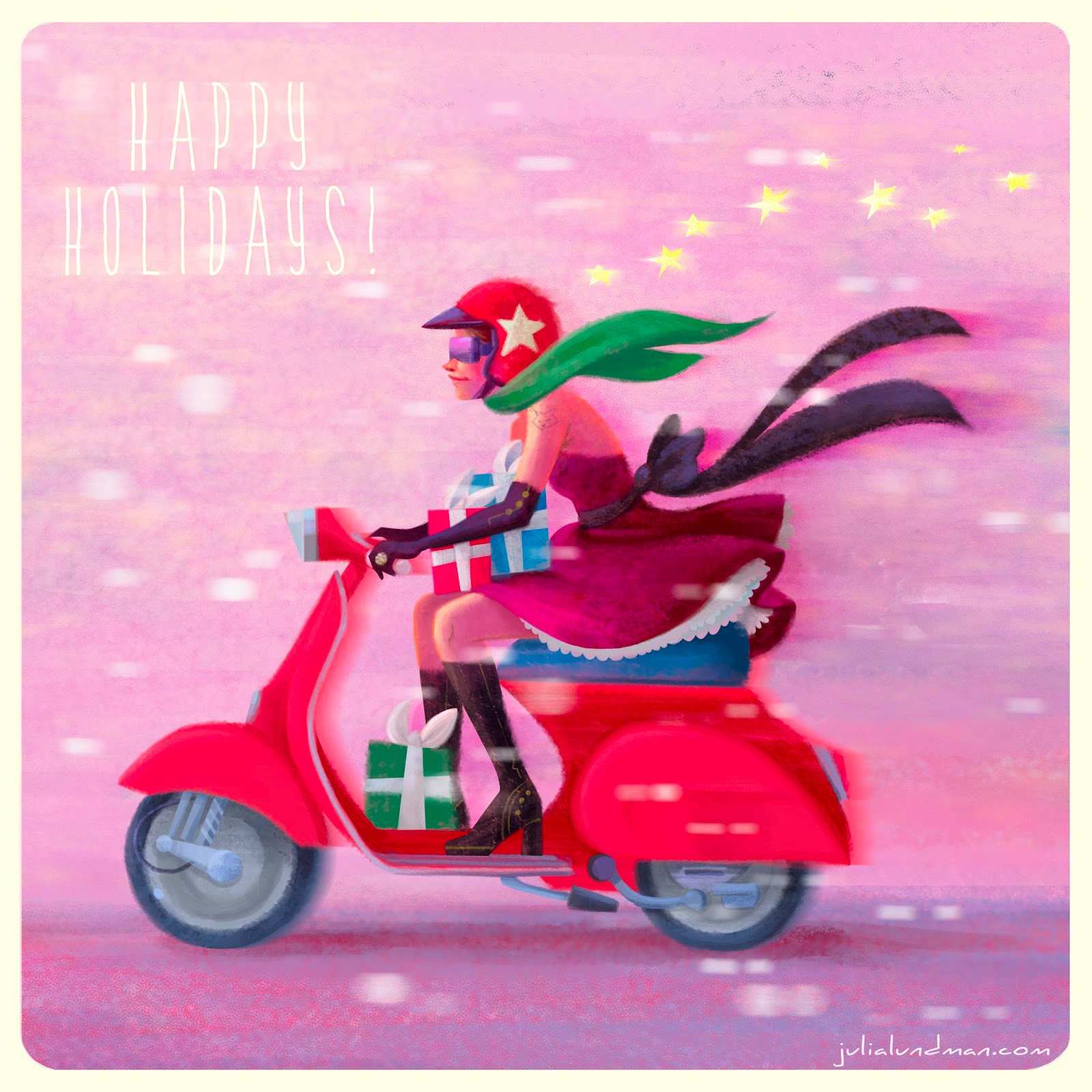
Happy Holidays!
4/23/2016
Bee Rider

"Bee Rider", photoshop
A few years ago I had this idea that tiny humans with wings were discovered in various regions of the planet. It's not a new idea at all, but I wanted to mess around with making these fairies a sort of tribal, pagan warrior race that looked more human than the wide-eyed alien version. I am deeply inspired by the art of Mary Cicely Barker (of Flower Fairy fame) and Margaret Tarrant, Edwardian era artists that depicted tiny human-like fairies usually of a friendly beautiful sort.
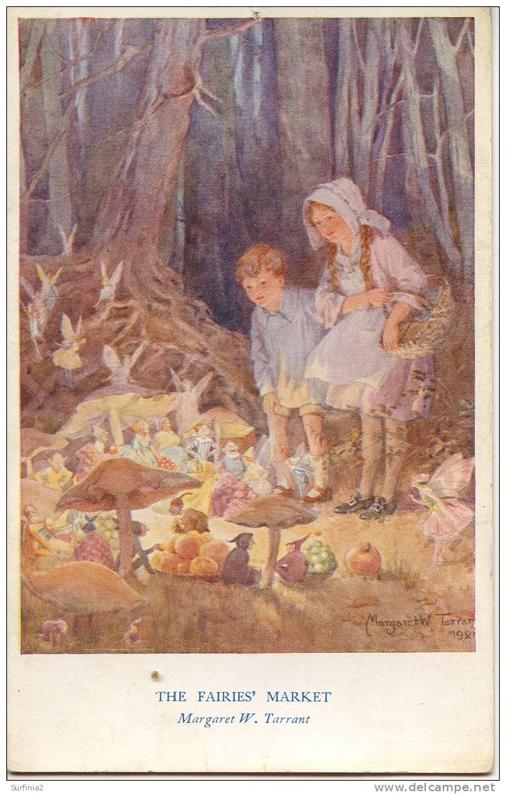
Margaret Tarrant watercolor

Cicely Mary Barker watercolor
I wanted to take their ideas about fairies and focus on aspects of character personality and group culture. It's a pretty big project that I am picking away at here and there in between many other projects.
I did this quick little sketch about five years ago. I like the idea but it's a little too vertical for the kinetics of the scene, and the costume doesn't work for me. I wanted to explore warriors that are more gutsy and brutal instead of sweet. I scanned my sketch and then did a TON of loose drawings on top to work out the idea more to my liking.
I also did a few studies of bees. Here are a few sketches. I thought about stylizing the shapes and the character far more than this, but in the end decided I'd rather focus on the story of the character, and of course (since I love to paint) the light.


I have a several more warrior fairies in the works in various states of finish. Hopefully I'll post a few more this year in between other posts. :)
Thanks for reading!
4/09/2016
Disney's "Whisker Haven Tales with the Palace Pets", Season 2!
For the past year or so I've been working on a new web and tv series called, Disney's "Whisker Haven Tales with the Palace Pets", published on the Disney Junior website and network. The latest episode, "Chowing Down" (Season 2), can be seen here:
All of these shows are developed, directed and produced at the awesome Ghostbot animation studio, where I have been working as Art Director with the Director-bots, Alan, Roque and Brad.
I am SO, SO proud of the really hard work that we all have done on this series. The best part has been meeting kids that tell me all about the shows and the characters. There is nothing better than that!


Here are a few production stills from this episode (I think this one is my favorite!), directed by Alan Lau. The color script on this episode was really key in getting the lighting, mood and tone just right, and also making sure transitions worked from the first sequence which was the set up to the indoor Kibble shop and dream sequences.


Below is some of the design work I did for the spring episode, "Hearts, Hooves, Eggs!", directed by Roque Ballesteros. The biggest thing I learned in this episode was scaling of details in the distance vs. the scale of details in the foreground. I spent a lot of time looking at mountainscapes studying how to make them work atmospherically.


The color script for the "Masquerade Ball", directed by Roque Ballesteros, was one of my favorites. The episode practically designed itself! A dark room with a party atmosphere was pretty interesting to explore in the color script and in the background design. I was surprised at how dark it could go, actually, and still read as long as the main characters had a good amount of light on them.

"Buddies Day", directed by Brad Rau, was really fun to design since the fall season was a character in the episode. I thought about things like how the color of the grass and the position of the sun in the sky would be different and distinct from episodes that take place in the summer or spring months. The most difficult part was the lighting in the maze from shot to shot, which required a color script - absolutely. In addition to that, getting a hay texture and shape in flash without it becoming too distracting or vector-y looking against the action of the characters was a real challenge. In the end, I think we found a good balance after a lot of trial and error.


I just wrapped on Season 2, 13 episodes, which will be released throughout the year including a Christmas episode I'm really excited about. I'm really hoping that we get a 3rd season. After 23 3 minute episodes I feel like I've really gotten to know the world pretty well. I enjoy every single part of the storytelling process in animation and film making and especially working with the Bots. I hope to visit the world of Whisker Haven again sometime soon!
12/16/2015
Star Wars Comps for Concept
Earlier this year for a class assignment with Armand Baltazar at the Animation Collaborative, we had an assignment to come up with a scene or concept that currently does not exist in a movie. One of my all time favorite movies is, of course, Star Wars, the original trilogy, but most especially "The Empire Strikes Back", where we meet Darth Sidious, "The Emperor", for the first time.
Up until that point, we feel that Darth Vader is the most powerful guy in the universe, even though we are conscious that he is definitely working for someone. When we meet The Emperor, he seems to be parallel to Master Yoda in power but belongs to the Sith and rules the Empire. However, I had always thought that since Darth Vader has unusual power, the Emperor, being a completely corrupt man, would perhaps have some other way of gaining force power than just by being himself. In addition to that, he must have been extremely peeved when Vader let Luke get away.
I imagined that in between "The Empire Strikes Back" and "Return of the Jedi", Darth Sidious brings Vader into his private chambers where he keeps a gigantic symbiotic parasite that he uses to not only control Vader, but also torture him and secretly extract force energy from him.
Here are a few concepts. I will bring one of these to full color soon, hopefully in the new year!

Additionally, I sculpted a bust and draped some cloth over him to create a nice working model of the Emperor's face. I've wanted to do a portrait painting of the man, and this will be very helpful for lighting.


6/23/2015
Disney's Palace Pets "Whisker Haven Tales"/Environment Designs and Color Keys
I recently had the honor of working with Ghostbot and Disney Publishing on ten 3:30 minute episodes of Disney Junior's "Whisker Haven Tales with the Palace Pets", directed by Alan Lau.
Episodes can be seen here:
www.DisneyPalacePets.com
Episodes can be seen here:
www.DisneyPalacePets.com
My primary role was to develop background "key" environments working from the approved animatics. If you aren't familiar with animation, a color key is an environment design that establishes a location, color palette, and lighting. It is then referred to by other artists on the the team that need to create various points of view surrounding that piece of the film in the sequence.

Elements like water that animate were tricky, especially bubbles. We had to take a close look at how bubbles looked under the water and out of the water.


Time of day was a major consideration in many episodes. I created guides for blocks of 2-3 hours for each time of day so that the color remained consistent throughout the episodes.


More episodes will be available soon via the Disney Junior Watch app on iTunes! The show is doing very well. It was a pleasure to work with Ghostbot and Disney on this exciting new show!
More of my work can be seen on my website as well, julialundman.com
6/14/2015
Disney's Palace Pets, "Tales From Whisker Haven"/Color Scripts!
I recently worked on ten 3:30 animated episodes for Disney's Palace Pets, a new show on Disney Junior. There is also a new Palace Pets Website (!!!) which can be found at www.DisneyPalacePets.com. The show was developed and produced at Ghostbot, directed by the talented Alan Lau. It was such a fun project for me personally as I served as Art Director on environments, props and color design. The show was definitely challenging as the Palace Pets have been a successful toy line for Disney for a while now and have a multicolored pastel palette. For this reason, color scripting was necessary on several of the episodes for either a full episode or portions of sequences that were particularly tricky to work out.
Below is my color script for my favorite episode, "The Knight Night Guard". (available to watch on the Disney Junior app now!) Color scripts, if you aren't familiar with them, are a way to get a big picture take on the color design for an entire episode or sequence. It is important to focus on the storytelling as scenes move from shot to shot and sequence to sequence, and make sure the planning for the lighting and effects is consistent logistically from one scene to another. They also are very helpful for animators so they can get a big picture idea of what it is we are shooting for, and also are very helpful for the compositor when piecing together all of the various elements into one shot. Additionally, I enjoy designing color scripts since they give me a chance to think globally about how I want to approach the design of specific environments and how much work I will need to do for specific areas of a sequence, and the work load we are facing in terms of environments and props for a particular episode or sequence.

Below are some stills from Episode 3. They translated pretty closely to the color script - good planning is worth it!


Below is a partial color script for Episode 4, "Throwing a Ball". I didn't have time to do a color script for the entire episode so I focused instead on a tricky sequence that takes place with a time of day change.

Below are a few shots for the final. (Additional characters were added after I did this initial color script.)


I actually did a few more of these but those episodes are not yet released.
Please check back for updates and be sure to watch Palace Pets "Tales of Whisker Haven" on Disney Junior! Next week I will post about some of the environments and props I designed.
Thanks for reading!
5/17/2015
Pacific Marine Animal Studies
Some more studies from our recent trip to the Monterey Bay Aquarium. I spent most of my time trying to capture a gesture or general feel for each animal, then tightened up my sketches later using photos I took and in some cases video, the puffins being the most difficult since they were very busy beasts!

The jellyfish exhibits are like nothing else I've seen at other aquariums. Absolutely stunning.

Moon Jellies (above) are in abundance in the Pacific Ocean, however because they are white they look very similar to white plastic bags. Sea turtles have mistakenly eaten plastic bags and died as a result, one more reason to go from plastic to paper.


I really loved these gentle sharks. Conservationists are concerned about them becoming overfished due to sport fishing along the Pacific Coast, where they live, mostly along kelp forests and rocky areas.


Tufted Puffins are in abundance along the Pacific Coast, especially up toward the Aleutian Islands in Alaska. I loved watching them - this guy was very curious about us!
The light shining through the water in the Kelp Forest exhibit made the anchovy schools look magical. Anchovy schools tend to gravitate toward long columns of kelp in a swirling spiral upward. Sublime! I did these studies from some video footage I shot and then painted various parts of different shots to make it all work together as a portrait of the habitat.

*****************************************************

*****************************************************
Next week Jamie and I will be busy sketching over Memorial Day weekend, so I will delay posting until the following week. Thanks for visiting!
5/11/2015
Monterey Bay Aquarium/Color Studies & Sketches
Jamie and I recently went on a trip down the coast to the Monterey Bay Aquarium, one of my very favorite places in the world. We both brought our drawing, sketching, and painting supplies, including my new samsung tablet. Because most of my color sketching was going to be done inside the aquarium, I carried around my tablet in my messenger bag and took it out when I saw something I wanted to study.
As mentioned in my previous post, the primary reason I purchased the tablet was so that I could do a lot more color studies of interior lighting in situations where it would be difficult to take out my usual paints or pastels, places like restaurants, cafes, aquariums, museums, unusual interior lighting situations. Boy am I glad I did. Each time I would sketch from life in the aquarium, I would take a photo before I left. When I would look at the photo later, I noticed a HUGE difference - the camera most of the time did not capture the lighting effects I observed, and if it did, the spirit of that light was completely lost, subdued, or just not there. What an amazing learning experience!
***************************************************
Below are a few of my digital studies. I also did numerous pencil and watercolor studies of the animals in the aquarium, and a few pastels from up the coast. I will post those next week.

The Kelp Forest. So glad I brought my noise canceling headphones for this one. There were deafening crowds of pre-teens on a field trip with their school. You never know what will confront you when plein air sketching - I highly recommend headphones if you sketch in public places.

I liked the presentation of this display so much. The blue light spilling from the water and the yellow-green reflections of the kelp were gorgeous. I felt the design stood well on it's own.

The sketch above is downstairs looking into the Sea Otter display, sea otters mostly spending their time up above water and only occasionally diving below. I noticed this perch watching people as they went by and thought it was funny...

Some sketches went faster than others. This one in the Deep Sea Exhibit was done in about 30 minutes. It was at the end of the day and just seemed to flow. I figured out a composition and story as it evolved in front of me.

Of all the subjects I studied in the aquarium, this jellyfish display was absolutely the most difficult. I sat across from the display on the floor against a wall in almost total darkness. My eyes had adjusted to the dark, but when I looked down into the bright computer screen of my tablet, my eyes would adjust to that brightness, so that when I looked back up again at the jellies, I had to give my eyes a moment to adjust to the darkness again. VERY tough! I spent a good two hours trying to capture the light of the tank. Wow, what a learning experience this sketch was!
One sketch that I did not have time for that I saw over and over was the selfie in front of any given tank. Maybe next time.
**********************************************************
I am going to start posting every Monday, as best I can, over the next four months. I have a lot of work to share from my latest projects, videos, sketches, paintings, progress on a few personal projects and the occasional workshop experience to share.
Next week:
puffin studies, rockfish, jellyfish studies and schools of sardines studies.
Thanks for visiting!
Subscribe to:
Posts (Atom)