As a continuation on my blog post series from the Advanced Open Studio I am taking with Sadie J. Valeri, this post is part two on the next stage, Color. These are my notes for my in progress painting. I hope you can glean some useful information from them. Enjoy!
********************************
Oiling Out
Before we paint, Sadie instructs us to always oil out the area we will be working on with a very small amount of painting medium.
Sometimes, when the oil is applied, it will bead up, which then requires wet sanding with very fine sand paper. It always makes me super nervous to sand my painting, but after having done it a few times now, I have found it actually great. The grain the sandpaper helps rid the surface of too many ridges (in Flemish painting an unwanted effect), dust, lint, odd streaks, and makes a really nice surface for the new layer paint to adhere to.
After I applied my "fat" painting medium on a portion of the surface, I used 1500 grit sand paper, moving in a circular motion. The reason for not oiling out the entire surface of the painting is because not only is it unneeded if only working on a small area for the day, but because over time those layers of oil, if put on too thickly, will slowly start to drip.
It also takes a few tries to figure out the thickness of the oil you like on your surface. It can't be too thin or too thick - somewhere in between that simply allows sanding and good flow of the paint.
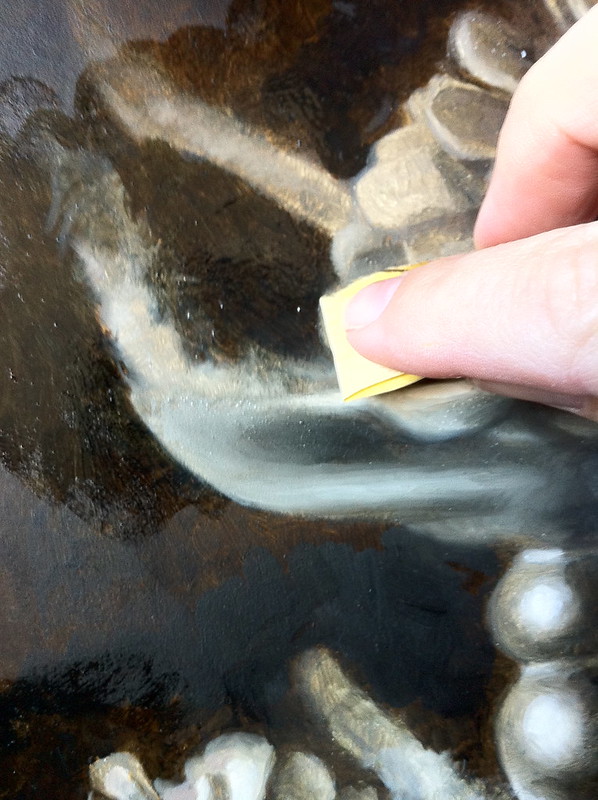
Usually when sanding, some of the grisaille, especially in the white areas, comes up. I learned it is important to work more gently on the opaque white areas. Some paint will come up, and thus don't be alarmed as long as it doesn't ALL come up.
Once the sanding is completed, there will be a pasty texture. I wipe this off using a blue shop cloth (which has less lint than other brands) so it does not interfere with the layers of paint.
It is really important to sand only the area planned for that day. I had an experience during one of these sessions where I did not sand the entire area well enough. When I got to the un-sanded area, the paint would not adhere properly. I needed to wipe that paint off and re-sand.
Speaking of sandpaper, I recently bought several grades at an auto supply store. I bought 1000, 1500, 2000, and 3000 grade. From this point on (after my color block in layer), I will be experiment with these grades whenever I oil out, hoping to rid some texture and get a nice, smooth surface to paint on. I haven't yet tried these but I imagine they will help get of that maddening lint and small bits of dust that accumulate on the surface.

I also recently placed my mediums into "source" bottles so that I only use what I need for that particular day, pouring small amounts of clean underpainting medium and painting medium into small palette cups. Sadie does this as well. Having been taught to paint in the Alla Prima fashion, I had never explored mediums to this degree - hard to believe now that I know how useful and important mediums are.

I bought both the bottles and palette cups at Michaels Craft supply store. I am unsure how well these will stand up over time. If I notice any deterioration of the plastic bottles I will update this blog post and switch to glass.
********************************
Color Palette
The palette we use in Sadie's class is the standard basic palette of colors. I have used these colors most of my career, regardless of the medium, oil, gouache, watercolor, colored pencils, and pastels (and it has informed my choices when painting digitally in Photoshop at my job). Once an understanding of how these colors work together (see previous post) it is easier to expand, limit or even add color to this set up.
For most painting purposes, these colors work very well in replicating just about any color and value. Painters always have strong opinions about what the best palette is, so you will find a lot of varied advice. I've tried quite a few of those variations but always come back to this basic set up. However, because I am familiar with the scope of the palette and have a ton of Rembrandt paints in my home studio, I've departed from the color palette slightly that Sadie recommends for class and added a couple of colors, specifically Transparent Oxide Brown, Transparent Oxide Red, and Pthalo Green.
Pthalo Green has always been a color I disliked for it's extreme staining power, but for some reason had a few tubes. I decided that since I would be painting a deep dark background for a still life subject that is mostly organic, Pthalo Green might be a good rich, powerful color when combined with Alizarin Crimson and Burnt Umber. So far I haven't been disappointed.

The palette I am using is as follows (a slight departure from Sadie's recommendations):
White: Titanium (Vasari)
Cadmium Yellow (Rembrandt)
Yellow Ochre Light (Rembrandt)
Cadmium Orange (Windsor Newton)
Cadmium Red (Rembrandt)
Alizarin Crimson Permanent (Gamblin)
Terra Rosa (Windsor Newton)
Transparent Oxide Brown (Rembrandt)
Yellow Ochre Light (Rembrandt)
Cadmium Orange (Windsor Newton)
Cadmium Red (Rembrandt)
Alizarin Crimson Permanent (Gamblin)
Terra Rosa (Windsor Newton)
Transparent Oxide Brown (Rembrandt)
Burnt Umber (Rembrandt)
Raw Umber (Rembrandt)
Cobalt Blue Light (Rembrandt)
Ultramarine Blue (Vasari)
Viridian Green (Vasari)Pthalo Green (Rembrandt)
I have added a couple of Windsor Newton color simply because I had them. Otherwise I do not prefer WN brand oils, finding them mostly filler. Rembrandt makes nice colors that I like, however I am annoyed beyond end by the tubes being too difficult to open.
Sadie recommends using Holbein brand or Old Holland, although I am using a combination of Vasari and Rembrandt oil paint because I have traditionally used them and have several tubes of these colors. At times I also add Cadmium Lemon, Mars Red, Transparent Oxide Red and Transparent Oxide Brown.
After I use up a little more of my paint stock, I plan to drop Rembrandt paints and replace them with Natural Pigments, finding the pigments far superior. (I will probably write about this at a later date.)
After I use up a little more of my paint stock, I plan to drop Rembrandt paints and replace them with Natural Pigments, finding the pigments far superior. (I will probably write about this at a later date.)
The main idea is to have good quality oil color. Specific brands are recommended because other brands are either inferior or do not match the specific palette needed. For instance, never use paint that has "hue" in the name because the color is only lightly tinted with pigment and has far too much filler, meaning that it practically requires an entire tube of this type of paint to make any influence in your mixtures. It is more practical to buy the expensive colors, which are powerful enough to influence mixtures with smaller amounts of paint. Paint is expensive, but you will be wasting your time with cheaper hue colors, unfortunately.
********************************
In all the years I've painted, whether it be in gouache, watercolor or oil, I have never made color strings. If you are unfamiliar with the term, a color string is simply mixtures of the main colors that you can identify in the set up. Color strings for me have been a "why didn't I think of this sooner" sort of an idea, so obvious!
Sadie always instructs us to mix up color strings of the basic colors from light and dark in the area we are working on that day. This helps to focus on a specific area without having to spend too much time figuring out color on the fly. Part of what interested me in this subject was the close chroma range between the pine cones, the wood base, and the twigs. Mixing up the color strings on this subject has been fun and challenging.

Color Strings
In all the years I've painted, whether it be in gouache, watercolor or oil, I have never made color strings. If you are unfamiliar with the term, a color string is simply mixtures of the main colors that you can identify in the set up. Color strings for me have been a "why didn't I think of this sooner" sort of an idea, so obvious!
Sadie always instructs us to mix up color strings of the basic colors from light and dark in the area we are working on that day. This helps to focus on a specific area without having to spend too much time figuring out color on the fly. Part of what interested me in this subject was the close chroma range between the pine cones, the wood base, and the twigs. Mixing up the color strings on this subject has been fun and challenging.
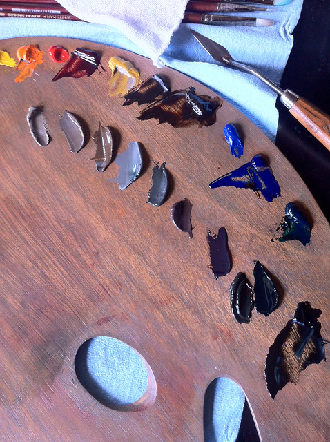
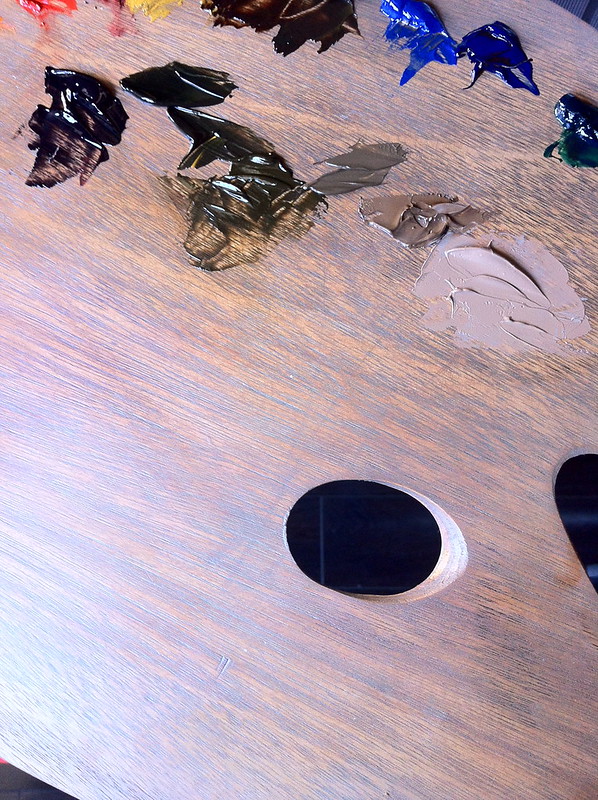
I spent some time trying to mix up two almost black colors: one for the background and one for the interior areas of the pinecone (the one at the top), that would look different from one another if seen in good lighting.
On the palette (below) you can see the slight difference between the cool dark (lower left) and the warmer, more reddish dark (upper right). Although both are a close to a value 10, the vibrancy of the color is very apparent on the painting next to one another. If I had made these two colors the same, the painting would far less depth in the final result, especially after a final coat of varnish.
On the palette (below) you can see the slight difference between the cool dark (lower left) and the warmer, more reddish dark (upper right). Although both are a close to a value 10, the vibrancy of the color is very apparent on the painting next to one another. If I had made these two colors the same, the painting would far less depth in the final result, especially after a final coat of varnish.
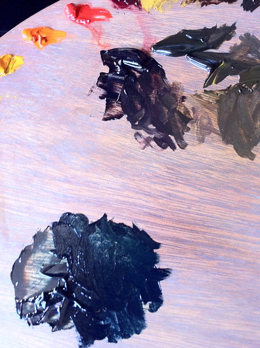
**note: notice how the red and alizarin colors are bleeding on the palette. This is because I hadn't opened those tubes of paint for some time and the oil separated from the pigment. To compensate for this, lay your colors straight from the tube on to a paper towel for 10 minutes to soak up the excess oil and then transfer the color to your palette. it's worth it especially since the extra oil makes a mess when color mixing.

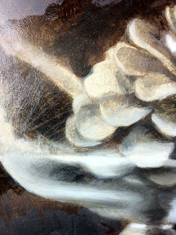
I then began on the upper pinecone and worked my way down the painting, blocking in large areas of color without worrying about minute details, painting all edges softly.

Once I finished this area, I thought I might move over to the lower left corner so that I could incorporate more color in the still life, especially because this set up is a study in very low chroma.
After I painted the green of the cloth in the lower left and part of the tree base, It was easier to judge color in more difficult areas like the glass and the bright greens of the lichen on the sticks behind the pine cones.

Sadie instructed me to paint difficult and detailed areas "blurry". The reason for this is because in later stages I can decide how detailed or non-detailed to make these areas. If I had painted these areas too finely in this stage, they would be more difficult to soften later.

Most of the chroma in this stage, the color block in, errs on the side of higher, warmer chroma rather than lower, cooler chroma. Sadie said that it is far easier to later bring the chroma down than to bring it up from a cooler state. Therefore this entire color block in is warmer than it appears in reality.

One of the most interesting things about this process is how Sadie stresses how soft and blurry everything should be. The reason is because at the next stages, the finish, we will work on selective focus, what areas to choose to emphasize, and what to let fall away.

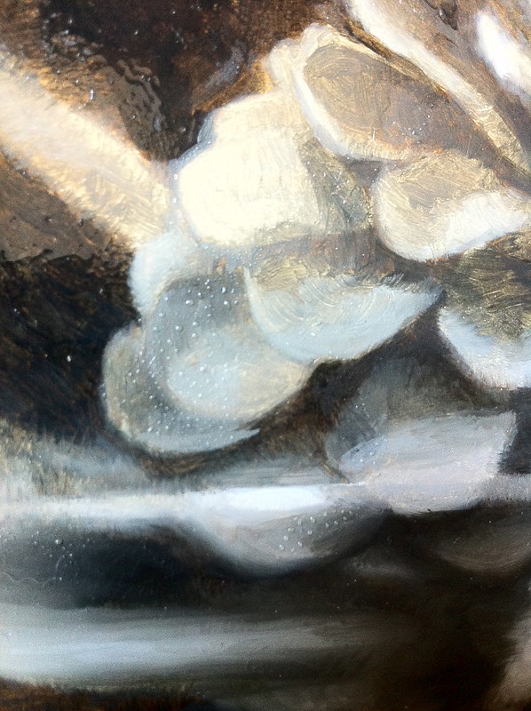
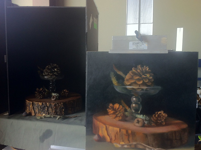
The two above photos demonstrate how blurry and out of focus to treat very detailed areas like this twig that is covered in lichen. Sadie said it was better to paint these areas as larger swatches of paint in one pass rather than focus in on the minute nuances of each string of lichen. Once the main color of the lichen is established, I can later go in and define detail.
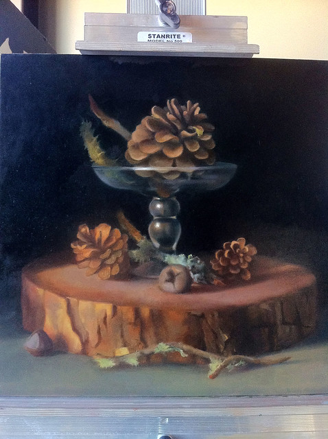
The finished first color pass.
Note that the highlights on the glass are treated generally rather than specifically and are much larger than they are in life. These will become closer to reality in subsequent stages.
The color block in took me about 24-30 hours total. I am only painting on Sundays, so this is over the course of a few months.
After I painted the green of the cloth in the lower left and part of the tree base, It was easier to judge color in more difficult areas like the glass and the bright greens of the lichen on the sticks behind the pine cones.
Sadie instructed me to paint difficult and detailed areas "blurry". The reason for this is because in later stages I can decide how detailed or non-detailed to make these areas. If I had painted these areas too finely in this stage, they would be more difficult to soften later.
Most of the chroma in this stage, the color block in, errs on the side of higher, warmer chroma rather than lower, cooler chroma. Sadie said that it is far easier to later bring the chroma down than to bring it up from a cooler state. Therefore this entire color block in is warmer than it appears in reality.
One of the most interesting things about this process is how Sadie stresses how soft and blurry everything should be. The reason is because at the next stages, the finish, we will work on selective focus, what areas to choose to emphasize, and what to let fall away.
The two above photos demonstrate how blurry and out of focus to treat very detailed areas like this twig that is covered in lichen. Sadie said it was better to paint these areas as larger swatches of paint in one pass rather than focus in on the minute nuances of each string of lichen. Once the main color of the lichen is established, I can later go in and define detail.
The finished first color pass.
Note that the highlights on the glass are treated generally rather than specifically and are much larger than they are in life. These will become closer to reality in subsequent stages.
The color block in took me about 24-30 hours total. I am only painting on Sundays, so this is over the course of a few months.
Please stay tuned for the final stages of this painting. For the finish, I will be posting more often and adding to an album I have created on Facebook.
I hope that by sharing my progress and class notes, you can find some new information for your own paintings that helps.
Thank you for reading! :)