Pages

12/01/2009

More watercolors from the early 90's

A good friend of mine, Gabor Svagrik and I had a two person art show at the Palette and Chisel in Chicago in 1995. Here are a few of my pieces from the show that sold:


The cat's name is Greta, the best cat in the world. She no longer lives with me.


Seeing these makes me feel homesick for the past. it was a difficult time during those post art school years in the 90's. However, it was good. I was doing nothing but painting: painting backgrounds at Calabash all day then heading over to the Palette and Chisel art league at night, and then more painting on the weekends. My mind must have really been in the groove back then. I can see it in the work. Over time, my career shaped my life: I went digital, struggled to make a living, finally got a good job, all of which seems to have changed my personal paintings. I think what I've been doing as of late in my own work has been more tense looking. Maybe it has something to do with the stakes being higher the older I get. What does an artist do when faced with making a living? Art school does not instruct the student in how to protect the heart, much less communicate with it. The desire to paint never goes away; it becomes more intense.

11/24/2009

Art school watercolors...

I have a website for my fine art from over the years. I do not update it primarily because I am thinking about overhauling the site entirely after I finish some personal illustration projects, but that will not be for some time. (hopefully next fall...) So, I thought I might add a few things to this site. I have some watercolors I'd love to show that are really the best of anything I did in art school. I was pretty young, 19 or 20, and heavily under the influence of my fantastic teacher Irving Shapiro, an incredible watercolorist who took the craft to a whole new level. Anyway, here are my paintings from about 1991-92.

I won a fancy Society of Illustrators award for the above painting...it's in a book somewhere. Also, the art school I went to, The American Academy of Art in Chicago, bought the painting and framed it for their walls. To me that was the most incredible honor and still is when I consider the school's walls are decorated with the likes of Richard Schmid, Haddon Sundblom, Gil Elvgren, Howard Terpning and a host of other incredible painters. My heart skips a beat when I think about it!


I gave the painting of the oranges and lemons to my sister.


Jody Kirberger, owner of the Talisman Gallery in Bartlesville, OK bought the lilly painting for her house.
Several thoughts come up when I look back at these paintings. First, this is the work that led me to work as a background painter at Calabash Animation in Chicago, a job that introduced me to animation and caused me to learn sooooo much about painting from memory and developing my imagination.

The other thoughts I have are more esoteric; I can see how I was on my way to a washy brushy look, which with some time and development could have been far more confident and interesting to look at. These paintings are stiff; I was so concerned with drawing things correctly I can see now that it caused me to freak out and tighten up. I am hoping with the new personal projects I am working on (in secret...hehe) to get back to this approach with a more experienced, older eye and looseness of brushstrokes. I can see it so clearly in my head...now if only I could do it in real life. We shall see...

Happy Thanksgiving!

11/11/2009


(click on art for larger version)
At one point, Pogo was playing with the idea of creating a Pogo Kids website, complete with kids games and an avatar system, all created in Flash/Illustrator. This was (and still is, I believe) to honor a deal that Electronic Arts has with Hasbro, who they have partnered with in the online gaming community. Although these initial concepts never came to fruition, I enjoyed designing some interesting characters that would be vector based. I really loved the graphic look we had in mind for the concept. As with many Pogo projects, this was a collaborative effort. The team consisted of myself, and two other artists - I worked on the avatar, avatar selector, and wardrobe.


(click on art to see larger version)
I also illustrated many mix and match badges for Pogo.com. The users collected the badges as rewards for achieving a certain number of games won. The badge program at Pogo has been very successful for our users, who like to collect as many as they can!

Pogo Mini Costume Designs


For the past few years, I have been working at Electronic Arts online casual gaming company, Pogo.com, as a staff artist. I have been primarily designing game art, costumes, backgrounds, and badges. On Monday I was laid off due to overseas outsourcing. I feel sad about this, especially since every single day I came into work feeling excited and happy about the work I was doing. I always took every single project seriously, no matter how 'small' or how 'big' the assignment was. I've always held that if an artist is a good artist, no matter what he or she touches, it should be of the highest quality and taken seriously.

I began working for Pogo/Electronic Arts as a contractor in 2003. At that time I designed some games, Canasta, Pinochle and a few others, while also providing lots and lots of artwork for various other games, like Mahjong, TriPeaks, etc. Eventually Pogo began a program called the Pogo Mini's, avatars for the users that can be customized with faces, skin color, facial expressions, hair, clothing, costumes, backgrounds, accessories, and even pets. I enjoyed this work SO much and always tried to bring interesting and fun items to our users.


11/06/2009


It's always really cool seeing your own work framed. I sent these three paintings to my mom and sister for their birthdays. I hope they like them!

11/04/2009


I found this little watercolor I did for an illustration job several years ago. It's a little cheesy.

11/03/2009


a couple of small watercolors from my sketchbook. The tree was in the Presidio and the tower is part of a highschool (the name of which I don't know) across from Dolores Park.

10/22/2009

Here is a small illustration I did for Calabash. I think I painted this in 2007. That year I was freelancing for Pogo, got to work on a Spiderwick video game, and painted a lot for Calabash Animation on Trix and Lucky Charms commercials.

Calabash asked me to take the sketch below and illustrate it, bringing it to a more detailed and clean rendering. Normally I do not like to take on freelance work that has been sketched out for me entirely, however in this illustration I felt there were challenges in the rendering that I wanted to take a crack at, such as stone countertops, a mirror and running tap water. Given that I only had a day to paint this, it was probably a good thing that the sketch was already worked out.

Trix Color Script panels

I found a few color panels from a color script I did for Calabash Animation back in...hmmm...maybe 2007. This was for a Trix cereal commercial that was done for the Mexican market. I had fun painting these.


10/16/2009

little experiments


For anyone who reads my blog, you might have noticed it's all over the road. There is a little of this and a little of that, some observational paintings, some from imagination. I feel like I have been on this directionless art journey, creatively lost in sketchbooks and other media for some time now - immersing myself in various schools of thought to see how it feels.

Lately, I am finally feeling like I'm coming out the other end with ideas that I am excited to bring to life. These tiny little watercolor experiments, which I did last summer, gel some of the ideas I've been thinking about - not completely, but just as little snapshots I suppose. I like the idea of archetypal characters, some realism, some stylized, and also a bit of fun with the format of painting. I think I prefer to work in oil, and I like the idea of making very small paintings. I am working on many more in my cozy art cave... self doubt abounds, but I try to just blow through that and keep working. I think it's good.

10/07/2009


Here are some packaging illustrations I did for a tea company about five years ago. The rendering is a lot tighter and more detailed than I would prefer; the client asked me to make sure they looked as realistic as possible while still maintaining a painted look. I'm not sure if I pulled it off. I'm also not sure about those ellipses. The illustrations have been sitting in my archive for a long time, so I thought I'd give them some fresh air. There are a few more in this series, but these are the best.

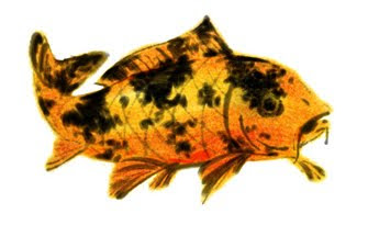
Koi Ranks for Mahjong game


Here are some koi illustrations I did in 2003 for the online game Mahjong developed at Pogo.com, where I currently work. These fish are 'ranks'. When you move up a level in the game, you earn a fish. I illustrated many more (like 20 in all), but only saved these samples for myself. I did the line work with black india ink on rice paper, then scanned the line work and painted them in Painter software using the watercolor brush. The effect could just as easily be done 100% traditional, but since these were for work, they needed to be digital. I enjoyed experimenting with this technique and, incidentally, love the game!

10/06/2009

Study of a Leafy Sea Dragon + Some

I recently visited the Monterey Bay Aquarium to see the amazing Seahorse Show. Wow... I did so many sketches, took photos and afterward obsessed over these tiny leafy sea dragons. I did this little study and added some fantasy color - I scanned in my sketchbook drawing and added some Photoshop color to it. 

Here are some of my sketches. After awhile I tried to draw them from memory. I'm not sure if they are accurate but I think the spirit of them is there. I studied Leafy Seadragons, Weedy Seadragons and plain old Sea horses. Such amazing creatures!


This is a leafy sea dragon with some fantasy coloring using colored pencils in my sketchbook.


Plain old seahorse, but just as fascinating. They seem to almost have exoskeleton forms, very angular, more than you would think by looking at their silhouette. 


This page is a mix of both Leafy Sea Dragons and Weedy Sea Dragons. You can tell the difference by looking at the amount of decorative fins. Weedys have much more elaborate fins than Leafys. 


A portrait I tried from memory of a Weedy Sea Dragon. I could study these guys forever!


10/01/2009

Sketch Comps/Greeting Card illustration

One of the first clients I found right as I left art school in the early 1990's was a greeting card company called Prudent Publishing, whom I still work with from time to time. The process in working with a greeting card company involves working up several comps, which then go into a review meeting. Typically, Prudent Publishing would have some ideas in mind when they'd ask me to generate some comps. So I would quickly paint them up and wait for the review. Sometimes the comps would be approved, and I'd be asked to work one or two of them into fully rendered illustrations. Here are several Christmas/Winter themed comps from several years ago (copyright Prudent Publishing Co.):


Santa! This one never made it to a card, but the comp was really fun to paint!


and below are a few cards that I illustrated: