Pages

8/25/2013

Sierra Pack Trip!

Earlier this month, I went on a fantastic six day painting adventure with artist friends Bill Cone, Paul Kratter, Ernesto Nemesio, Michele DeBraganca, Jeff Horn, Eric Merrell and Sergio Lopez to the Eastern Sierras - John Muir-Edgar Payne country. It was precisely the kind of uninterrupted painting time I so yearn for but don't very often get. 

Lake Ediza was our destination, a steep hike up from about 7,000 feet to around 10,000 at the lake. As we hiked up from the Agnew Meadows pack station where we dropped off our gear for the mules to carry up, I was floored by the incredible views along the rocky trail as I breathlessly made my way up slower than my group, despite the conditioning/training I did a few months before the trip.

Lundman_muletrain

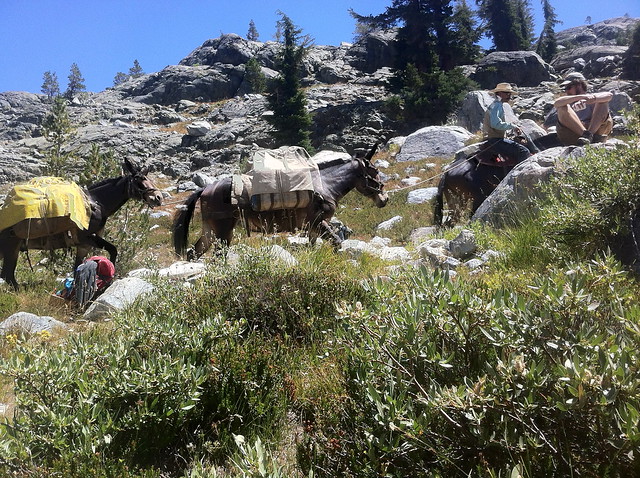
Our mule train arriving after a long hike up to Lake Ediza. Eric Merrell on the far right on top of a boulder.

Lundman_tentatEdizacamp

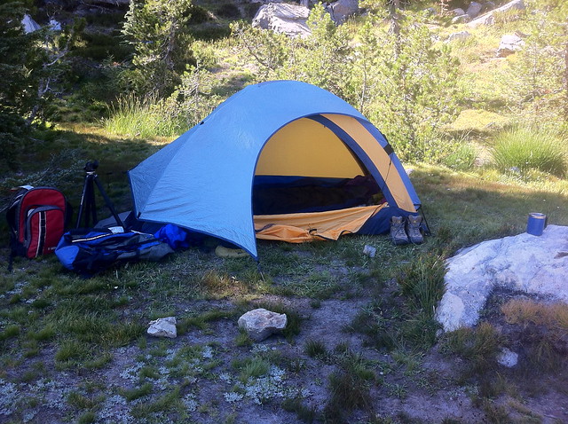
I set up my tent just under a tree, situated rather close to our cook's food storage/prep area due to the view of the Minarets from my tent. Given that we had a 4:00 am bear visit to the camp site, I think in the future I'd place my tent much farther away from the food source. I'm sure the view was just as magnificent a little further away.

Lundman_Minaretsviewtent

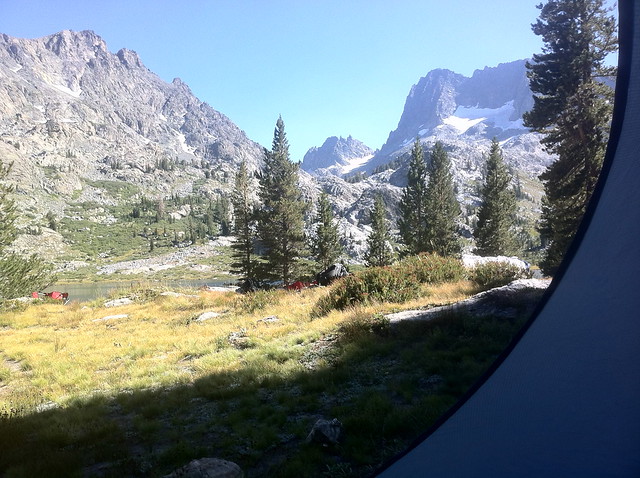
Zipping down the front flap to my tent each morning gave me the most amazing view! I did a few little pencil sketches from my tent in the mornings but mostly sipped coffee while staring at the mountains and feeling like all was right with the world. Probably not the most efficient use of my painting time, but deeply enjoyable nonetheless.

Before I went on the trip I planned out how I would approach the week of painting. I intended to sketch out a couple of long shots, a few medium and a couple of close up intimate scenes so that I could create a portrait of the area from large scale to the very small.

What I hadn't counted on though was how much the altitude seemed to factor into my experience within the first 24-48 hours. After we got up to Lake Ediza from a long and difficult climb up to almost 10,000 feet elevation, I found that even after a long rest and some water that my heart was beating quite fast. I tried my best to ignore it, but my worry distracted me and I didn't paint very well the first day.

Lundman_oilsketchnewkit

After the first 24 or so hours, my heart slowed to it's usual pace and I felt pretty comfortable. Still, I decided to stay close to camp to further acclimate to the elevation. While my camp mates were hiking up steep terrain in pursuit of painting gargantuan landscapes, I crawled along a stream bed close by looking for miniature wildflower compositions.

Lundman_wildflowerstudy1

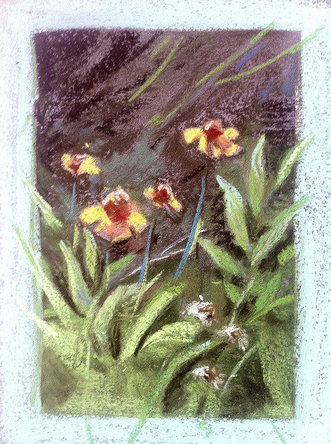
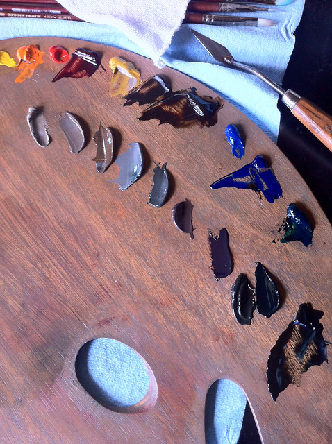
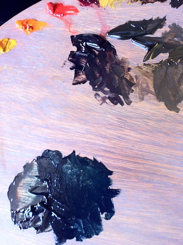
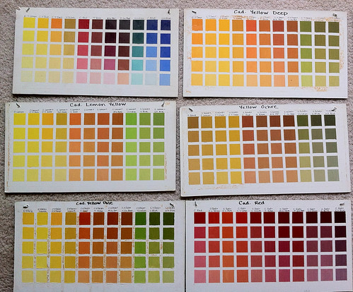
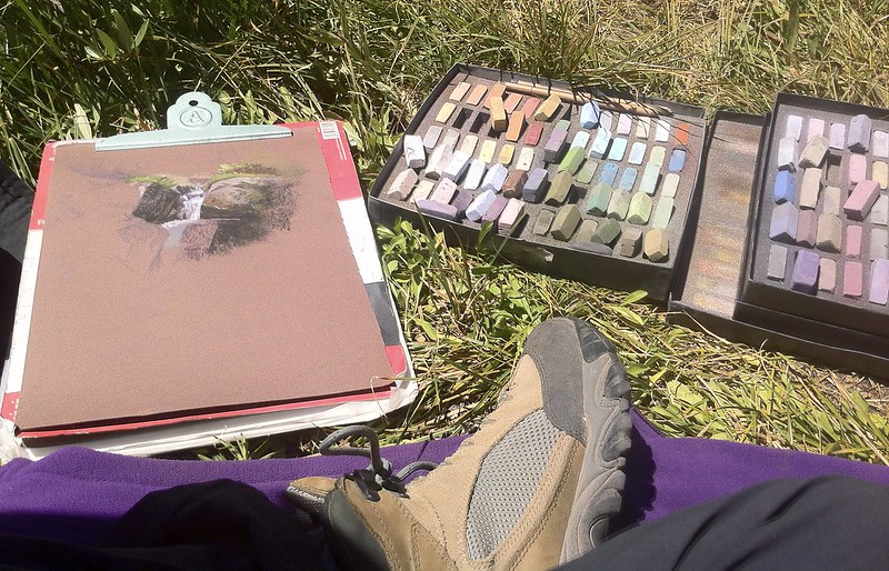
I attempted several minute scenes, but these two are my favorites of the lot. Most of these tiny compositions were along stream banks underneath tree growth bathed in beautiful cool sunlight with reflected light bouncing in and deep warm shadows. The pastel set I brought did not have a yellow that was as bright and pure as the yellow I saw in the light, so I tried my best to layer a few colors together and tried adding some transition color along the edges in order to brighten the color.

Lundman_wildflowerstudy2

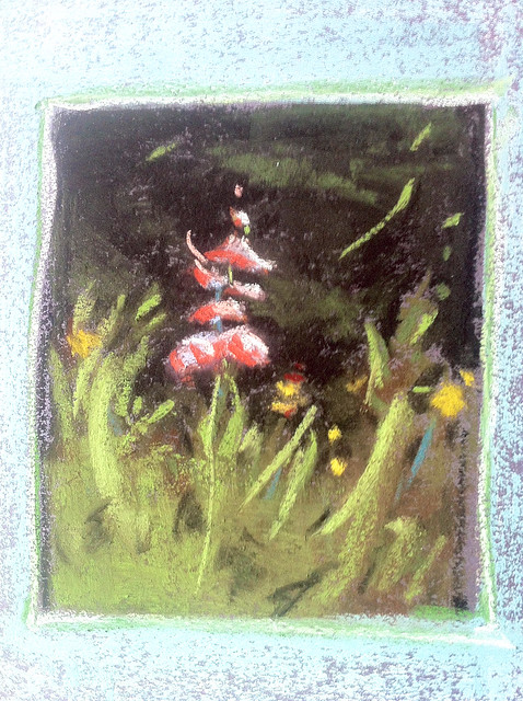
I also had some fun playing with the outside edges of the compositions, layering blue and accenting the edges with an emerald green. These little compositions reminded me a lot of the kind of watercolor paintings I did a lot of in my 20's. I would really like to get some hot press watercolor paper and do some more of these little flower studies. 

In keeping my goals, I decided to venture further away from camp in order to attempt a long shot landscape. I found a bank of trees at the opposite end of Ediza near to where we hiked in and made myself comfortable by the lake shore in a shady spot. I always enjoy large view paintings but do find them daunting at times. Part of the reason for this is probably technical on my part; I feel the need to hang out in one area until I get the entire area correct in terms of value, hue, and saturation before moving on to anything else. This I am sure is due in part to the lessons I learned early on at the Palette and Chisel via Richard Schmid, who often lectured about the importance of getting everything correct within the focal point first. It is entirely possible that I misunderstood his point, but still, there it is, imprinted on my art mind forever and the way I've approached painting since I was 19.

Bill must have wondered what the heck was going on because at one point he came up to me and said, "Commit Julia! Commit!" I had to laugh because I knew exactly what he meant. From that point on I told myself over and over, "stop the bullshit and lay in some more color!!!" I did find it helpful to stop lingering as much as I was in my focal point and get some more color down.

Lundman_sketch1

Lundman_treegroupingLakeEdiza

What attracted to me to this grouping of trees was the deep shadow within the bank of trees at the bottom. I liked the way the shape looked and liked how it was juxtaposed against warm and cool greens in the light. I'm not sure this photograph picked up the variety of color in the shadow very well, unfortunately.

Also, while I painted the mountain in the far distance behind the bank of evergreens, I noticed that the colors were muted variations of reds and greens, a color scheme I saw near the foothills of Zion National Park in Southern Utah. I wondered if these mountains have some of the same elements.

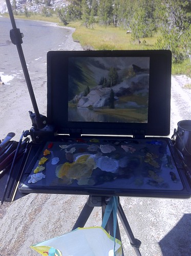
Switching to oil, I wanted to make a few studies of the light on rocks down by the water. I was attracted to the color in the shadows on the rocks - just jam packed with rich color that made it really fun to paint.

Lundman_rockfaceontheshoreofEdiza

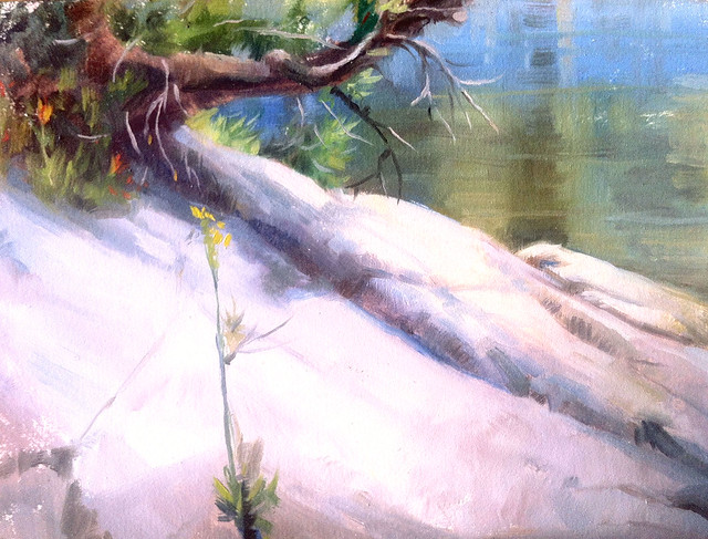
However, this simple study was more challenging than it might look. I'd look down to mix up some color, look up, and all of the sudden the temperature in the light was completely different! I decided it was probably due in part to the reflection of the shimmering light coming off of the water from Lake Ediza. This one is also on Arches oil paper. I layered the paint thicker in this study to compensate for the absorbency of the paper which seemed to make my values at least a full value darker about ten minutes after I laid down the paint. I did another few studies of the Minarets but became frustrated with the oil paper. I think I'll switch back to my usual L219 new traditions panels for oil studies. 

Lundman_rockfaceEdiza

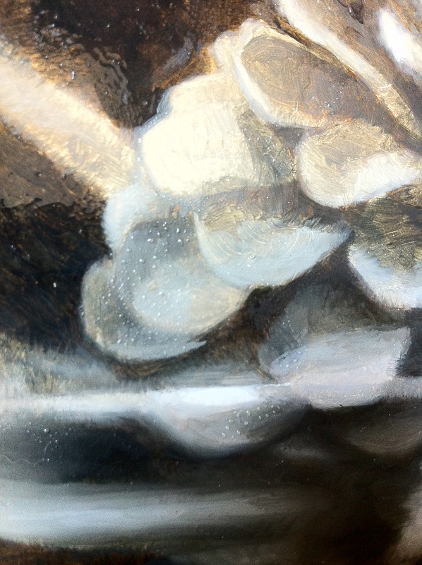
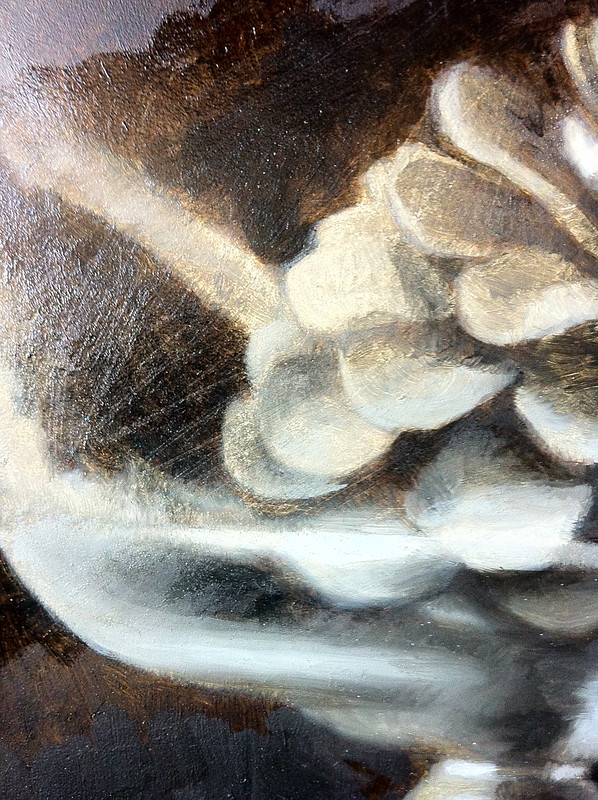
Switching back to pastels, I decided to turn around, move down the beach and paint a close up study of this rock face and shadow. The rock had a blue-grey local color and in the shadow side had some oxidization that made rich brown patterns along the cracks. The entire time I was painting the main deep shadow of the rock I could barely wait to paint in those wisps of grass in the light. When I finally put those little lights in, it was like going to the circus! 

Lundman_LakeEdizaview

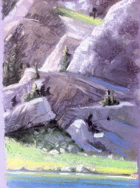
I tried a longer view from across the lake. I had to work very quickly on this one since the shadow and reflected light was changing by the minute, it seemed. The triangle of shadow at the bottom was filled with cool deep greens while the shadows above had warm light bouncing into cool shadows.

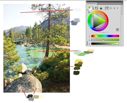
The amazing thing about the Sierras, at least the Minarets and Lake Ediza, is the reflected light. I found it quite difficult to paint such bright bounce light in the shadows, always thinking to myself that no one would  believe my painting if I painted what I saw in front of me. It was challenging to keep the reflected light within a value range that was in keeping within the shadow while also trying to define form. I've always found rocks and boulders challenging more so than other subjects for this reason.

Lundman_RockSlab

I am so fortunate to have spent time amongst the Minarets with this band of talented mountain loving artists. What made it so deeply enjoyable was the kinship with fellow artists who were all equally enthusiastic about painting. As we sat around the dinner table while Kelly cooked we all talked about what we painted that day, the places we explored and the light we saw.

Lundman_Edizaatdusk

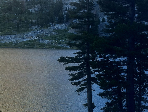
 The light at dusk was just stunning, absolutely my favorite lighting of all, the time of day when all of the color is blanketed in a blue grey bath. Apparently I wasn't the only one interested in this; right after dinner each night, Eric Merrell would begin to set up his pochade box for some nocturne sketching. He had an excellent night time set up with little led lights on his palette that were perfect for illumination and did not blow out the light when you looked up at the dark scene in the distance.

Lundman_EricMerrellnocturne

Eric painting around 9:00. Although you can't see it in this photo, the moon was quite bright, illuminating the landscape and flooding it with warm and cool grey light.

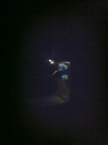
I attempted a nocturne, but quickly learned that in order to do it well I needed a much better lighting set up. Every time I looked down at my palette with my headlamp to locate a color I wanted, I would look up and find my eyes completely unadjusted to the light making everything in sight a giant silhouette. I tried using a dim book light on my palette instead which was an improvement, but then had problems locating the colors I wanted to use. Below is my result, for better or worse. 

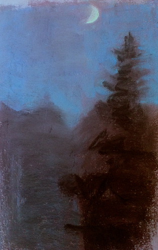
However, I did indeed learn A LOT by making the attempt. Not only would I come with tiny LED lights like Eric's, but I'd lay out a limited palette ahead of time full of cool blues, neutral greys, and even warm greys and a few rich violets too. 

The sky was so rich, full of violet and ult blue. I also vividly remember a thin sliver of very warm yellow value 2 light on the outer lighted edge of the moon - very surprising since the rest of the moon looked cooler in the light. 

Lundman_nocturnesketch

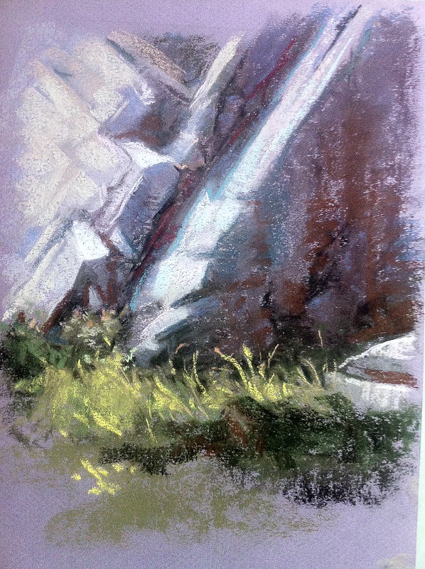
Besides developing a nocturnal lighting obsession, I became completely enamored by the lighting around waterfalls that were close to our camp. These areas were typically surrounded by rocks that when wet became a deep brownish color, almost black in some areas. This looked really stunning against the white water washing down around them and the green patches of vegetation nearby.

Lundman_waterfallintoEdiza

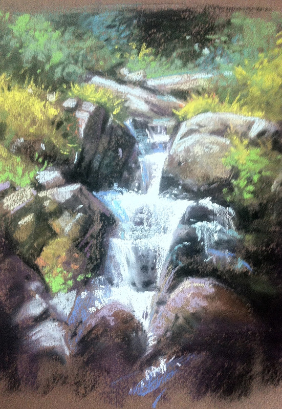
I felt like one day's time was not enough to study this waterfall area. I really want to go back and spend a full week exploring the light and color of this incredible dynamic.

Lundman_waterfallsketching

There is something about the mountains. When I was a little girl, my father, a Captain in the Army, was stationed at Fort Carson, Colorado. It was just outside of Fort Carson that I spent every weekend learning to ride horses, became obsessed with wildlife, the mountains, the air, the snow, the birds, horses, and hiking.

I am so fortunate to have spent such sacred time with fellow artists and friends in the Sierras. I really could do this forever! 

****************************

7/27/2013

Searle in America Auction, "Reminiscing"

Since starting my new job last year at Disney Media Group/Playdom, I've spent a lot of time sketching and thinking about classic Disney characters. It seemed a natural fit when the Searle in America Art Auction came around that I might try a theme with one of the villains. 

The auction is taking place on EBAY. Pieces from animation industry professionals will be auctioned off HERE. Check it out!

***update: my painting on this post SOLD today! There are a number of new pieces by other artists that have been added and more coming - be sure to check the auction page!

After sketching a few ideas out of Searle's birds and cats, I just kept coming back to the concept of Cruella de Vil relaxing in her home office... I did a little research on wikipedia, and what do you know?!! Cruella did indeed go to school in England! Here is an excerpt from Wikipedia:

In the original story, Cruella is a pampered and glamorous London heiress who knows the owner of the Dalmatian puppies through school, though it is mentioned that they were not friends. Her net wealth as mentioned in The One Hundred and One Dalmatians is £6 million. She was a menacing student with black and white plaits. She was later expelled for drinking ink

Of course that school was St. Trinians. 

Lundman_Reminiscing
"Reminiscing", 10 x 12", gouache on board


************************************************
PROCESS NOTES

It's been awhile since I've painted something cartoony without a computer. These days at my job the characters, props and backgrounds I draw and paint are for pre-production concepts, so I don't often get to finish the art myself. I enjoyed researching Searle and his interesting line work and making an attempt at it myself, although I was light on the line work and more heavy on the values.

 I thought I'd share a little bit of my process on this piece. 

Lundman_Reminiscing_firstsketches

When I first thought of the concept of Cruella in her home office or study, I pictured lots of books, framed diploma on the wall, books on the floor as well as photos and other paraphernalia from her early days at St. Trinians. After sketching out several ideas, moving things around, and thinking about it, I decided that it was better to go simple with this idea. Since Cruella's face is looking down and so clearly the center of interest, I thought it better to have her looking into her yearbook. All else in the concept is support at that point, so I eliminated as much detail as possible, feeling the idea is stronger with less.

After I finished sketching, I found some good photoshop brushes and experimented with palettes. I looked at some of Searle's work and found that he often used an interesting blend of warm grey and cool blacks. I love the look, so I dug out some materials from my art closet to see if I could match his look in terms of color first. 

Lundman_Reminiscing_materials

I thought a base layer of tan acrylic wash would work well with cool and neutral grey gouache tones and a cool dark grey line.


Lundman_Reminiscing_transfer

After I transferred the printed out drawing to a lightweight cold press illustration board, I painted a thin acrylic wash using the tan acrylic. This at first can be jarring because it tends to make the whole piece look dark and smears the lines a little, but when it dries the lines are in tact and the wash fairly clean.


After the acrylic wash was dry, I simply began to paint in flat values using the various grey gouaches mixed with a little titanium white gouache at times. I spent a lot of time fiddling with the layers, being careful to not let the gouache get too thick.

Lundman_Reminiscing_acrylicwash

After I painted the grey tones I painted in the line work. This took longer than any other part of the rendering process, but was probably the most fun of all. In fact, I am now thinking about seeing what I can do with this technique on more Disney villains - just for fun!


Lundman_Reminiscing_gouachelayers

Please stay tuned if you have been following my posts on studying the Flemish Method with Sadie. I have finally finished the piece and will post about that VERY SOON! 

Thanks for reading!

3/03/2013

Little Museum Drawings and a Hiatus

I've been on a short hiatus from this blog and painting since December. I traveled in December to Cedar Rapids, Iowa to see to the spectacular Alphonse Mucha show at the Czech & Slovak Museum, a rare showing of his works in the US, then a quick trip to the Art Institute of Chicago. After that, the holidays were upon us. During that time a family medical emergency took place, which I have been immersed in since. 

I am now back at my Sunday studio workshop with Sadie Valeri, starting again today. In April I will resume posting about the painting I have been working on for about a year now. I have about 8-10 Sunday sessions to go before I finish this elaborate work. After that, on to the next one, which I think will be considerably smaller. I am eager to move on to new works. I have sketched out quite a few ideas around some themes I have been thinking about for a number of years now.

It was an incredible experience to see Alphonse Mucha's works in person. Seeing a lot of his large format paintings and lithographs was absolutely worth the trip. His palette was far richer and varied than is conveyed in reproductions of his work. There were also a large number of sketches, many in mixed media, some in oil, and some in pencil and watercolor. All were amazing. Really amazing.

I sat and did a quick sketch of this painting. (There is a copy of the painting HERE.) I didn't quite capture it - I was a little distracted by the hawkish curators who were on the look out for picture taking and eyeing me cautiously even though I was only drawing.

muchadrawing

Next we spent a day in Chicago to visit the Art Institute. Going back to downtown Chicago brought back warm memories of being a 20 year old art student, slogging my way in between the American Academy of Art on Michigan Avenue and the Palette and Chisel across town, sometimes stopping off at the Terra Museum to check out the fantastic Winslow Homer paintings in between or the Sargent paintings at the Art Institute, one of which I did a museum study of while I was a student.

On this visit, I found this odd little sculpture that had an expression that intrigued me because of  the intensity and the strangely slightly inwardness of his eyes. It made for an arresting sculpture that I quite enjoyed drawing. 

Desktop_HomeStudio_sculpture

Earlier this year Jamie and I were in Paris, where we visited the Musee D'Orsay. The museum is packed with incredible paintings and sculptures, but also fantastic decorative Art Nouveau pieces as well. While I didn't have enough time to sketch this piece in person, I took some photos and pieced them together later so that I could do this study of a gate by Art Nouveau architect Hector Guimard

IMG_3878

I have been collecting all of my little museum drawings on this magnetic chalkboard I have on my desk. They all remind me of some of the most magical times I have had with Jamie sketching together, probably some of the best times I've ever had with another human being. 

Desktop_HomeStudio

 I look forward to more adventures together.

-Julia

11/22/2012

Advanced Open Studio with Sadie/Part Five B

As a continuation on my blog post series from the Advanced Open Studio I am taking with Sadie J. Valeri, this post is part two on the next stage, Color. These are my notes for my in progress painting. I hope you can glean some useful information from them. Enjoy!

********************************

Oiling Out


Before we paint, Sadie instructs us to always oil out the area we will be working on with a very small amount of painting medium.

Sometimes, when the oil is applied, it will bead up, which then requires wet sanding with very fine sand paper. It always makes me super nervous to sand my painting, but after having done it a few times now, I have found it actually great. The grain the sandpaper helps rid the surface of too many ridges (in Flemish painting an unwanted effect), dust, lint, odd streaks, and makes a really nice surface for the new layer paint to adhere to.

IMG_2690

 After I applied my "fat" painting medium on a portion of the surface, I used 1500 grit sand paper, moving in a circular motion. The reason for not oiling out the entire surface of the painting is because not only is it unneeded if only working on a small area for the day, but because over time those layers of oil, if put on too thickly, will slowly start to drip.

It also takes a few tries to figure out the thickness of the oil you like on your surface. It can't be too thin or too thick - somewhere in between that simply allows sanding and good flow of the paint.

IMG_2692

Usually when sanding, some of the grisaille, especially in the white areas, comes up. I learned it is important to work more gently on the opaque white areas. Some paint will come up, and thus don't be alarmed as long as it doesn't ALL come up.

Once the sanding is completed, there will be a pasty texture. I wipe this off using a blue shop cloth (which has less lint than other brands) so it does not interfere with the layers of paint.

IMG_2694

It is really important to sand only the area planned for that day. I had an experience during one of these sessions where I did not sand the entire area well enough. When I got to the un-sanded area, the paint would not adhere properly. I needed to wipe that paint off and re-sand.

Speaking of sandpaper, I recently bought several grades at an auto supply store. I bought 1000, 1500, 2000, and 3000 grade. From this point on (after my color block in layer), I will be experiment with these grades whenever I oil out, hoping to rid some texture and get a nice, smooth surface to paint on. I haven't yet tried these but I imagine they will help get of that maddening lint and small bits of dust that accumulate on the surface.


I also recently placed my mediums into "source" bottles so that I only use what I need for that particular day, pouring small amounts of clean underpainting medium and painting medium into small palette cups. Sadie does this as well. Having been taught to paint in the Alla Prima fashion, I had never explored mediums to this degree - hard to believe now that I know how useful and important mediums are.


I bought both the bottles and palette cups at Michaels Craft supply store. I am unsure how well these will stand up over time. If I notice any deterioration of the plastic bottles I will update this blog post and switch to glass.

 ********************************

Color Palette


The palette we use in Sadie's class is the standard basic palette of colors. I have used these colors most of my career, regardless of the medium, oil, gouache, watercolor, colored pencils, and pastels (and it has informed my choices when painting digitally in Photoshop at my job). Once an understanding of how these colors work together (see previous post) it is easier to expand, limit or even add color to this set up.

For most painting purposes, these colors work very well in replicating just about any color and value. Painters always have strong opinions about what the best palette is, so you will find a lot of varied advice. I've tried quite a few of those variations but always come back to this basic set up. However, because I am familiar with the scope of the palette and have a ton of Rembrandt paints in my home studio, I've departed from the color palette slightly that Sadie recommends for class and added a couple of colors, specifically Transparent Oxide Brown, Transparent Oxide Red, and Pthalo Green.

Pthalo Green has always been a color I disliked for it's extreme staining power, but for some reason had a few tubes. I decided that since I would be painting a deep dark background for a still life subject that is mostly organic, Pthalo Green might be a good rich, powerful color when combined with Alizarin Crimson and Burnt Umber. So far I haven't been disappointed.
IMG_2697

The palette I am using is as follows (a slight departure from Sadie's recommendations):


White: Titanium (Vasari)
Cadmium Yellow (Rembrandt)
Yellow Ochre Light (Rembrandt)
Cadmium Orange (Windsor Newton)
Cadmium Red (Rembrandt)
Alizarin Crimson Permanent (Gamblin)
Terra Rosa (Windsor Newton)
Transparent Oxide Brown (Rembrandt)
Burnt Umber (Rembrandt)
Raw Umber (Rembrandt)
Cobalt Blue Light (Rembrandt)
Ultramarine Blue (Vasari)
Viridian Green (Vasari)
Pthalo Green (Rembrandt)

I have added a couple of Windsor Newton color simply because I had them. Otherwise I do not prefer WN brand oils, finding them mostly filler. Rembrandt makes nice colors that I like, however I am annoyed beyond end by the tubes being too difficult to open.

Sadie recommends using Holbein brand or Old Holland, although I am using a combination of Vasari and Rembrandt oil paint because I have traditionally used them and have several tubes of these colors. At times I also add Cadmium Lemon, Mars Red, Transparent Oxide Red and Transparent Oxide Brown.

After I use up a little more of my paint stock, I plan to drop Rembrandt paints and replace them with Natural Pigments, finding the pigments far superior. (I will probably write about this at a later date.)

The main idea is to have good quality oil color. Specific brands are recommended because other brands are either inferior or do not match the specific palette needed. For instance, never use paint that has "hue" in the name because the color is only lightly tinted with pigment and has far too much filler, meaning that it practically requires an entire tube of this type of paint to make any influence in your mixtures. It is more practical to buy the expensive colors, which are powerful enough to influence mixtures with smaller amounts of paint. Paint is expensive, but you will be wasting your time with cheaper hue colors, unfortunately.

********************************

Color Strings


In all the years I've painted, whether it be in gouache, watercolor or oil, I have never made color strings. If you are unfamiliar with the term, a color string is simply mixtures of the main colors that you can identify in the set up. Color strings for me have been a "why didn't I think of this sooner" sort of an idea, so obvious!

Sadie always instructs us to mix up color strings of the basic colors from light and dark in the area we are working on that day. This helps to focus on a specific area without having to spend too much time figuring out color on the fly. Part of what interested me in this subject was the close chroma range between the pine cones, the wood base, and the twigs. Mixing up the color strings on this subject has been fun and challenging.

IMG_2699

IMG_2700

Lundman_AOS_Color_5

I spent some time trying to mix up two almost black colors: one for the background and one for the interior areas of the pinecone (the one at the top), that would look different from one another if seen in good lighting.

On the palette (below) you can see the slight difference between the cool dark (lower left) and the warmer, more reddish dark (upper right). Although both are a close to a value 10, the vibrancy of the color is very apparent on the painting next to one another. If I had made these two colors the same, the painting would far less depth in the final result, especially after a final coat of varnish.

IMG_2702
**note: notice how the red and alizarin colors are bleeding on the palette. This is because I hadn't opened those tubes of paint for some time and the oil separated from the pigment. To compensate for this, lay your colors straight from the tube on to a paper towel for 10 minutes to soak up the excess oil and then transfer the color to your palette. it's worth it especially since the extra oil makes a mess when color mixing.


I then  began on the upper pinecone and worked my way down the painting, blocking in large areas of color without worrying about minute details, painting all edges softly.

IMG_2703

IMG_2705


 Once I finished this area, I thought I might move over to the lower left corner so that I could incorporate more color in the still life, especially because this set up is a study in very low chroma.

After I painted the green of the cloth in the lower left and part of the tree base, It was easier to judge color in more difficult areas like the glass and the bright greens of the lichen on the sticks behind the pine cones.

Lundman_AOS_Color_4

Sadie instructed me to paint difficult and detailed areas "blurry". The reason for this is because in later stages I can decide how detailed or non-detailed to make these areas. If I had painted these areas too finely in this stage, they would be more difficult to soften later.

Lundman_AOS_Color_3

Most of the chroma in this stage, the color block in, errs on the side of higher, warmer chroma rather than lower, cooler chroma. Sadie said that it is far easier to later bring the chroma down than to bring it up from a cooler state. Therefore this entire color block in is warmer than it appears in reality.

IMG_3831

One of the most interesting things about this process is how Sadie stresses how soft and blurry everything should be. The reason is because at the next stages, the finish, we will work on selective focus, what areas to choose to emphasize, and what to let fall away.

IMG_3823

The two above photos demonstrate how blurry and out of focus to treat very detailed areas like this twig that is covered in lichen. Sadie said it was better to paint these areas as larger swatches of paint in one pass rather than focus in on the minute nuances of each string of lichen. Once the main color of the lichen is established, I can later go in and define detail.

IMG_3828

The finished first color pass.

Note that the highlights on the glass are treated generally rather than specifically and are much larger than they are in life. These will become closer to reality in subsequent stages.

IMG_3813

The color block in took me about 24-30 hours total. I am only painting on Sundays, so this is over the course of a few months.

Please stay tuned for the final stages of this painting. For the finish, I will be posting more often and adding to an album I have created on Facebook

I hope that by sharing my progress and class notes, you can find some new information for your own paintings that helps.

Thank you for reading! :)

10/13/2012

Learning about Color


My first experience in learning anything at all about color was in making color charts at the American Academy of Art. I was pretty bummed at the time and wanted to just move ahead to painting, but looking back now, it was a perfect introduction. In mixing up charts we learned about how paint handles, what happens when one color interacts with another, and how value is related to chroma. After this, we went on to painting monotone samples for a while, then with limited palettes, and finally full color, usually assignments ranging from still life painting, illustration, and figure painting. We always used gouache to paint, with the exception of specialized classes like oil painting or watercolor where we always painted from the model.

However, the real break through for me came from constant practice during my years as a background painter of environments and color scripts at Calabash Animation in Chicago combined with observational painting in my home studio and the Palette and Chisel Art League where Richard Schmid painted.

For my background painting job, there were usually 7-12 imaginary landscapes and interior paintings per commercial that I had to plan out and paint. Because of the fine art curriculum I took in art school, we rarely worked from imagination. My only guess then as to how to make convincing paintings with no reference was to apply the principles I learned about in Carlson's Guide to Landscape Painting, which I kept at my desk and referred to constantly. This forced upon me a need to truly understand the concepts of atmospheric perspective, the way color behaves while in a landscape, and other principles of lighting that cause changes on local color of objects. By working backwards, studying light and atmospheric perspective, I could then put those principles into practice on an imaginary stylized landscape.

 A Lucky Charms commercial pan background I painted in gouache on illustration board, approximately 3 ft. x 14" wide, around 1994

 However, just working from what I learned in Carlson's Guide to Landscape Painting was not enough. I also pored through books of other artists' work, studying paintings very, very closely. If I had no ideas on color schemes for seemingly mundane things like pavement or boring interior walls, I'd look at how Disney background painters were handling these subjects - usually with interesting lighting, chroma and contrast and learned how lighting and color can be an important compositional element in directing the eye. I combed through book stores and the library to find painters who were working from imagination; I practically memorized every inch of James Gurney's Dinotopia book for examples of great color. 

"Lillies", 11x14, gouache on paper, 1992

But working from imagination alone, I believe, is not effective unless an artist works also from life. One tends to inform the other. During my years in Chicago, I regularly painted the still life, figures and portraits from life over at the Palette and Chisel, which helped me to develop a sense of how to mix paint, see color, simplify it, and apply it on canvas. I learned from Richard Schmid the principle of "cool light warm shadows, warm light cool shadows", something entirely new to me at the time. It was there that I learned how critical value relationships are to color, and how important it is to keep your color clean. Interestingly, I also learned from painting the figure and still life how it seems the majority of colors in any given subject seem to be more greyed down that I usually think at first, and how few really true high chroma colors are usually present.

Later on, when I needed to switch to painting in Photoshop at work, the Munsell Color System in the program gave me a way to visualize how connected the relationships are between hue, chroma, and value. 

After having these experiences, I believe that learning about color is not simply the study of one component like a color wheel or color charts. I believe it has to be a combination of methods plus a relentless pursuit in training your mind to see and translate color accurately. I am still learning and sharpening my color and values sense, and hope that by making another concerted push now in my life I might break through a plateau I've been experiencing the past few years. By documenting my experiences and writing down what I know plus reading new research and methods while also painting from life, I hope to make some improvements.

********************************

Learning to Mix Color


Color mixing is one skill in a set of skills that an artist needs to develop for painting in color.

As stated earlier, the first time I ever mixed color was my first year in art school where we mixed color charts. Later, I made much more extensive charts on a recommendation that Richard Schmid made during a lecture at the Palette and Chisel. When he eventually wrote his book, Alla Prima, he included the exact same advice where you can find it to make your own charts. 

The purpose of making color charts is not so that you have "recipes" for mixing color. These charts are not meant to be short cuts, recipes or formulas for color.  At the time I made these I did not know what each oil color did when combined with another in the palette I was using. When I had problems remembering what, for instance, cadmium yellow deep did when combined with terra rosa, looking at these charts helped guide me. When I needed to figure out what color I was looking at in a still life, if I referred to these charts, it helped my eye understand what it was seeing in terms of chroma and value - usually I would mix that color up and go from there by adding a bit of a third. 

Lundman-colorchart-yellowsreds

Lundman-colorchart-redsblues

Going through the process of mixing colors for charts like this is important in learning many useful things about how to handle paint, how to physically mix it, apply it, manipulate it into values, observe what happens to it's temperature, and notice how important it is to keep it clean. Making charts like this is also useful when you add a new color to your base palette or for experimenting with a set of colors to find how it reacts with other colors in your palette. 

********************************

Learning to Identify Color


Sometimes while I was first learning to paint, I used a small piece of white paper with holes punched in it. I would look through this piece of paper when I was stuck, aligning it with the color I was trying to identify. Very often I was surprised at what I found - a color that was either more grey, less saturated, and not at all what I thought it was. Often, I would mix up what I was seeing through the hole and put a small swatch up on the white piece of paper. I would keep doing this until I got the correct color.

To help visualize what I mean, I made up an example from a recent photograph I took. Although the water is somewhat greenish blue, it can be very difficult to identify specifically. Here, by calling out swatches, you can see just how green the water is and what it's value is. Our minds might tell us that the mountains in the distance covered with pine trees must be green, also, however by calling out the swatch, we can see that the hills are not green, but greyed blues.  


Screen shot 2012-08-14 at 3.36.17 PM
Since I was using Photoshop to make this example, I placed the color wheel there too so you can see where the green of the water is placed within that particular hue.

Isolating colors using a white card punched with a hole puncher can help break down the symbols of what our mind "thinks" it sees into what is actually there. Over time, this simple tool helped me to discover just how saturated or non-saturated a color might be. 

********************************

Tools to Understand Color


After sifting through multiple websites, I finally found two excellent sites that explain color and how an artist uses it. Just about everything an artist needs to know about the physical properties of color and light can be found on these two sites.


Other tools that help visualize and explain how color works are demonstrated in chart form.  It is widely agreed within the realist painting community that the Munsell Color System is perhaps the most accurate way of understanding color and identifying it in context with other colors. The system identifies three terms: hue, chroma and value.

value: the black and white scale, brightness, how dark or light a subject is

hue:
the local color of the subject 

chroma: the degree of saturation or greyness of that local color


Another useful visualization of the Munsell Color System is the way that the program Adobe Photoshop represents it. Photoshop has an excellent color picker that brings up a color wheel. However, I prefer to use an enhanced extension called Magic Picker, an excellent color wheel for Photoshop used by many professional digital artists. If you have a copy of Photoshop, open up the program and experiment with painting swatches using the color wheel. Playing around with the sliders and adjusters really helped me see how color works using this system. This is the same chart depicted above, but represented differently.

Screen shot 2012-08-14 at 3.26.40 PM

Adobe published a technical guide regarding the Munsell Color System. You can find it HERE.

For further reading on the color wheel, read James Gurney's "The Color Wheel" series, Parts 1-7 on his blog, Gurneyjourney.blogspot.com. Gurney has a different but related approach culminating from his years of research on the color wheel. Excellent information, worth the read, including the comments.

Artist Graydon Parrish teaches a three week workshop in using the Munsell Color System at the Grand Central Art Academy in New York City each summer. The usefulness of learning the Munsell Color System is that it can help any artist identify any color, and use that color to depict anything he or she wishes. It is complex to understand at first, which requires some study and practice. I hope Graydon continues to teach - his classes are on the top of my list to attend!

Here is how Parrish describes the way he determines color in his paintings:

"What distinguishes my system is that I make strings of single chromas combined with single hues. I analyze what I am going to paint, find its notation, then mix up strings to cover the range. Reilly's method used cadmiums, way out of flesh range. A string of cad orange brought down with burnt umber/alizarin crimson shifts not only in value, but in hue and chroma as well, making it hard to predict. Reilly too recommended the addition of neutral greys to kill the chroma, but this causes the hues to shift as well. This is something Reilly never mentioned.

The above is just the beginning. One can analyze, then translate so many effects of nature into paint. I have a photo of a Bouguereau drawing where he had written the various colors of his model: green-grey, yellow-grey, rose-grey etc. With Munsell, the notations can be much closer. No more vague terms. (How much grey, for example, is in green-grey?) Its better to say 7.5 YR 6/3 or 7.5 R 5/4, for the average flesh and the ruddies. Then with mixing and planning, one can create an entire palette of Bouguereau flesh, for every change in value, and predict the rise and fall of chroma.

Likewise, Paris Hilton, could be studied and painted as well in all of her sun-tanned splendor. She is likely a chroma 5. When you then know where the chroma rises and where it falls, why some colors pull yellow in the lights and others don't, and how various transparent objects are more chromatic on the edges, then you have the beginning of an entire repertoire of visual phenomena from which to create." - quoted from the wetcanvas.com forums, HERE.

********************************

How Color Behaves in it's Environment


In addition to studying the Munsell system, learning how to mix and identify color, it is critical to also understand the principles of light and how color is affected by it. Matching color in any given subject is an important skill in developing the eye to see color correctly and helps to determine your palette and pigment choices. However, also understanding the reasons that make color appear a certain way in a particular situation is equally as important.


The very best books I can recommend are:

 Carlson's Guide to Landscape Painting

 Andrew Loomis, Creative Illustration

James Gurney, Color and Light

Richard Schmid, Alla Prima

Here is a summary of some important points I learned from these books about how light and color work together:
  • cool light produces warm shadows; warm light produces cool shadows. (Alla Prima)
  • the most saturated color in a particular area is at the transition between the light side and the dark shadow and also at edges of objects. (Color and Light)
  • Values in a landscape are often as depicted below, the source of the light, the sky, most often (even at night) being the lightest value in the landscape, the ground plane the second, slanting planes third, and upright planes usually the darkest. (Carlson's Guide to Landscape Painting)
  • Value is the most important factor in a painting, with hue and chroma coming next. If values are correct, hue and chroma will still be able to read. (Color and Light)
  • a color will alter it's appearance depending upon the context of that color in the light or if other colors around it change. (Alla Prima, Color and Light)
  • the limitations of pigments prevent us from depicting the wide range of luminosity in the world around us, so we must make adjustments in order to get across an approximation of what we see. (Alla Prima, Color and Light)


page 34, Carlson's Guide to Landscape Painting by John F. Carlson

In "Creative Illustration" by Andrew Loomis, he dedicates a chapter entirely to the great Howard Pyle. Loomis included this chapter in order to pass on directly, in print, information that was taken in note form during classes taught by Pyle regarding his general theory regarding light and color.

"All objects of nature are made visible to the sight by the light and of the sun shining upon them. The result is that by means of this we see the colors and textures of the various objects of nature.
From this it may be seen that color and texture are the property of light and that they do not enter the property of the shadow. For shadow is darkness and in the darkness there is neither form nor color.
Hence form and color belong distinctly to light. Shadow - as the object illuminated by the sun is more or less opaque, so when the light of the sun in obscured by that object, the shadow which results is more or less black and opaque, being illuminated only by the light reflected into it by surrounding objects.
By virtue of shadow all objects of nature assume form or shape, for if there were no shadow all would be a flat glare of light, color and texture...But when the shadow appears, the object takes form and shape.
If the edges of an object are rounded, then the edges of the shadow become softened; if the edges of an object are sharp, then the shadows is correspondingly acure. So, by means of the softness or sharpness of the solid object, is made manifest. 
Hence, it would follow that the province of shadow is to produce form and shape, and that in itself it possesses no power of conveying an impression of color or texture."
-Howard Pyle, as quoted by Andrew Loomis, Creative Illustration, pg. 136