For Valentine’s Day this year, Jamie gave me a three day weekend trip to Bill Cone’s pastel plein air workshop in Idyllwild, California. :))
If you are unfamiliar with Bill Cone, he is a Production Designer at Pixar and has worked on many of their films. His position at Pixar is similar to that of a cinematographer, but since the medium is cg animation, his concepts for lighting and atmosphere are painted and usually include both environments and characters for the film. This process helps not only the director to visualize, but also aids the production down the road when scenes are built and lit. In addition to his stellar filmography and illustration history, Cone is an accomplished landscape painter who passionately studies the behavior of light and color. To see some of Cone’s work, check out his blog HERE. (I highly recommend reading his thoughts and insight on the blog in addition to looking at his beautiful pastel paintings)
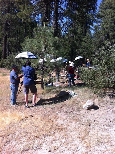
I have admired Bill Cone’s work for a long time being familiar with it through the various “Art of” movie books, and became more impressed when I went to his one man show of pastel plein air works at the Studio Gallery in San Francisco. I was delighted to learn that he also teaches workshops, and have since wanted to attend. I was so surprised when Jamie gave me a Valentine's Day gift of signing me up for the workshop, especially since I had tried to sign up myself and found the class full! :)
Bill’s approach to pastel painting reminds me of the impressionist style of thinking capturing the LIGHT and SHADOW, as opposed to the Classical Realist approach regarding documentation of exacting detail. Precise placement of detail is a lower priority in this workshop, the emphasis on capturing the light patterns, color temperature, atmospheric effects, composition and over all impression of the scene. Focusing on placement of each and every branch or leaf might be better suited to studio work afterward if one chooses to create a highly precise work, but while out in the field, prioritizing everything ELSE seems to work best. In fact, the scene really cannot be observed properly unless you squint down, do some interpretation, a few edits, and simplification to a degree.
(In fact, Scott Christensen's blog "Flow" also posted about this kind of editing and interpretation in landscape painting: The Fiction of Art.)
(In fact, Scott Christensen's blog "Flow" also posted about this kind of editing and interpretation in landscape painting: The Fiction of Art.)
In addition to listening to Bill's approach to landscape painting, I learned what a fantastic medium pastels are for painting out doors. One of the best advantages is the physical property of the medium, large square pieces which force you to choose big shapes and commit straight away. The most difficult aspect for me was this very thing because I am so accustomed to fine detail work in figurative drawing and illustration at my job. I also like the idea of laying in color all around the picture for the purpose of being able to judge how correct each area is against another and adjusting as you continue to develop the scene. Much like alla prima painting, the first statements around the picture are increasingly accurate as experience is gained.
Bill recommended that we purchase a set of hand made landscape pastels from Terry Ludwig. After trying them, I see why; the feel of them is so rich and buttery, and make beautiful opaque marks in addition to softer more subtle ones. I bought the basic landscape set which seemed to have each and every color I need. A great buy!
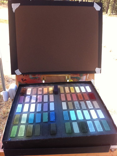
Bill also required us to work on Canson Mi Tientes toned paper, Twilight and Tabacco (shown above). Some students mentioned that they like to work on sanded and toned pastel paper called Waichilus because it is more forgiving. I might try it in the future, although I rather like the Cansons (I also use it for life drawing). It took a few tries to get used to working on toned paper outdoors, as I was unaccustomed to using a dark surface. The best way to regard the brown surface is the think of it as your mid range value and work either up or down from there. Same with the blue paper, if the scene in front of you is higher key then it most likely requires the lighter blue toned paper.
I must add here the rich brown tone might also work well for portraiture, as often times the shadows are a nice Transparent Oxide Red or Burnt Sienna-ish color. Most organic form has an undertone of warm, which is a good starting point for laying color on top.
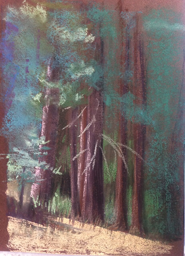
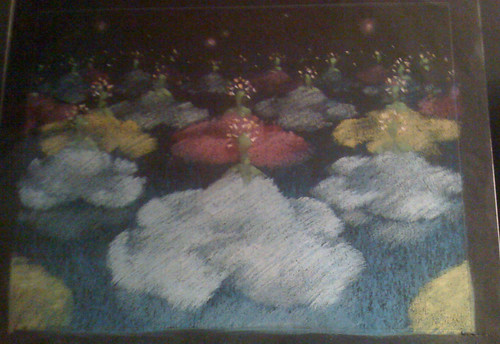
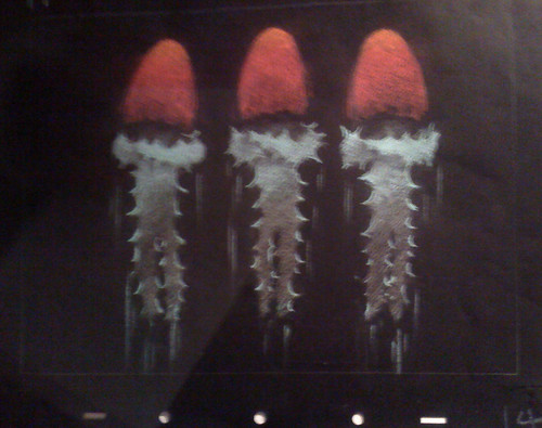
Here are some of my plein air sketches from the workshop.
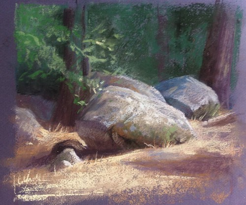
This painting was the very first I tried with pastels. I was uneasy and nervous considering that I had not ever used them before (except for ONE homework assignment way back in art school) and was used to working on white canvas rather than a deep brown color. Bill helped me punch up the contrast and showed me some ideas regarding technique with pastels.

I really struggled with this painting of the water and shore of the lake we visited on the second day. Bill does a lot of beautiful paintings of water and it's lighting effects (in fact, I'd say he's an expert on this). He helped me in a few spots, like the ground and gave me some tips in trying to get everything in all over the picture rather than in just ONE spot so that I can judge colors against each other and correct as needed.
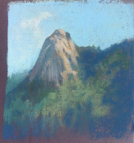
Regarding composition, I learned that a distant view is more interesting when a sense of scale is achieved. In order to accomplish this, many landscape painters add a few foreground objects that we know are smaller than the thing in the distance. In this case there were a line of evergreen trees at the bottom of this scene. The scene might be more dramatic had I included them, giving the viewer a sense of how large and how distant the mountain top is.
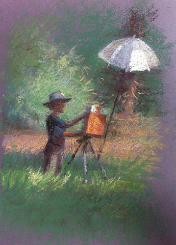
This was one that I had to paint! I can't resist a figure in a landscape. Not sure I captured the scene, but it was certainly a joy to paint.
I've thought since coming home from the workshop that I might expand my set of landscape pastels and add more colors. I am currently working on my "Spring" studio painting and would like to try a color study of it after I am finished with the pencil design.
I've thought since coming home from the workshop that I might expand my set of landscape pastels and add more colors. I am currently working on my "Spring" studio painting and would like to try a color study of it after I am finished with the pencil design.
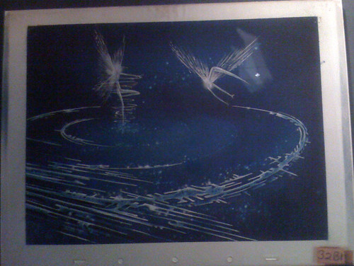
Bill's animation experience and pastel work got me thinking about the concept art for Disney animated movie, Fantasia. When I got home, I went through some photos I took (secretly) from a recent visit to the Disney Family Museum in the Presidio. I have seen these very paintings in books over the years many times, but was quite moved when I saw them in person. The technique is the same, focus on the LIGHT and shadow, done in pastels on toned paper. Inspiring, beautiful, and most importantly, connected to naturalist ideas. In fact, the reason I think these work is exactly that, because they are not only caricatures, but also based on light and natural form. (and isn't a caricature also based on natural form?)
If anyone noticed that my last post on my studio spaces has gone missing, there is a reason for that. I found more photos and decided to write a longer post. Will post again sometime this summer. Next posts will regard further process on my painting, "Spring" and also notes on "Structure/Form," which will include how I am trying to learn/think/approach the human form in sculpture and also some notes on flower painting and organic subjects.
Thank you for visiting!
5 comments:
I love Bill's work as well. Looks like you had a great time, beautiful paintings. Thanks for the write-up!
Waahh! Great post, Julia :D Plus.. beautiful pastel works :)
Great results Julia- what a fantastic workshop! Bill is the MAN!
Fantastic pastel work, Im very impressed especially as you hadn't used them before. I appreciate your in depth descriptions of the workshop and Bill Cones process, thoughts etc. I would love to take a workshop from Mr. Cone. I wonder if he ever teaches in Los Angeles?
Wow, I can't believe that thees are your first pastels! They look great and you should be very proud. I will also be taking Bill's workshop and am very excited about it :)
Thank you for sharing your work.
Post a Comment