Earlier this year I finished these four small paintings. It was a huge breakthrough because I spent so much time planning and figuring out technical details (process outlined below). More importantly, they represent an aesthetic I've been trying to figure out for some time, which recalls my love of fantasy inspired by illustrators in literature and history. All of these subjects have been deep influences on my interests throughout my life, yet I never quite knew how to channel it all.
Below is my process. For those interested, feel free to ask any questions. I am happy to give more details if they help.


Seems like video is the best way to view these.
****************************************************************
PROCESS
The first thing I did was work up some quick loose sketches in my sketchbook, then these studies below.


Because I wanted my paintings to have gold and silver details, I needed to carefully consider the palette. I scanned the drawings and then played with color palettes in Photoshop before I actually painted them. I really liked a muted palette against the brightness of the gold and silver and went with it.
I thought about making some custom black frames, but decided against it, at least for now.

I thought about making some custom black frames, but decided against it, at least for now.

***************************************************************
Because the drawings were scanned, all I needed to do was print them out to the correct size for the transfer. I transferred the drawings using saral graphite paper on to panels that I gessoed and sanded a few months before.
Because the drawings were scanned, all I needed to do was print them out to the correct size for the transfer. I transferred the drawings using saral graphite paper on to panels that I gessoed and sanded a few months before.


The method of painting I use is called indirect oil painting. It is the oldest form of all the oil painting techniques developed by Dutch painters, sometimes also called the Flemish method. Indirect oil painting involves a few layers of underpainting in warm tones, which is called a grisaille. This first layer, the "open grisaille", is always really unattractive looking, but it is important to get some paint on the surface so that subsequent opaque layers can adhere to the panel.

After the first open grisaille, I began the second grisaille, which uses white paint and is entirely opaque.

For all of these paintings, I designed the palette to be limited to a few custom mixes.
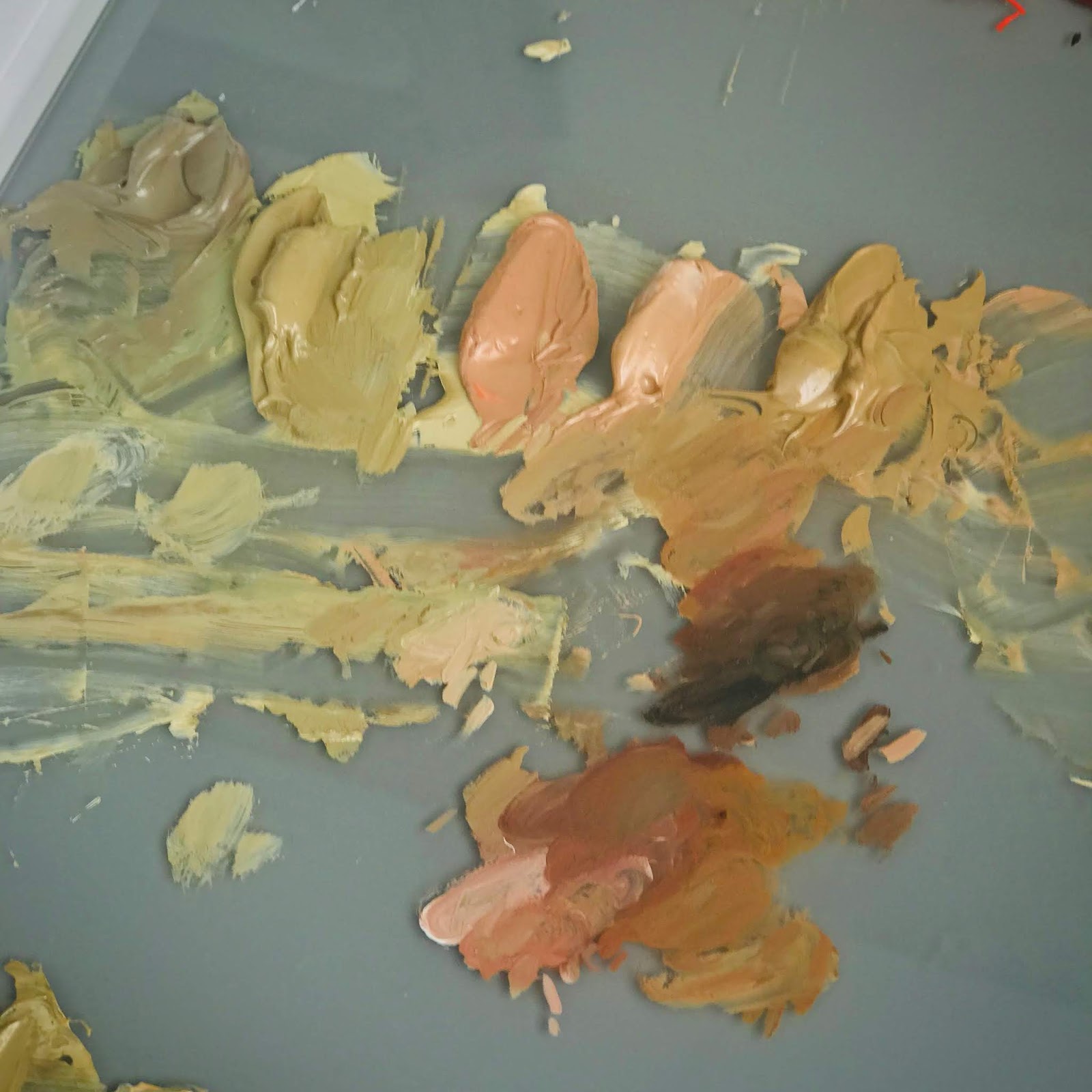
My limited palette comprised of mixtures I made from a typical palette of colors.
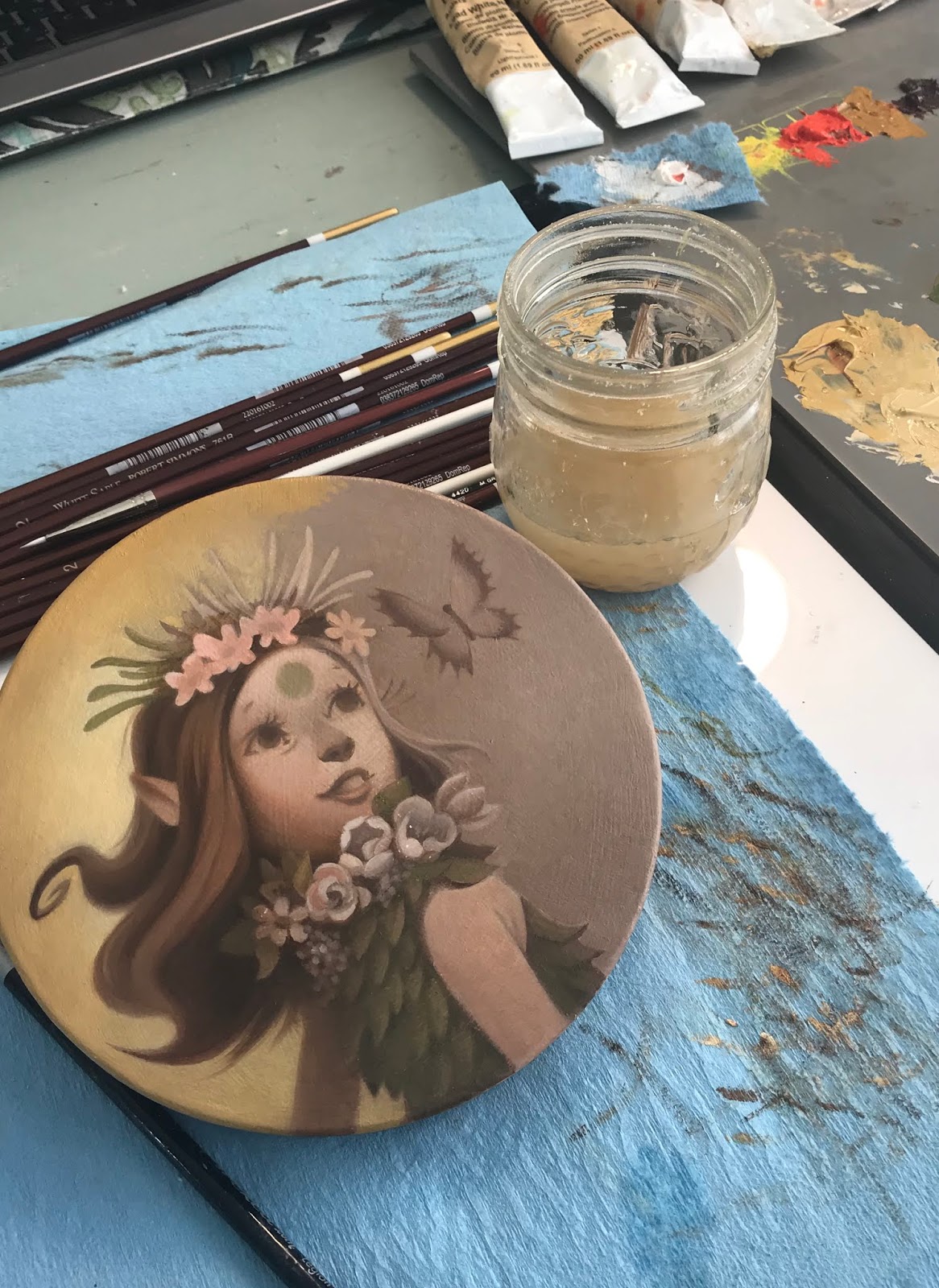
After coming up with the base color palette and marking down how I made the mixtures, I began the color glazing stage, following the color mock ups I did in Photoshop, which I have in front of my on my ipad at my desk.
In regards to technique, glazing color on top is fairly easy, it is just takes a few layers in order to cover the underpainting underneath. I love this stage the most. It finally feels like everything is coming alive.

After they were finished, I used a matte varnish rather than a glossy varnish. I wanted to make sure the metal leaf details didn't compete with another shiny surface.
And this is the part that took me literally months to figure out...gilding.
I had so many frustrating experiments on test surfaces that were not working the way I needed them to. Gilding on oil paintings, it turns out, is a little more involved than gilding on paper surfaces. I see a lot of artists using gilding in their work, but it is not at all easy when you want a specific design and are working with oil paint, which tends to want to grab the metal leaf, making brushing away the excess a nightmare.
I ended up taking a class with Lynn Rutter on gilding techniques. I am so glad I did. I learned a huge amount in information in two days that answered a lot of questions and provided important information about how to make sure that materials like oil paint and varnishes underneath the gilded surface interact well and archival for a long time. For all of the gilded details, I painted used twelve hour oil size and then used various metal leaf when the size was ready. Because some metal leaf tarnishes, I also learned about the importance of using shellac (and which kind) to create an isolation layer.

These are the samples of gilded surfaces we learned about in Lynne Rutter's two day weekend class.

I used twelve hour size. Timing it is important, so you have to make sure your schedule is clear twelve hours later, otherwise the gilding window closes and you have to start all over again. The photo above is what it looks like while it's drying.
After that, brushing it off was fun, too, except that sometimes the edges weren't as crisp as I'd like them to be. I had to double leaf the details in some places.
The finished piece.
Much more to come in 2019!
If you've made it this far down the page - THANK YOU.
No comments:
Post a Comment