Pages

9/25/2011

Weekend with the Masters - David Jon Kassan demo

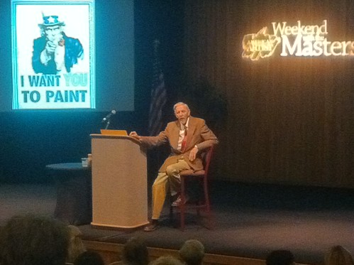
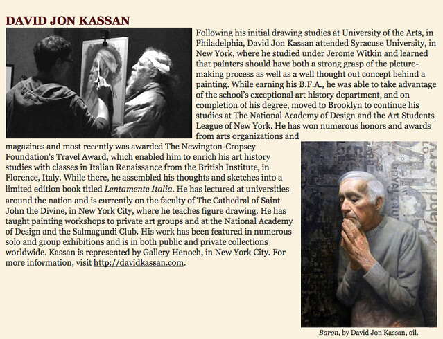
David Jon Kassan is an artist I was really excited to meet and study with at the painting conference I recently attended, American Artist's Weekend With the Masters, in Monterey, California.  Aside from his technique and acute observational abilities, Kassan has been an artist I've admired for his subject matter and unusual juxtaposition of realist figures against street art or other interesting abstract textures. 

I've also enjoyed the videos he has put together, particularly a portrait on an ipad tablet using the ArtRage app as well as traditional portrait sessions of people around where he lives in Brooklyn, NY.  If you haven't watched them yet, be sure to check out his blog and enjoy.

From Kassan's artist statement on his website:

My influences are understandably just as contradictory as they have fed and connected my perspective on painting. I am constantly seeking out work that is congruent with my own which has led me to explore the work of life size old master paintings, urban stencil and graffiti street art, Marcel Duchamp's found objects, abstract paintings by Robert Rauschenberg, and finally the sheer conceptual and executed realism of Caravaggio.

A flexible and open mind. I like that.

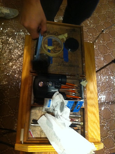
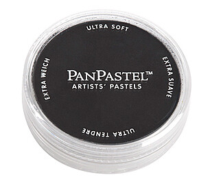
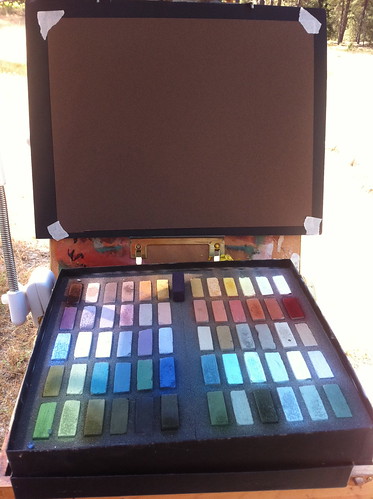
Notable supplies for the day included pan pastel in black, Generals charcoal pencils in blacks, greys, and white, a custom maul stick he made using a collapsible tent pole and coat hanger, and binoculars...

Kassan's drawing supply list can be found here.

Kassan_demo12

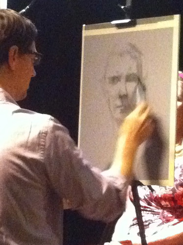
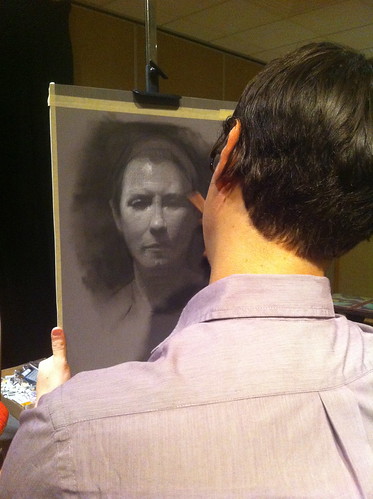
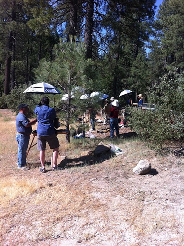
He began the demo on toned paper in a mid range moving up or down the value scale in order to model the form. He started by massing in the key darks of the eye sockets, under the nose and mouth with black Pan Pastel.

Panpastel


Kassan_demo16


Kassan_demo14


Kassan_demo15

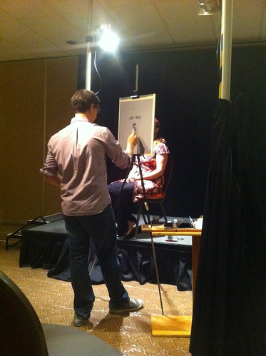
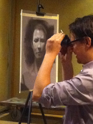
After he laid in the darks, he refined them by looking into a set of a binoculars at the model (not the drawing) to find the exact edges of these shapes and adjusting with an eraser. I had never before seen an artist use binoculars and was really curious to know how he was using them.

Kassan explained that the binoculars aid in finding the exact edges of shadow shapes and help in observing specifically where forms turn. He told us that occasionally students find this device controversial. His view is that while yes, binoculars are an optical aid, the mind and the hand are still creating the work; an artist still has to understand the form well enough to know what to look for in the first place as well as translate what is being seen on to the page. I have no problem with this myself. I wear eyeglasses for the same reason so binoculars to me feel like essentially the same thing.

Kassan_demo7

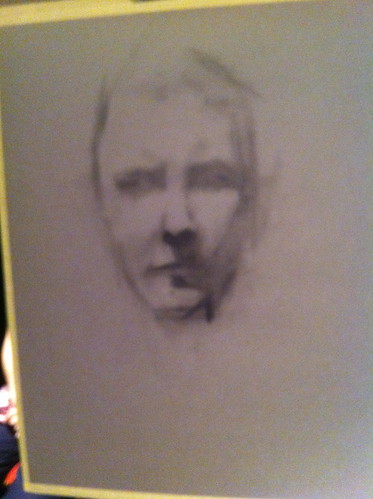
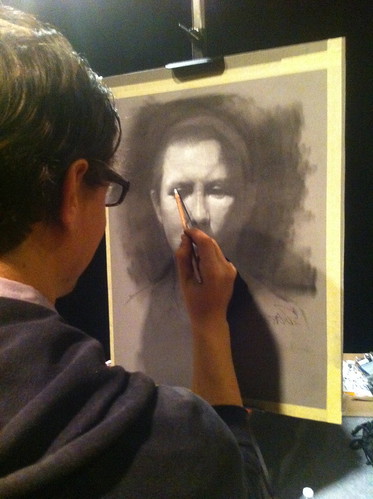
After he adjusted and refined the shadow shapes with a tuff stuff eraser, he used a white General's pencil employing crosshatching, another departure from my own training and one that attracted me to Kassan's work.

Kassan_demo10

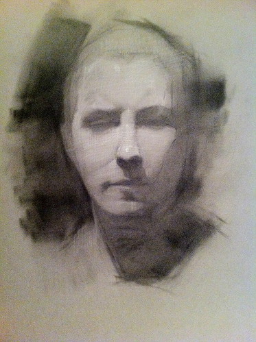
As he continued to refine the form in the light and add more depth and accuracy to the darks, he explained further about his use of crosshatching with white in the light tones. He follows each form around the face according to the natural grain that grows on that particular feature, something he learned from Costa Vavagiakis, with whom he studied at The Art Student's League in NYC. Years later Kassan learned from a doctor who was also a student of his that there is a medical term for this concept, Langer lines !!!

Kassan_demo8


Kassan_demo4 

Kassan_demo2 

Kassan_demo1

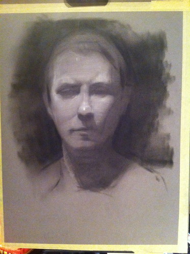
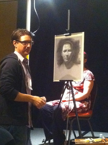
Kassan's finished 3 hour demo drawing:

Kassan_demo

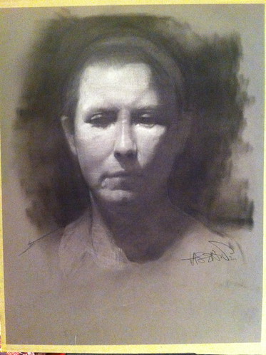
It was cathardic for me to hear about Kassan's use of white pencil, crosshatching and langer lines. A seemingly innocent thing like cross hatching has become a bit of a flash point in my personal art.

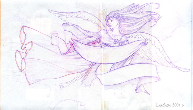
Many years ago, while I was in high school, I became completely obsessed with Langer lines, although at the time I didn't realize that is what they were. I had been at a local book store and discovered the Dover Press Alphonse Mucha's Figurative Decoratives, a book which remains incredibly inspiring to me to this day. I stopped experimenting with this technique when I went to art school because I learned that lines do not exist in Nature, that light illuminates volume creating tones rather than lines. Additionally, when I began to study at the Palette and Chisel during the early 90's, this idea was reinforced quite powerfully as tone being the best way to accurately depict light in Nature.

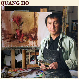
While this concept might be actual fact, it does not take into account that visual language is a human way of depicting our world on to two dimensional surfaces. During a lecture given by Quang Ho, he mentioned line as a part of visual language - and it caused a bit of an on stage controversy. (more about this in subsequent posts)

 I have always loved the line work in Mucha's life drawings throughout the years; It was the addition of using white plus line work in the lights that attracted me to Kassan's work and in my personal life I know so many comics artists who use line ONLY to create absolutely stunning work. It was a relief to hear from another artist in the fine art Realist community who is intrigued by cross hatching and line work and makes no apologies about it.

Further, during the above portrait demo, Kassan mentioned that he felt it was a good idea to try out various techniques in order to find what fits your personal temperament - also an idea that resonates with me.


MuchaFiguresDecoratives-1 MuchaFiguresDecoratives-2

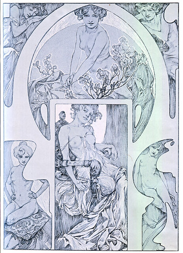
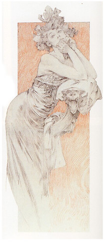
a nice flickr set of Alphonse Mucha's Figurative Decoratives can be found here.

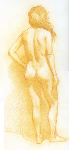
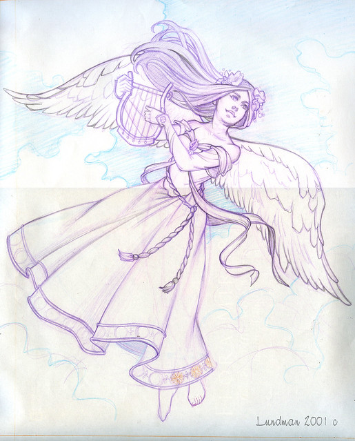
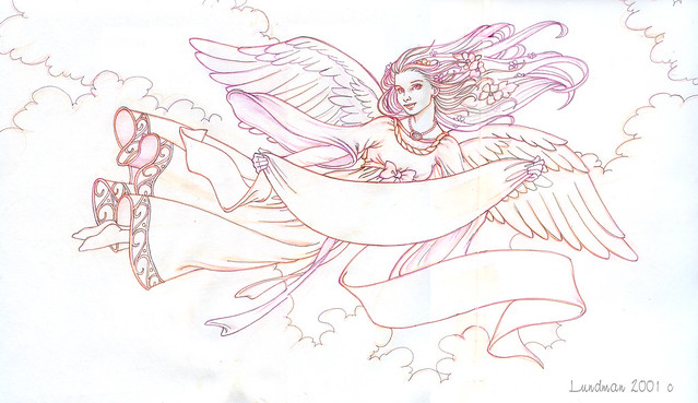
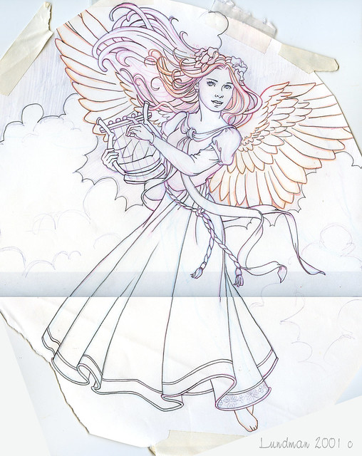
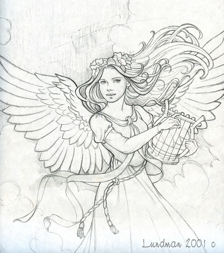
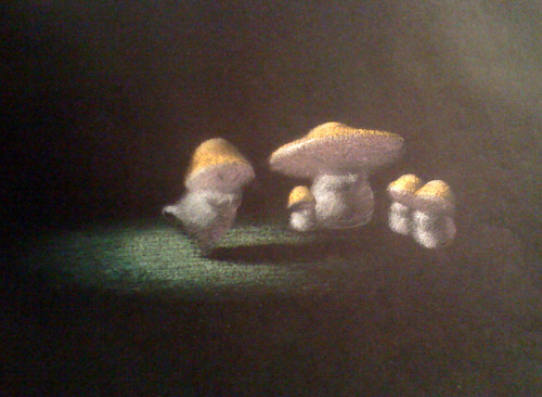
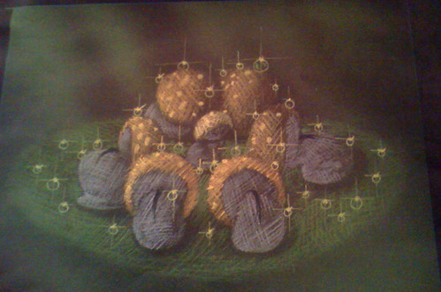
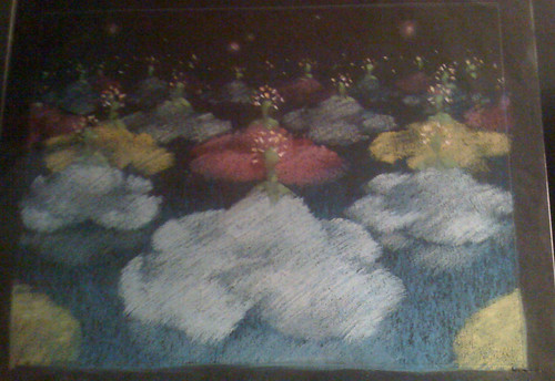
Here are some of my more recent experimentations using Langer lines: 

Lundman_Bilge_001
"Bilge" pastel pencil on Strathmore paper, 9 x 12 

Lundman-Tiffany

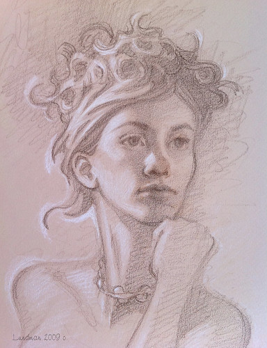
"Tiffany", brown and white pastel pencil on Canson's Mi Tientes paper
*note: this might have been more effective had the lines followed the forms on the face and body - and if the hand were more accurately drawn.

What I've learned over time, perhaps more than anything else, is that the art community is rife with opinions about the 'right' way. It is quite easy as a young and eager student to be overwhelmed by a Master, especially as I was genuinely blown away by some of the artists around me and wanted to paint exactly like they did.

Later in life, I have begun to realize my own internal temperament is different than those who influenced me in school, but they are still difficult to to ignore; I want to explore the idea of drawing with lines and yet I feel horribly when I do because it is the opposite of what I was taught. The only way I can address it is to break away from that line of thinking completely and put my fine art work "on hold" while I experiment with whatever I seem to gravitate toward.

So far it has been an interesting journey in finding my original influences, the things that attracted me to drawing before I even went to art school which are still deep within like a burning ember that never went out.

”…pay attention to the urges that motivate you…it’s your job to make it yours…not to judge it or compare it to other expressions…no artist is pleased…it’s just a divine dissatisfaction…a blessed unrest that keeps us marching…and makes us more alive...”
Martha Graham


9/20/2011

Words of Wisdom

"I want to paint like a pig eats." 

Last week I attended the Weekend with the Masters, in Monterey, California. The weekend is a conference with some of the top American Realist painters in the fine art scene. 

Painter Richard Schmid kicked off the event by giving a fabulous lecture about his adventures through a life time of painting, during which he stated that he wanted to paint like a pig eats. He explained what he meant: without holding back, without feeling self conscious and indulgence in the act of painting.

Schmid_paintlike pig eats 

This phrase, "to paint like a pig eats", was repeated throughout the workshop days mostly joking around by student painters and instructors. On the last day I took Daniel Sprick's demo, during which he said that in a later conversation Schmid elaborated that the statement was derived from a critic's quote regarding Spanish painter Joaquin Sorolla when his paintings were exhibited at the 1933 World's Fair held in Chicago. The critic scoffed at the direct painting method Sorolla used and wrote, "He paints like a pig eats!"
 
Sorolla
Walk on the Beach, 1909 - Sorolla
To which Schmid is clearly stating that indulgence in painting is OK. Why shouldn't it be?

Overall, the Weekend with the Masters was a lot of process and philosophy from various top fine artists. However, most interesting were the panel discussions that tackled ponderous big questions and definitions around what Realism really means. (as a Sci Fi fan, I love contemplating what reality is - and was surprised to find many Realist painters think about such things too!)

Please stay tuned over the next couple of weeks for my notes, photos and discussion. I am eager to share!
Lundman - paintingpig


9/05/2011

September 11th/Ten Years Ago

Ten years ago I was working as a full time freelance illustrator from my home studio here in San Francisco. I had moved here the previous year with my ex husband, Mike. I had been working happily as a background painter at Calabash Animation in Chicago and Mike was a lead animator and Director. In addition to working in animation, I was also painting and selling work in a gallery but the money I earned was not enough to make it a full time venture. As traditional animation turned toward cg animation, we were forced to look elsewhere for jobs. Mike and I both applied for jobs all over, and ended up in San Francisco when Mike landed a great position directing at Mondo Media.

San Francisco was not as giving to me, however. As it turned out, the first year and a half we lived here, 100% of my clients were from New York, Chicago, and Denver. The client I was working with the weeks before the attacks was the Art Director I worked with at Enesco in Illinois, with whom I had a professional relationship for about seven years. When she moved to another giftware company, she contacted me. My first assignment was to paint some beautiful angels, which would first be made into greeting cards and figurines if the paintings were well received. The project held the promise of royalties and long term expansion of my career into a field I always enjoyed - collectible sculpted figurines.

Although I am not the kind of artist that typically paints angels or spiritual themes, I was excited about this job because it was figurative. Much of the work I painted in commercial animation was background environments, color design of characters and props, and color scripts of story boards. I fell in love with animation during my time at Calabash and was eager to continue working in the field, but found I did not have enough experience when I moved to San Francisco, and also had no digital skills whatsoever. Although I applied to animation studios around town, the answer was always the same. They wanted digital work, not traditional.

So this particular job held much promise for me as a new direction. I threw myself into the project. I spent long hours thumbnailing various poses, made studies of decorative elements from Art Nouveau designs, and researched costuming that I felt would work for this theme. All of my research sketches are lost, unfortunately. In addition to the pencils below, I had also rendered close up details of the edging along the bottom of the gowns, sketched out wings, and had designed specific flowers for the hair.

ANGEL2-V1-FINALPENCIL

 The pencils above are the first versions I sent. She requested that I change the faces to look at the viewer, and have a slightly happy expression. I felt angels would look more heroic, as they are intended to be, if they were not looking at the viewer, instead looking toward the heavens. I tried to convince her but she insisted on a friendly appearance and felt my pencils were too serious.

ANGEL1-V2-FINALPENCIL

I have two versions of this pencil (below). One is flipped. I can't remember which was the final version of the painting. Also, the reason there is tape all over the pencil is because this was the pencil rendering I used to transfer the design to illustration board. I painted all of the paintings in watercolor and gouache, my preferred medium that I had a lot of experience using as a background painter.

ANGEL2-V2-FINALPENCIL

On Monday, September 10th, I had gotten final approval for all of the pencils and the go ahead to start painting. I spent all of Monday transferring the pencils to illustration board. I was set to begin painting the first angel on Tuesday, September 11th.

The morning of Tuesday September 11th unfolded - and like the rest of the nation, I was horrified and consumed. 

My deadline came and went. I found myself unable to paint. Every time I put my brush to the illustration board, a flood of images and thoughts raced into my head - the artists who lived in studios in the towers, the pastry chef from San Francisco, the firemen who rushed in, the people in the Pentagon, the people on the planes. Painting angels felt so terribly ridiculous. I could not - would not - feel a sense of peace and hope while so many were lost in such a horribly violent attack. I explained to my Art Director that I would not be able to deliver the assignment on time. She was very upset with me and told me, "life must go on."

ANGEL2-V2-XEROX

I eventually finished the assignment. However, I lost the client. The original paintings were never returned to me. I never received samples of the finished product. I did get paid, thankfully. 

Across the country, work completely dried up for freelance artists, causing great financial hardship for so many artists. The only silver lining for me during this time was that my father bought me a copy of Photoshop and a Wacom tablet for my computer. I spent all of my time learning how to paint digitally and rebuilding my portfolio, which led to a background painting contract at the Learning Company, a contract I was so grateful for.

Although it is natural to look for meaning in events, I still cannot make any sense or connection with these images of angels I was assigned to paint at this particular time. My art director was right in saying that life must go on. However, I feel strongly that we must pause to grieve for the loss the victim's families suffered that day and remember the soldiers who were called to war in Afghanistan and Iraq. 

Angelborder-xerox014

Peace.


8/22/2011

Weekend with the Masters

The second week of September I am taking a four day intensive seminar called Weekend With the Masters, organized by American Artist magazine.

weekend w masters

The seminar is in Monterey, California, which is about a three hour drive from San Francisco. The location is a major plus because the seminar weekend is expensive, running about $1200 for four days plus the hotel and materials; saving on the additional airfare makes it more in the affordable range.

It is going to be a grand weekend and a reunion of sorts too. Some of the painters teaching at the seminar are friends that I went to school with at the American Academy of Art and the Palette and Chisel - artists who really raise the bar for this kind of intensive. It will be so great to see my friends who have gone on to lead successful fine art careers and catch up, while also learning a little more of their well honed painting skills. As you can imagine, I had a difficult time choosing who I would study with.

In the end, I chose to mix it up a bit with artists I am already well familiar with and artists that are entirely new to me, who come from differing schools of thought than what I have been trained in. 

Here are a few of the artists I will be studying with:

A full day lecture by Jacob Collins, the founder of the Water Street Atelier, The Grand Central Academy of Art and Hudson River Fellowship. I am so excited to finally be able to meet him and attend this lecture. He will be lecturing with Daniel Graves of the Florence Academy  and Joseph McGurl:
Collins - wwm profileGraves - wwm bioMcGurl - wwm bio

An evening painting demo by master alla prima painter Richard Schmid. I had the honor of attending the Palette and Chisel in Chicago while Richard Schmid was president of the art league. Schmid's lectures and demos changed my life...what more can I say? Richard will be painting artist Alexy Steele:
Schmid - wwm profile

A full day of quick pose paintings with Sue Lyon. I have been a fan of Sue's since meeting her back in art school. She was always a really nice friend and even helped get me into the Palette and Chisel long ago. How could I ever forget! She was a great painter then and even better now (I even have a watercolor portrait she painted of me in art school. I'll post it someday.):
Lyon - wwm profile

Drawing the portrait with David Kassan. Who can forget the famous you tube demo David did on the ipad  - http://www.youtube.com/user/DavidJonKassan#p/a/u/0/5OLP4nbAVA4. It will be really cool to learn from him. I love his work:
Kassan - wwm profile

Lecture with Quang Ho. Of all the direct/alla prima painters out there, Quang Ho is one of my favorites. His still life paintings have not only a fresh feel but also incredible composition and sense of Zen. I dream of owning one of his works someday. Listening to his unusual philosophy about painting is bound to be an amazing learning experience.

Ho - wwm profile
Here is a little of his biography, in his own words:

"Realism and abstraction—it's all the same to me. The real essence of painting is the dialogue between shapes, tones, colors, textures, edges, and line. Everything else follows—including light, form, concepts, personal beliefs, and inspirations. For me, painting is a marriage between the mastery of those basic visual elements, the discoveries and understanding of visual statements (the search for what is true on a personal level artistically), and the trust in one’s own intuition and inspiration. Understanding gives rise to higher understanding. Working this way allows me to open the door to new ideas and inspirations. One day I may be interested in a color statement, the next perhaps a relationship of simple shapes, and the next an extremely complex arrangement of texture and edges—with every painting there is a singular visual thought to be completed." :

A full day of painting the figure with Daniel Sprick. Sprick is another of my favorite painters. I am really excited to paint with him!
Sprick - wwm profile


I will break down my notes on this blog and show the work I did for each day. If we are allowed to take photos, I will post those too. I am eager to learn about the different philosophies and approaches to observational painting.

I am still continuing to work on my "Spring" painting, but my busy schedule has forced me to put it on hold until after this course. I have booked a model for the pose and will be taking reference photos. I am interpreting the form into an stylized figure with some bits of fantasy, which is my intention with this subject, but will explain why I need reference for this particular painting.

I also have two sculptures in the works, which I will post about once they are complete. One is a portrait of an older man and the other a greyhound - the first animal sculpture I've ever attempted. I'm not sure if either will turn out to be successful sculptures, but I'll post about it regardless.

IMG_1337

3Greyhound -WIP 8-20

I am eager to continue sharing the things I learn and experience on my blog.
Thank you for visiting!

7/19/2011

San Diego Comic Con & Trickster!

ComicConLogo2

BOOTH 1329!

My Sephilina pin up that I painted for Jamie Baker's comic, "Sephilina the Nauti Girl" will be on sale at his booth, #1329. The print alone is $15, but the book + the print are $20 - a $5 discount on the print!

SEPHI-color-scan

Sephilina Book - Jamie Baker


ALSO only available at TRICKSTER:

FREE GIFT with Purchase of one of Jamie's books! 

I've been spending all week in the lab with ROCKET RABBIT AND THE PROFESSOR brewing up their secret special recipe ROCKET CARAMEL CORN! With every purchase of one of Jamie Baker's books or prints at Trickster, you will receive a FREE bag of Secret Recipe Rocket Caramel Corn! Available only THIS SATURDAY at TRICKSTER and while supplies last!

RocketRabbitCaramelCorn

Trickster

I will be splitting my time between helping out at Jamie's booth and helping out at Trickster. Please stop by and say hello!

7/14/2011

Bill Cone Plein Air pastel workshop

-->
For Valentine’s Day this year, Jamie gave me a three day weekend trip to Bill Cone’s pastel plein air workshop in Idyllwild, California. :))

 If you are unfamiliar with Bill Cone, he is a Production Designer at Pixar and has worked on many of their films. His position at Pixar is similar to that of a cinematographer, but since the medium is cg animation, his concepts for lighting and atmosphere are painted and usually include both environments and characters for the film. This process helps not only the director to visualize, but also aids the production down the road when scenes are built and lit. In addition to his stellar filmography and illustration history, Cone is an accomplished landscape painter who passionately studies the behavior of light and color. To see some of Cone’s work, check out his blog HERE. (I highly recommend reading his thoughts and insight on the blog in addition to looking at his beautiful pastel paintings)

Lundman_workshop peeps

I have admired Bill Cone’s work for a long time being familiar with it through the various “Art of” movie books, and became more impressed when I went to his one man show of pastel plein air works at the Studio Gallery in San Francisco. I was delighted to learn that he also teaches workshops, and have since wanted to attend. I was so surprised when Jamie gave me a Valentine's Day gift of signing me up for the workshop, especially since I had tried to sign up myself and found the class full! :)

Bill’s approach to pastel painting reminds me of the impressionist style of thinking capturing the LIGHT and SHADOW, as opposed to the Classical Realist approach regarding documentation of exacting detail. Precise placement of detail is a lower priority in this workshop, the emphasis on capturing the light patterns, color temperature, atmospheric effects, composition and over all impression of the scene. Focusing on placement of each and every branch or leaf might be better suited to studio work afterward if one chooses to create a highly precise work, but while out in the field, prioritizing everything ELSE seems to work best. In fact, the scene really cannot be observed properly unless you squint down, do some interpretation, a few edits, and simplification to a degree.

(In fact, Scott Christensen's blog "Flow" also posted about this kind of editing and interpretation in landscape painting: The Fiction of Art.)
 
In addition to listening to Bill's approach to landscape painting, I learned what a fantastic medium pastels are for painting out doors. One of the best advantages is the physical property of the medium, large square pieces which force you to choose big shapes and commit straight away. The most difficult aspect for me was this very thing because I am so accustomed to fine detail work in figurative drawing and illustration at my job. I also like the idea of laying in color all around the picture for the purpose of being able to judge how correct each area is against another and adjusting as you continue to develop the scene. Much like alla prima painting, the first statements around the picture are increasingly accurate as experience is gained.

Bill recommended that we purchase a set of hand made landscape pastels from Terry Ludwig. After trying them, I see why; the feel of them is so rich and buttery, and make beautiful opaque marks in addition to softer more subtle ones. I bought the basic landscape set which seemed to have each and every color I need. A great buy!

Lundman_newpastelsunused

Bill also required us to work on Canson Mi Tientes toned paper, Twilight and Tabacco (shown above). Some students mentioned that they like to work on sanded and toned pastel paper called Waichilus because it is more forgiving. I might try it in the future, although I rather like the Cansons (I also use it for life drawing). It took a few tries to get used to working on toned paper outdoors, as I was unaccustomed to using a dark surface. The best way to regard the brown surface is the think of it as your mid range value and work either up or down from there. Same with the blue paper, if the scene in front of you is higher key then it most likely requires the lighter blue toned paper. 

I must add here the rich brown tone might also work well for portraiture, as often times the shadows are a nice Transparent Oxide Red or Burnt Sienna-ish color. Most organic form has an undertone of warm, which is a good starting point for laying color on top.

Here are some of my plein air sketches from the workshop.
 
Lundman-pleinairrocks

Lundman-pleinairtrees

This painting was the very first I tried with pastels. I was uneasy and nervous considering that I had not ever used them before (except for ONE homework assignment way back in art school) and was used to working on white canvas rather than a deep brown color. Bill helped me punch up the contrast and showed me some ideas regarding technique with pastels.

Lundman-pleinairlake

I really struggled with this painting of the water and shore of the lake we visited on the second day. Bill does a lot of beautiful paintings of water and it's lighting effects (in fact, I'd say he's an expert on this). He helped me in a few spots, like the ground and gave me some tips in trying to get everything in all over the picture rather than in just ONE spot so that I can judge colors against each other and correct as needed.

Lundman-pleinairmountain

Regarding composition, I learned that a distant view is more interesting when a sense of scale is achieved. In order to accomplish this, many landscape painters add a few foreground objects that we know are smaller than the thing in the distance. In this case there were a line of evergreen trees at the bottom of this scene. The scene might be more dramatic had I included them, giving the viewer a sense of how large and how distant the mountain top is.

Lundman-pleinairpainter

This was one that I had to paint! I can't resist a figure in a landscape. Not sure I captured the scene, but it was certainly a joy to paint. 

I've thought since coming home from the workshop that I might expand my set of landscape pastels and add more colors. I am currently working on my "Spring" studio painting and would like to try a color study of it after I am finished with the pencil design. 

Bill's animation experience and pastel work got me thinking about the concept art for Disney animated movie, Fantasia. When I got home, I went through some photos I took (secretly) from a recent visit to the Disney Family Museum in the Presidio. I have seen these very paintings in books over the years many times, but was quite moved when I saw them in person. The technique is the same, focus on the LIGHT and shadow, done in pastels on toned paper. Inspiring, beautiful, and most importantly, connected to naturalist ideas. In fact, the reason I think these work is exactly that, because they are not only caricatures, but also based on light and natural form. (and isn't a caricature also based on natural form?)

IMG_4168

IMG_4171

IMG_4166

IMG_4165

IMG_4164

If anyone noticed that my last post on my studio spaces has gone missing, there is a reason for that. I found more photos and decided to write a longer post. Will post again sometime this summer. Next posts will regard further process on my painting, "Spring" and also notes on "Structure/Form," which will include how I am trying to learn/think/approach the human form in sculpture and also some notes on flower painting and organic subjects.

Thank you for visiting!